How Does Colour Affect Mood in Working Spaces?
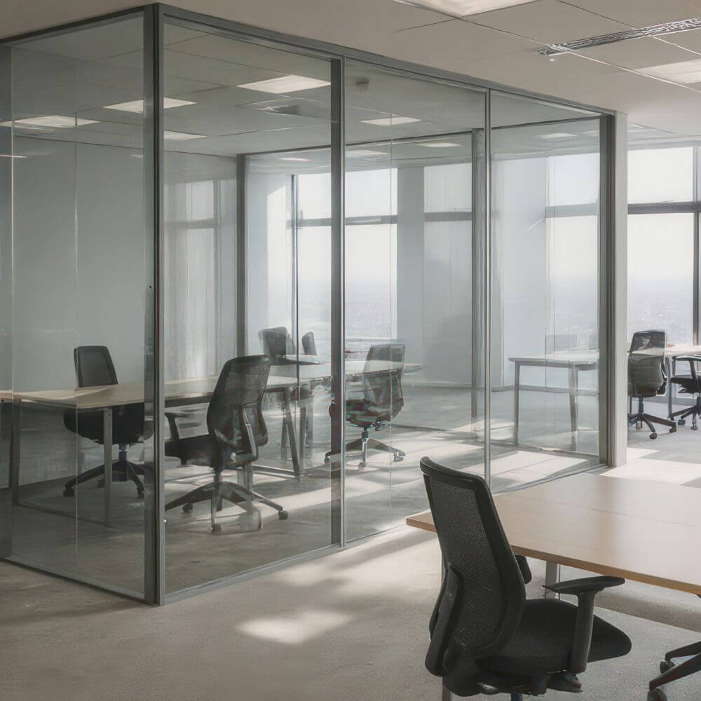
Most offices still look like no one thought about the humans inside them. White walls that feel like hospital corridors. Grey partitions. Blue accents that were probably chosen because someone once said blue was “professional”. The whole thing ends up visually flat and emotionally tiring, yet companies wonder why staff feel disengaged, irritable, or mentally foggy by 3 pm.
Colour affects mood in working spaces far more than people acknowledge. Not in a cheesy “yellow sparks creativity” way. In a deep, nervous system, emotional tone, and behavioural pattern way. Your environment speaks to your body long before your brain catches up.
This article is the grounded version of that truth. No Pinterest fluff. No airy colour psychology clichés. Just the practical reality of how colour shapes mood, presence, energy, and the daily experience of being a human trying to function in a workplace.
Why Colour Hits Before Thought
You feel colour before you think about it. The body takes it in instantly. It influences:
• emotional state
• tension levels
• ability to focus
• willingness to communicate
• energy throughout the day
• how safe or stressed you feel
In a working environment with back-to-back meetings, task switching, notifications, and other people’s moods bleeding into your own, your nervous system is already working overtime. The wrong colour palette adds pressure. The right one reduces it.
This is why offices that rely on cold corporate neutrals often feel draining. They are visually tidy but emotionally empty. There is no grounding. No warmth. No sense of being held by the room.
Colour either supports your internal state or pulls from it.
The Nervous System Reacts to Environment, Not Design Trends
Companies often assume workplace dissatisfaction is caused by workload, management, or a lack of motivation. Sometimes it is. More often, the environment creates a low-level stress pattern that people cannot name. Their shoulders sit higher. They breathe shallower. Their mood dips. Their patience thins.
Colour is one of the clearest contributors to that shift.
If a room is filled with cold whites, harsh lights, and grey tones, the body gets locked in a subtle state of alert. If a room introduces warmth, softness, texture, and depth, the body relaxes enough to actually think.
Colour is regulation. Not decoration.
The Problem With “Professional” Colour Palettes
We have normalised the idea that offices should be visually bland. Neutral equals respectable. Clean equals efficient. Minimal equals smart.
Except none of that is true.
A colour can look professional and still feel emotionally dead. Neutrals are not bad. They are just overused and underconsidered. Most office palettes do not calm people. They mute them. Workers lose energy because the room offers no sensory support. The environment becomes something they endure rather than something that helps them function.
Neutral is not calm. Neutral is often numb.
And numb is rarely productive.
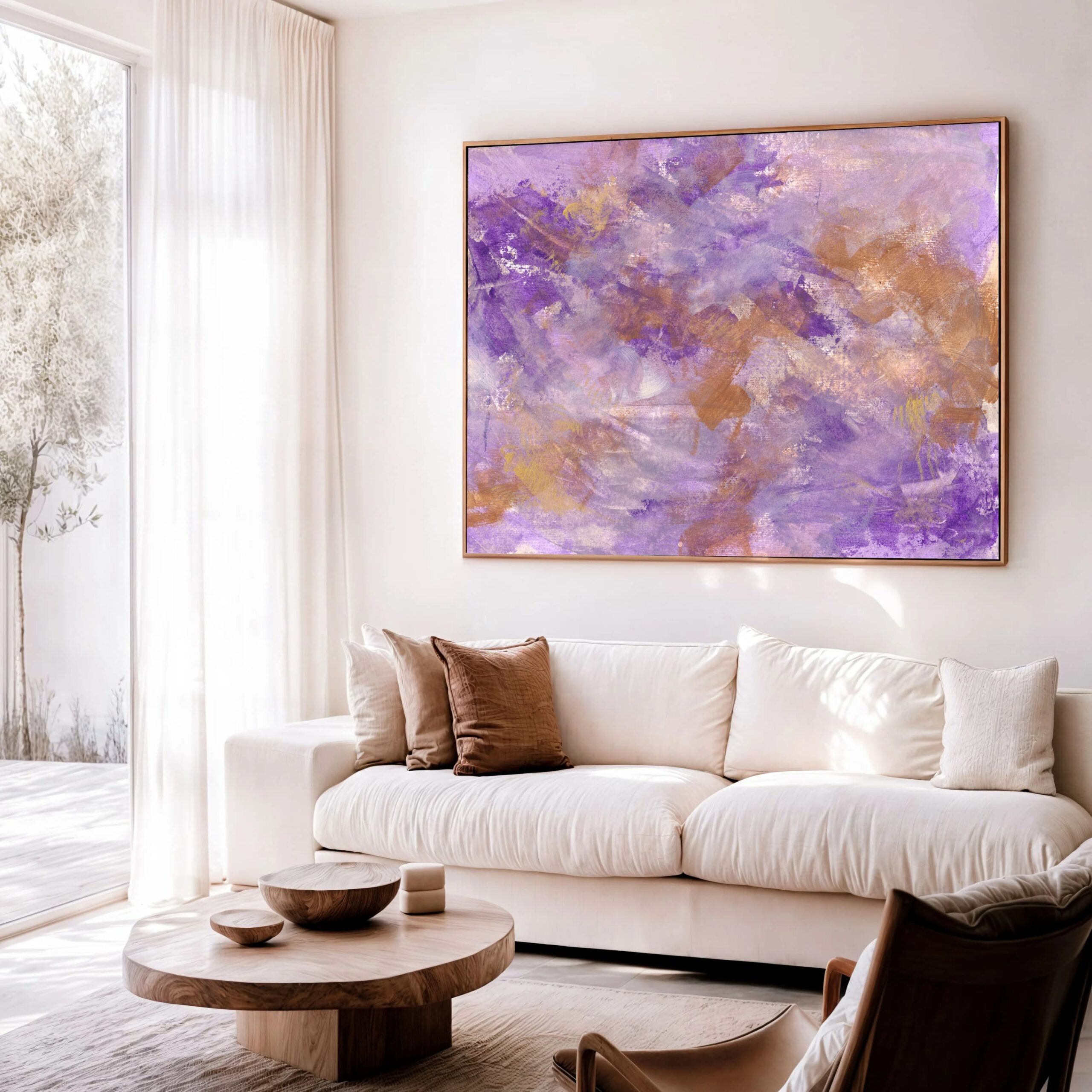
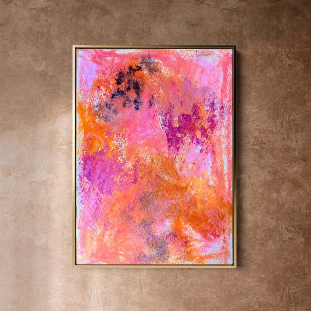
Warm Colours Increase Connection and Ease
Warm colours are not about cosiness. They are about human presence. They support openness, safety, and social connection, which are crucial in workplaces where communication can either fuel a healthy culture or create unnecessary friction.
Thoughtful warm colours such as terracotta, muted peach, camel, warm beige, clay, and earth-based neutrals help people feel more at ease. They soften harsh architectural lines and balance strong lighting.
Warm tones do not make a workplace casual. They make it human.
Cool Colours Enhance Clarity and Focus
Cool colours get a bad reputation because people associate them with cold, clinical spaces. That is a failure of execution, not colour theory.
When used properly, cool tones help with:
• mental clarity
• task focus
• cognitive endurance
• detail-oriented work
• emotional steadiness
Think about softened greens, deep navy, muted teal, slate blue, or slightly greyed greens. These colours support the mind without numbing it. Green is especially powerful for sustained concentration because it strikes a balance between calm and alert.
Cool does not have to mean cold. It can mean clear.
Why White and Black Need Support
White on its own is fatiguing. Black on its own is heavy.
Neither creates a supportive emotional climate. Both rely on context. White needs texture and warmth to avoid feeling sterile. Black needs contrast and softness to avoid dominating the space.
Architectural photographs make monochrome look chic. Actual humans rarely thrive inside it.
Where Colour Matters Most in an Office
You do not need to repaint the entire space. Certain areas influence mood far more than others.
1. The wall people face when they walk in
This sets the emotional tone immediately.
2. The wall behind workstations
This influences how long people can focus without mental burnout.
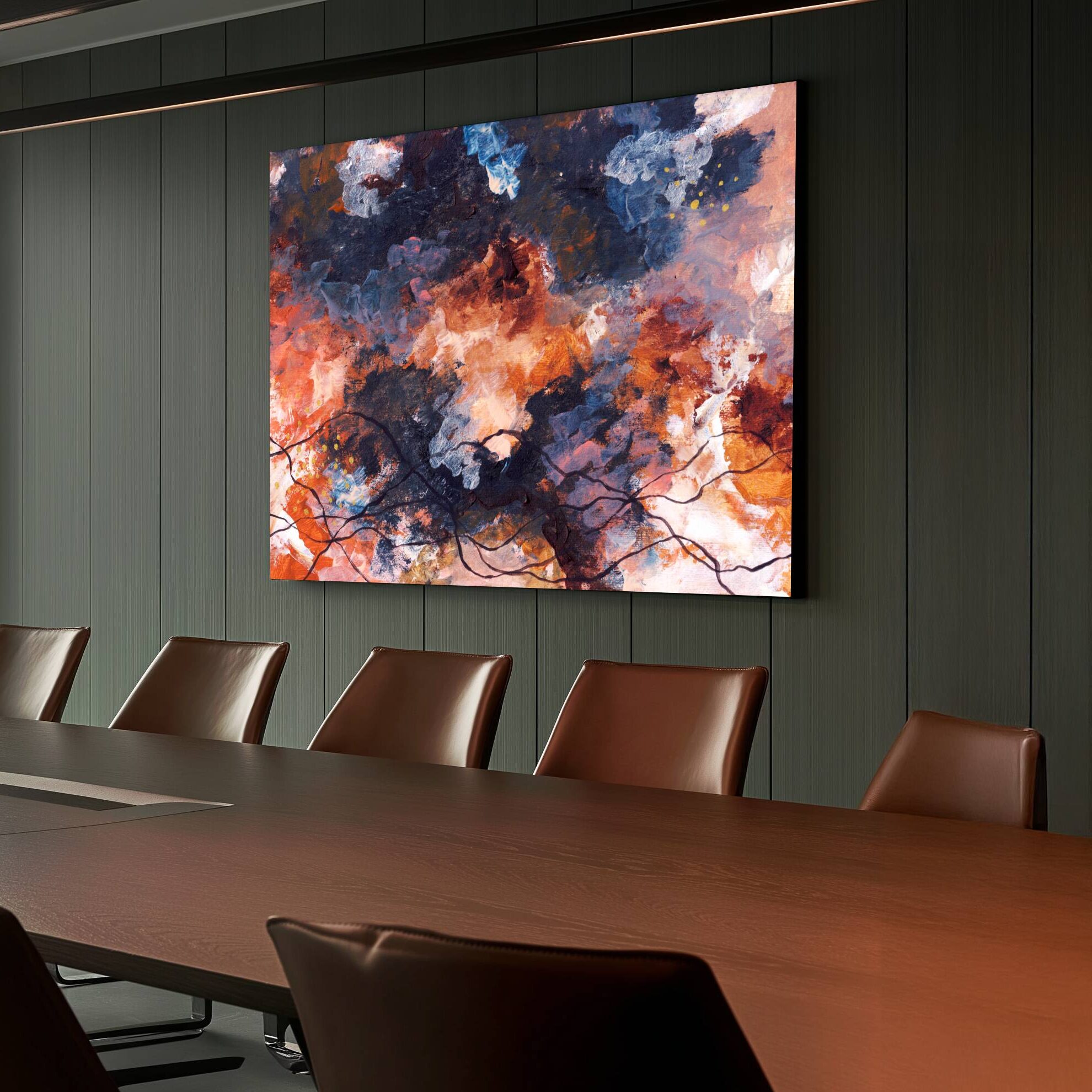
3. Meeting rooms
Warm, grounded tones reduce tension and help conversations stay collaborative.
4. Creative or breakout spaces
These can handle deeper or more expressive colours because the expectation in the room is different.
5. Quiet zones
Soft greens, muted neutrals, or deeper colours help people decompress and reset.
A small colour shift in these five areas can change the emotional climate of an entire workplace.
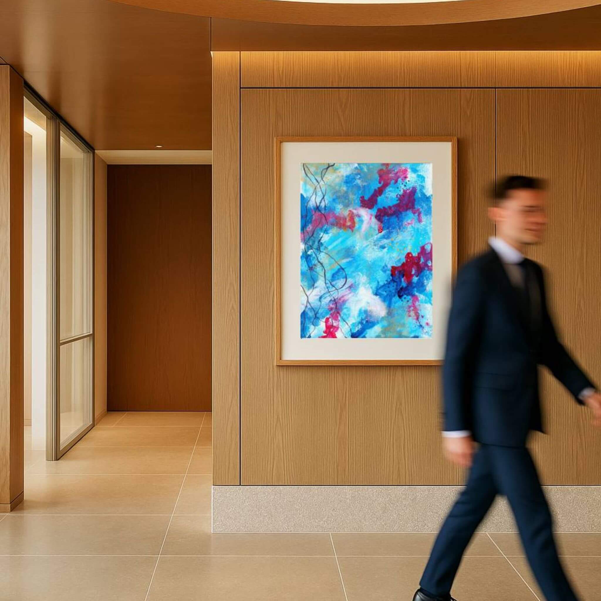
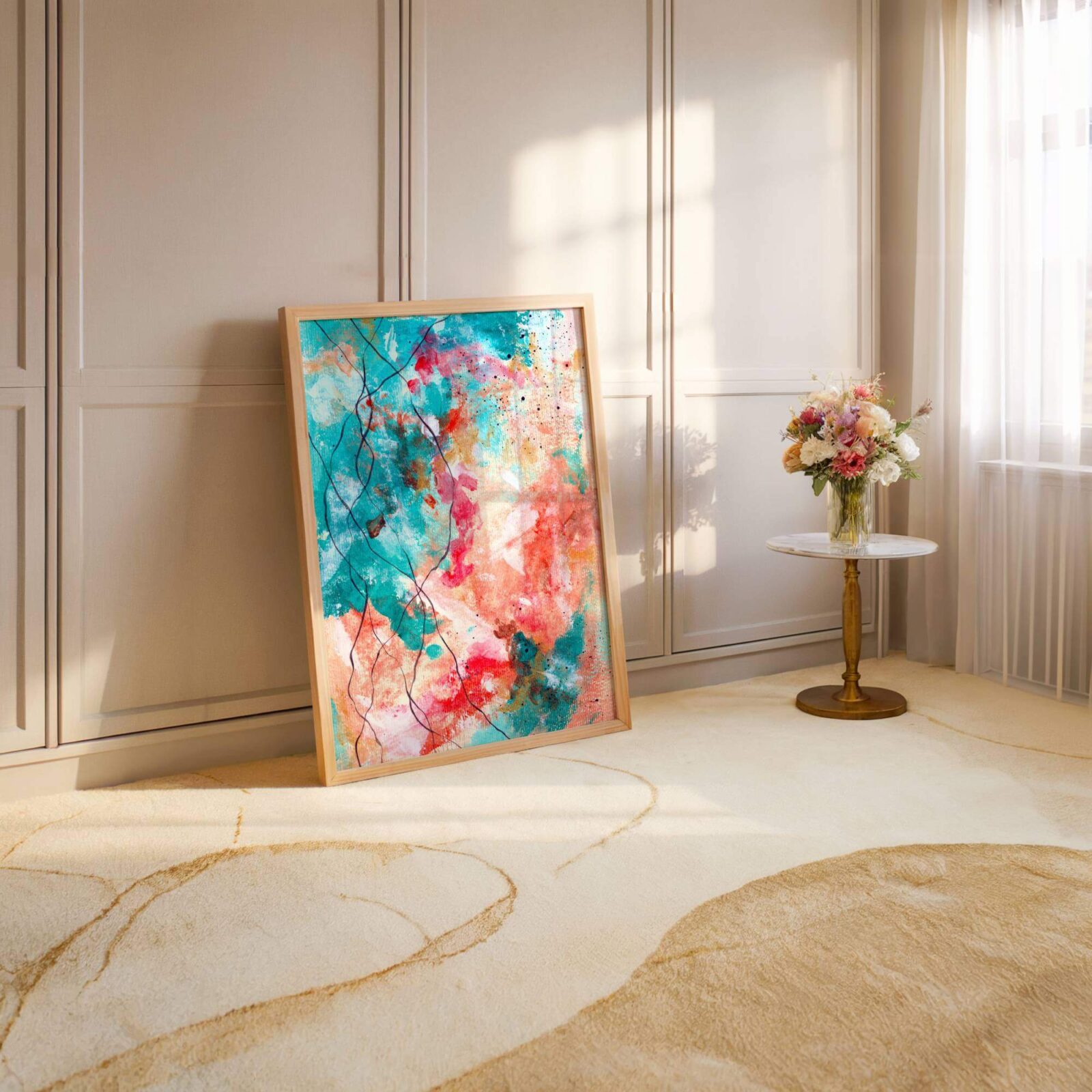
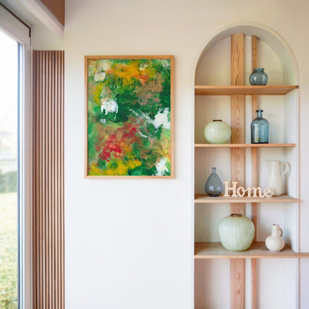
How Artwork Changes Mood Without Repainting Anything
This is where art becomes a practical tool, not a luxury item.
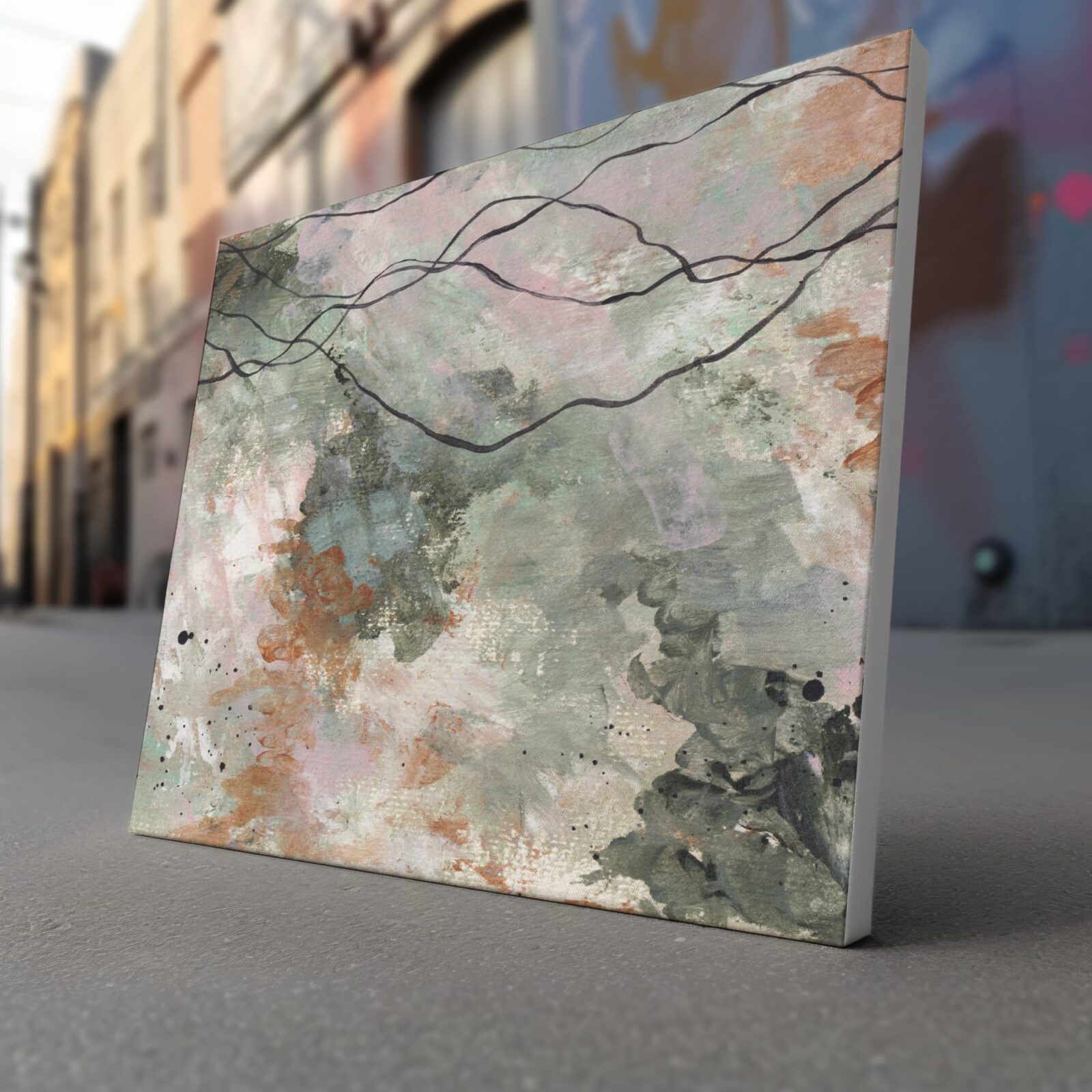
Colour in artwork behaves differently than colour on a wall. Paintings add depth, movement, and emotional tone in a way that flat paint never can. They give the eyes something to rest on. They create focal points that help regulate the nervous system.
Thoughtful abstract art can:
• break visual monotony
• soften tension
• anchor the space
• change the emotional temperature
• add warmth without repainting
• introduce clarity without feeling clinical
This is why companies often see a shift in atmosphere after introducing art, even if nothing else changes.
If you want to see the kind of work that transforms corporate and mindful spaces, you can explore my private catalogue here: The Collector’s Vault
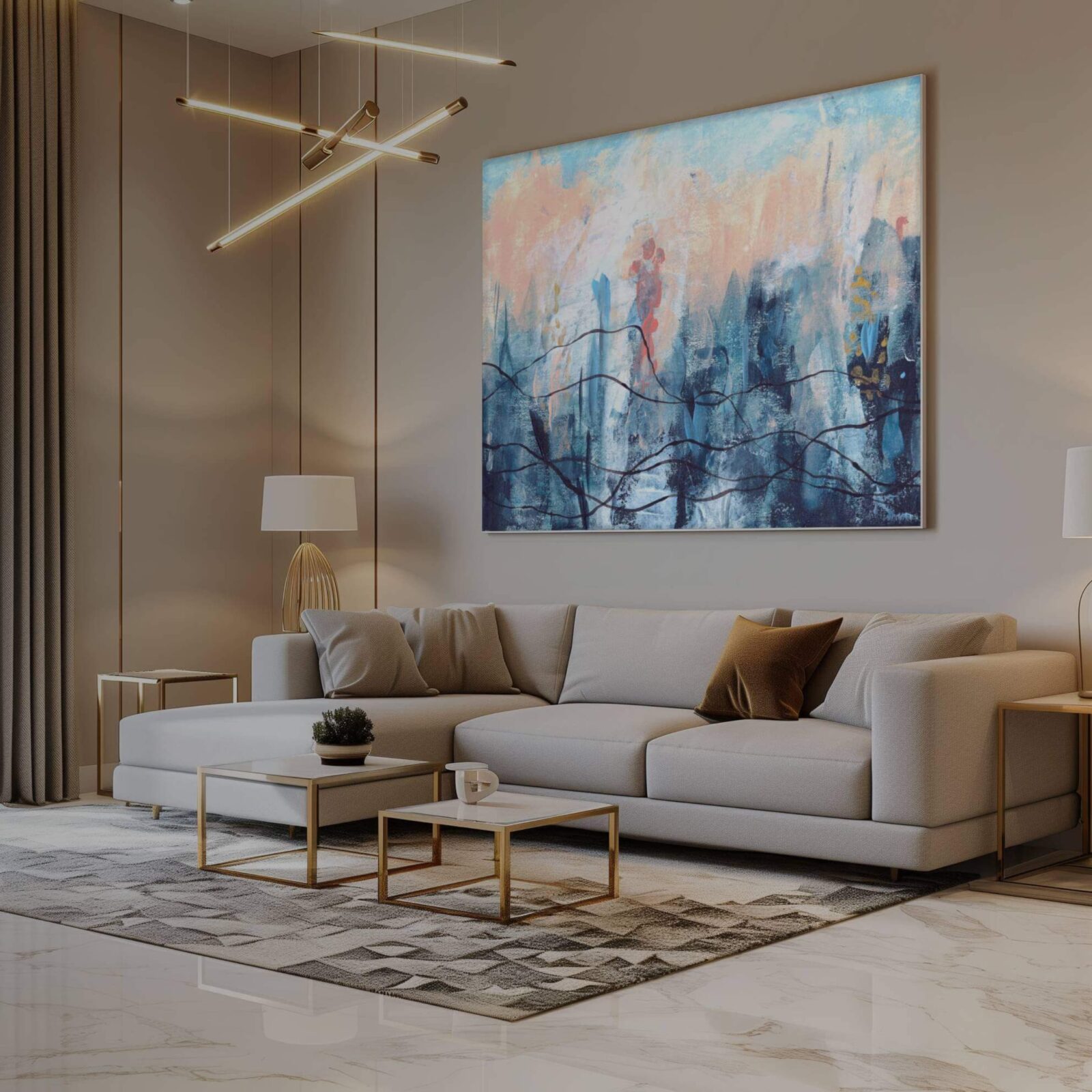
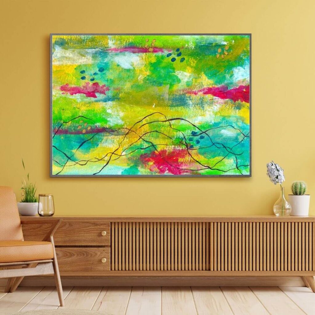
How Abstract Colour Works Inside a Work Environment
The colour language in abstract art affects mood differently because the viewer reads it as emotional texture rather than flat tone.
For example:
• deep blues support calm thinking
• earthy neutrals create safety and emotional grounding
• subtle contrast adds alertness without agitation
• layered textures create presence and depth
• warm palettes relax the nervous system
• cool palettes stabilise attention
Most workplaces do not need louder colours. They need colours with emotional intelligence.
The Real Question Companies Should Ask
It is not “which colour makes employees productive”. That question is outdated and reductive.
The better question is:
What do people feel when they step into this room, and what feeling would genuinely support the type of work they need to do here?
Colour shapes the emotional baseline of a space. When you shift the palette, you shift the behaviour it encourages. People communicate differently. They focus differently. They carry themselves differently.
Colour is a quiet but powerful form of behaviour design.
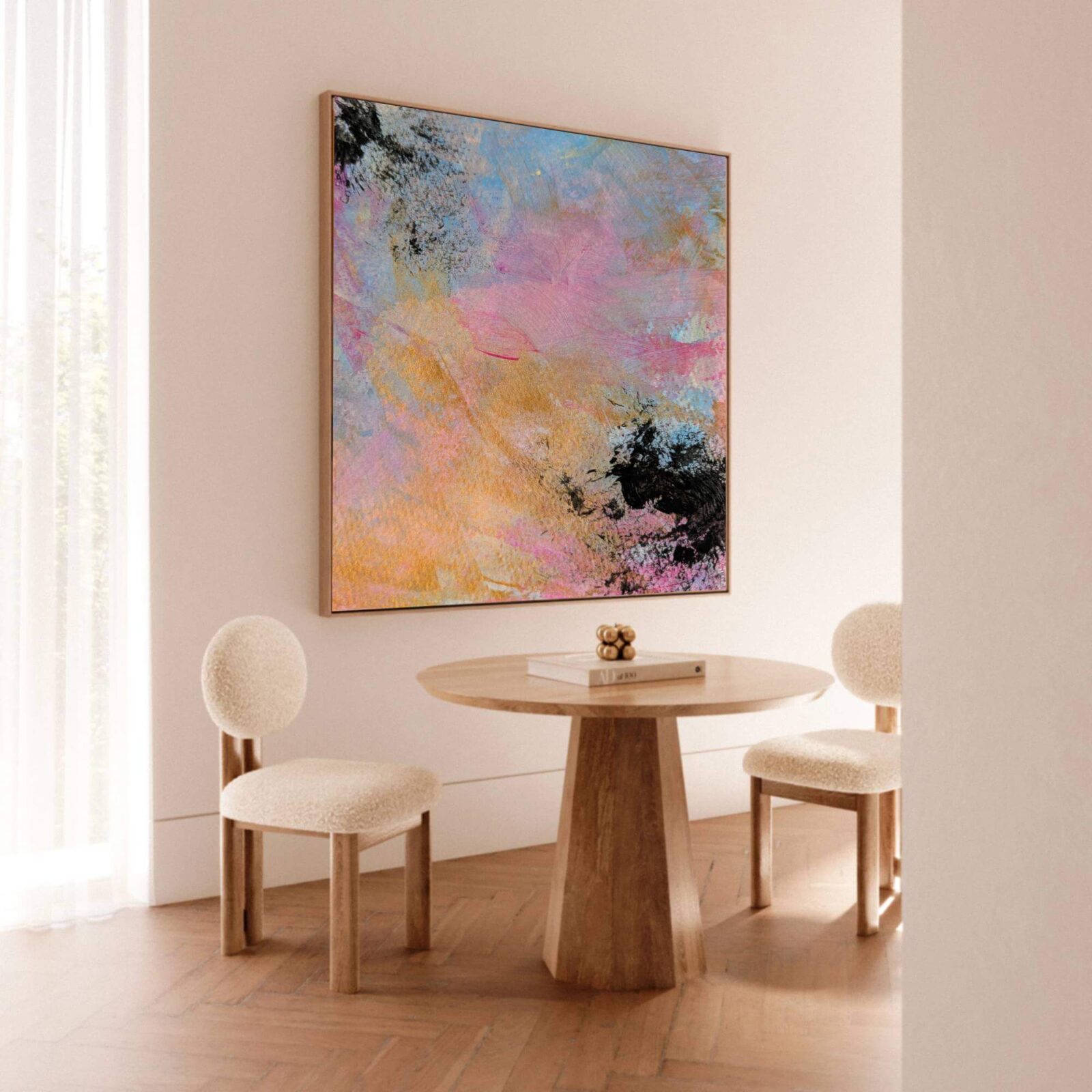
Understanding Colour Through Context, Not Rules
A colour does not work in isolation. Its impact depends on light, materials, furniture, layout, and the emotional expectations of the room.
A terracotta wall can feel grounding in natural light and suffocating under harsh LEDs. A deep green can feel thoughtful in a textured room and heavy in a stripped space.
This is why colour psychology advice online often falls apart. Humans do not respond to colour in absolute terms. They respond through their nervous system and lived experience.
This is where artwork becomes incredibly useful. It allows colour to sit inside context and movement rather than as a hard, flat decision.
A Practical Approach to Colour in Workspaces
If you remember one thing, make it this. Colour shapes emotional habit. Over time, the palette becomes part of the internal experience of working there.
A few simple principles help:
Warm tones create ease.
Cool tones create clarity.
Texture reduces stress.
Contrast adds energy.
Artwork creates emotional coherence.
When you combine these intentionally, the room begins to work for people instead of draining them.
Why This Matters for the Future of Work
The modern workplace asks people to manage constant cognitive load. Meetings, deadlines, multitasking, decision-making, and emotional labour all sit on top of each other. If the environment offers no support, workers burn out faster.
Colour is one of the most accessible ways to change how people feel at work. Not in a superficial way. In a nervous system way.
A workplace that pays attention to colour will always outperform one that treats it as an afterthought. Because employees are not machines. They are bodies in motion, navigating pressure, expectations, and uncertainty every day.
Support the body, and the mind follows. Support the space and the people inside it functions better.
If you want a grounded wellbeing programme that addresses the actual human side of workplace performance, not just the corporate buzzwords, you can explore my twelve-week movement and presence programme here: Sit Happens
Frequently Asked Questions
Colour hits your nervous system before your brain has time to narrate anything. Warm tones help people relax and actually talk to each other like humans. Cool tones help with focus and clear thinking. Harsh white makes everyone feel a bit on edge. Flat grey drains energy quietly in the background. It is less mystical and more “your body reacts because it has to.”
There is no magical productivity colour. Anyone selling that idea is trying too hard. What actually works is matching colour to the behaviour you want. Greens help people concentrate without feeling tense. Warm neutrals make conversations smoother. Deeper blues help people stay calm when their to-do list looks like a personal attack.
Yes. Bad colour choices create stress you only notice once you step outside and suddenly feel better. Warm neutrals lower tension. Balanced cool tones calm your mind. Overbright whites and cold greys can make people feel unsettled all day without knowing why.
Absolutely. Artwork does things paint cannot do. It adds depth, movement, texture, emotional tone, and a sense of presence. It softens harsh rooms and gives people a visual place to land. If you want to see the kind of art that works beautifully in mindful workplaces, you can look inside The Collector’s Vault:
https://vikithorbjorn.art/collectors-vault/
Meeting rooms need warmth and grounding. Think clay, soft brown, muted peach, warm beige, sage-based greens. These colours take the edge off discussions so people stop performing and start actually listening.
Muted greens, deeper navy, olive, slate blue, and desaturated teal. Nothing neon. Nothing shouty. The goal is clarity, not stimulation.
Great for quick bursts of energy. Terrible for long hours. Use them in creative or breakout areas, not where people are trying to think or regulate themselves through a stressful afternoon.
Mid-tone colours with a bit of softness. Warm neutrals, deep greens, smoky blues. Avoid bright white in small spaces because it creates visual glare and makes the room feel colder and more cramped.
Definitely. Colour influences emotional regulation, focus, mood, and how quickly people burn out. Good colour choices help the nervous system settle instead of constantly firefighting the environment.
Start with artwork, lighting tone, and the colour of the first wall people see when they walk in. These areas shift the whole atmosphere. A few well-placed abstract pieces can stabilise the emotional tone of the room faster than a full renovation.
Yes. Your nervous system does not care whether you are in an office or at home. Warm tones help you stay settled. Cool tones help you think. Artwork gives your eyes a place to rest when your brain feels fried from Zoom.
Warm colours soften communication. Cool colours support clarity. Harsh whites and stark contrasts increase tension, even if everyone pretends they are fine.
The wall people face as they walk in. It sets the mood for the entire space, but it is usually the last thing anyone considers.
Yes. Wellbeing programs land better when the environment helps people stay regulated. Colour does half the emotional labour in a room. If you want a workplace wellbeing program built around presence, movement, and real human behaviour, not corporate wallpaper language, you can look at Sit Happens: https://vikithorbjorn.art/sit-happens/