
How Colour in Abstract Art Changes the Feeling of a Room
TL;DR
Colour in abstract art changes the feeling of a room because colour affects atmosphere before the mind has time to explain it.
A blue painting can make a space feel cooler, quieter or more spacious. A red or orange piece can bring warmth, energy or intensity. Soft neutrals can create calm, but they can also feel flat if the work has no depth. Darker tones can add intimacy, weight and drama. Bright colour can lift a room, but it needs enough sophistication not to look like the wall has been attacked by a children’s party.
The point is not to choose art by colour alone.
The point is to understand how colour behaves in a room, how it works with light, scale, furniture, mood and emotional tone, and how it changes the way the space feels.
If you are choosing abstract art for a considered home, colour matters. But it should serve the work, not reduce the artwork to a matching accessory.
For a broader guide to choosing serious canvas work, start with the Collector-Grade Canvas Art Guide.
Definition: what does colour in abstract art do?
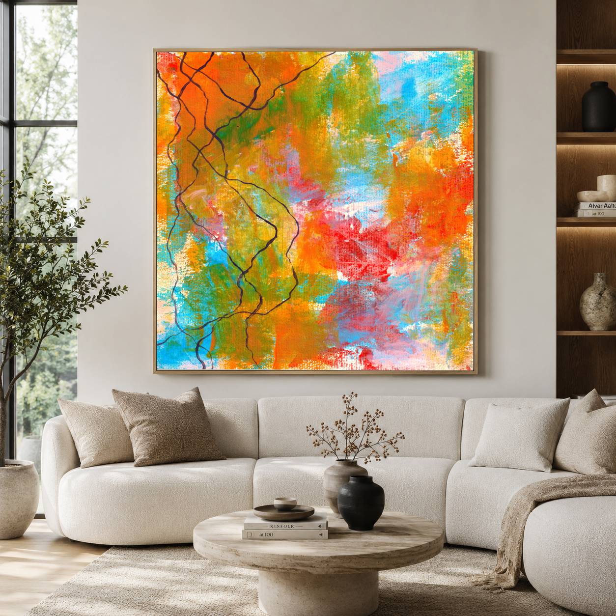
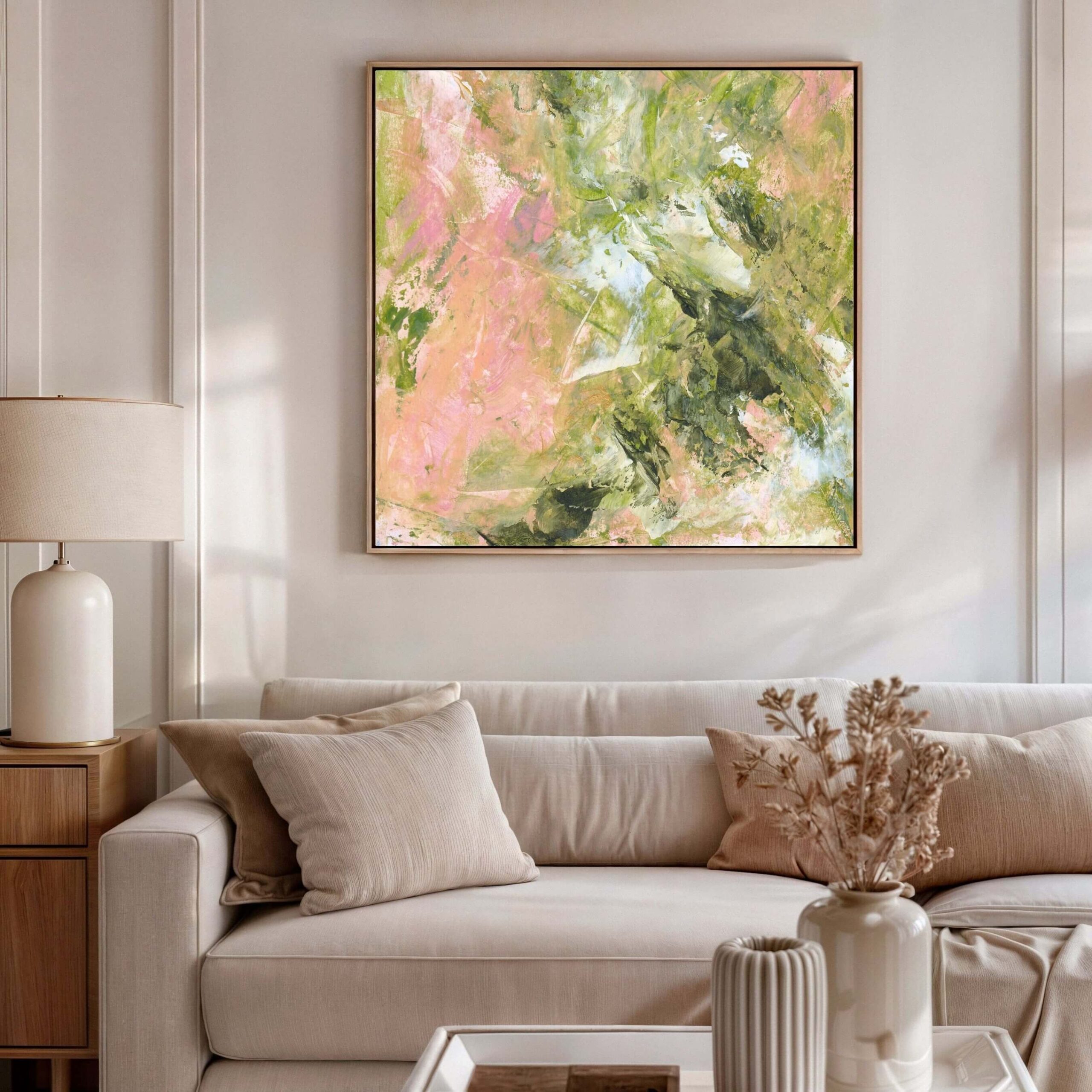
Colour in abstract art affects the atmosphere, mood and emotional presence of a room. Because abstract art does not rely on recognisable subject matter, colour often becomes one of the main ways the work communicates. It can create calm, energy, warmth, depth, tension, softness or intimacy depending on the palette, scale, contrast, light and placement.
Why colour matters more in abstract art
Colour matters in all art, obviously. We are not discovering fire here.
But colour often matters even more in abstract art because abstract work does not usually tell the viewer what to think through obvious subject matter. There may be no landscape, figure, still life, face, animal, boat, dramatic sky or emotionally burdened woman looking out of a window. The colour has to carry more of the feeling.
That is part of why abstract art can work so powerfully in interiors. It does not simply show you something. It changes the atmosphere.
A large abstract canvas can shift a room before anyone has consciously analysed the image. The colour reaches the body first. You feel the coolness, warmth, softness, tension, depth or brightness before you start thinking, “Ah yes, this piece uses a muted ochre against a layered blue ground, how intellectually satisfying.”
Most people do not experience art like that in their own home.
They experience it while walking into a room. While making coffee. While sitting down after work. While hosting friends. While avoiding the laundry pile with impressive commitment. The artwork becomes part of daily life, and colour becomes part of how that room holds them.
That is why colour in abstract art should not be treated as a decorative afterthought.
It is not just about matching. It is about feeling.
If you are choosing canvas art for your own home, the practical buying guide here may also help: How to Buy Canvas Art.
Decision box: what feeling do you want the room to have?
| If you want the room to feel… | Colours that may support this | What to watch for |
|---|---|---|
|
Calm |
Soft blues, muted greens, warm neutrals, pale greys |
Too much softness can become bland |
|
Warm |
Ochre, terracotta, rust, warm pink, soft orange, earthy brown |
Too much warmth can feel heavy or overstimulating |
|
Spacious |
Pale blues, off-whites, soft greys, light neutrals |
Very pale work can disappear if it lacks depth |
|
Grounded |
Deep greens, charcoal, brown, navy, earthy tones |
Dark work needs enough light and space around it |
|
Energised |
Red, orange, yellow, bright pink, vivid blue |
Bright colour needs balance or it can dominate |
|
Intimate |
Deep blue, burgundy, dark green, warm brown, muted plum |
Dark colour can shrink a room if badly placed |
|
Elegant |
Layered neutrals, black, ivory, taupe, muted metallic tones |
Neutral does not automatically mean sophisticated |
|
Joyful |
Clear colour, warm contrast, lively combinations |
Joyful should not mean visually chaotic |
|
Restorative |
Soft greens, blues, mineral tones, warm whites |
Avoid anything too clinical or cold |
|
Dramatic |
High contrast, dark tones, saturated colour |
Drama needs intention, not just volume |
Colour changes the emotional temperature of a room
Every room has an emotional temperature.
Some rooms feel cool and quiet. Some feel warm and full. Some feel sharp. Some feel heavy. Some feel flat. Some feel like nobody has ever had a proper conversation in them, which is always slightly concerning.
Colour plays a huge role in that.
A room with pale walls, light furniture and soft natural textures may already feel calm, but it can also risk feeling thin or unfinished. A deep abstract artwork can bring weight and emotional depth. A room with dark furniture and strong architectural lines may need something lighter, softer or more spacious to stop it feeling too dense. A neutral room may need colour not because it lacks taste, but because it lacks pulse.
This is where abstract art becomes useful.
Because abstract colour does not have to explain itself through subject matter. It can simply alter the emotional charge of the room. It can make a quiet space feel more alive. It can make a busy space feel more settled. It can bring warmth into a cool interior or calm into a visually restless one.
The mistake is thinking colour only has one job.
Blue is not always calm. Red is not always aggressive. Yellow is not always cheerful. Green is not always restorative. Beige is not always elegant, despite what several interiors accounts and one thousand boucle chairs would like us to believe.
Colour depends on context.
A soft blue in a bright room can feel spacious and calm. A deep blue in a dim room can feel intimate and almost nocturnal. A pale neutral abstract with rich texture can feel refined. A pale neutral abstract with no depth can feel like someone forgot to finish the room.
Colour changes with scale, light, material, surrounding tones and the emotional language of the artwork itself. That is why choosing abstract art by colour alone is risky.
The question is not, “What colour do I like?” The better question is, “What does this colour do in this room?”
Abstract art does not need to match the sofa
This needs saying because people still get trapped here. Abstract art does not need to match the sofa.
It can relate to the sofa. It can echo a tone. It can pick up a colour already present in the room. It can create harmony with the palette. But if the whole decision is “the cushions are green, so the art must be green,” the artwork has been demoted before it even reaches the wall.
That is how art becomes décor.
Not because it is in a home. Art belongs in homes. But because it has been chosen only to behave.
The strongest abstract art often works because it does not match too neatly. It may bring contrast. It may introduce a colour that gives the room more life. It may deepen an existing palette rather than repeat it. It may create tension, and tension is not always bad. Sometimes tension is exactly what stops a room looking like a showroom where nobody is allowed to sit down.
Matching can be useful, but resonance is better. Matching asks, “Does this go?” Resonance asks, “Does this belong?”
That is a different standard.
A piece can match perfectly and still feel dead. A piece can contrast slightly and make the whole room come alive. The trick is to choose a colour that feels connected to the space without becoming obedient to it.
If you are choosing serious canvas work rather than decorative filler, this distinction matters. You can read more about that here: Collector-Grade Canvas Art Guide.
Calm colour is not always pale colour
People often assume that calm interiors need pale art. Soft whites. Pale greys. Gentle blues. Muted beige. A whisper of sage. Something so quiet it may need a small microphone.
Those colours can absolutely create calm, but calm is not the same as pale.
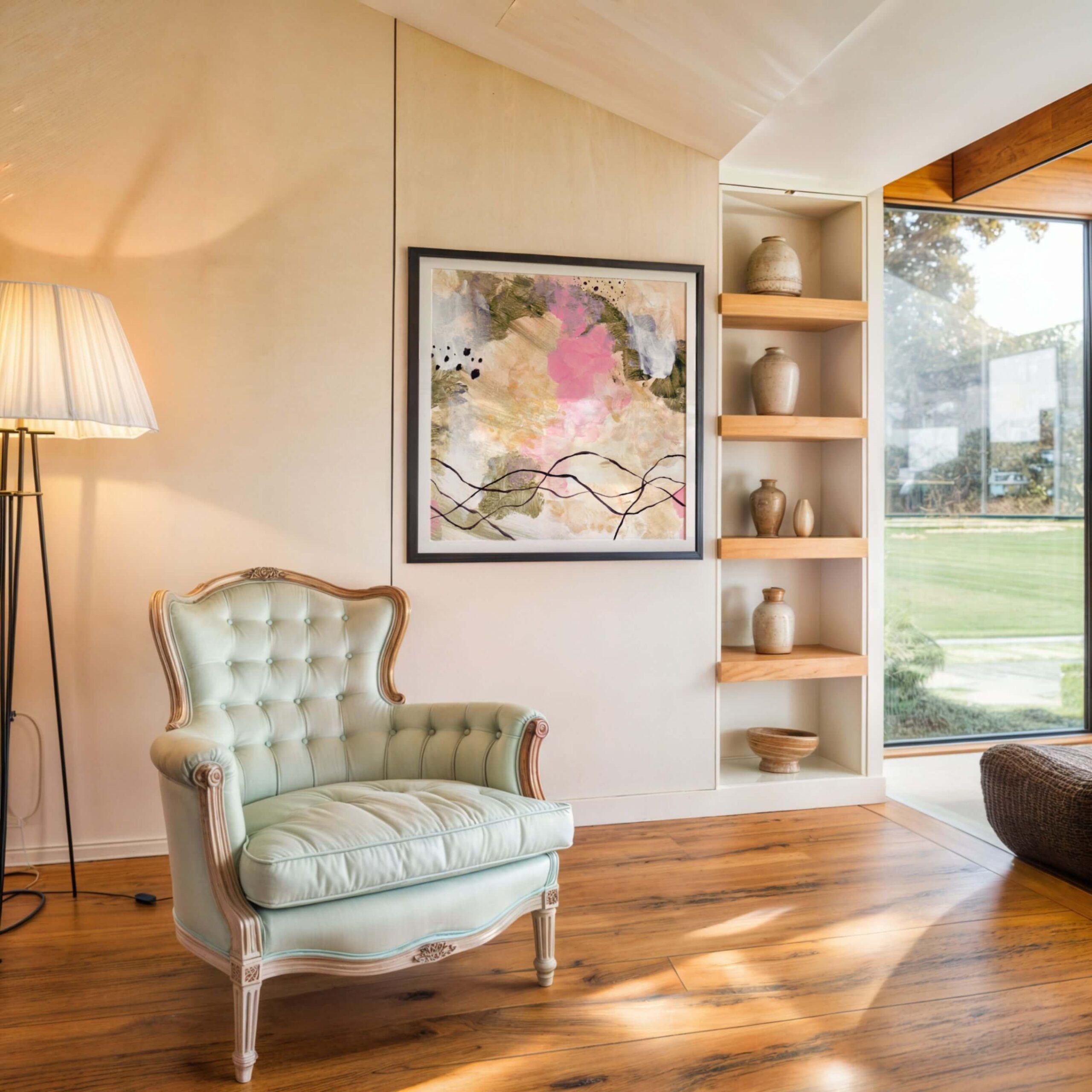
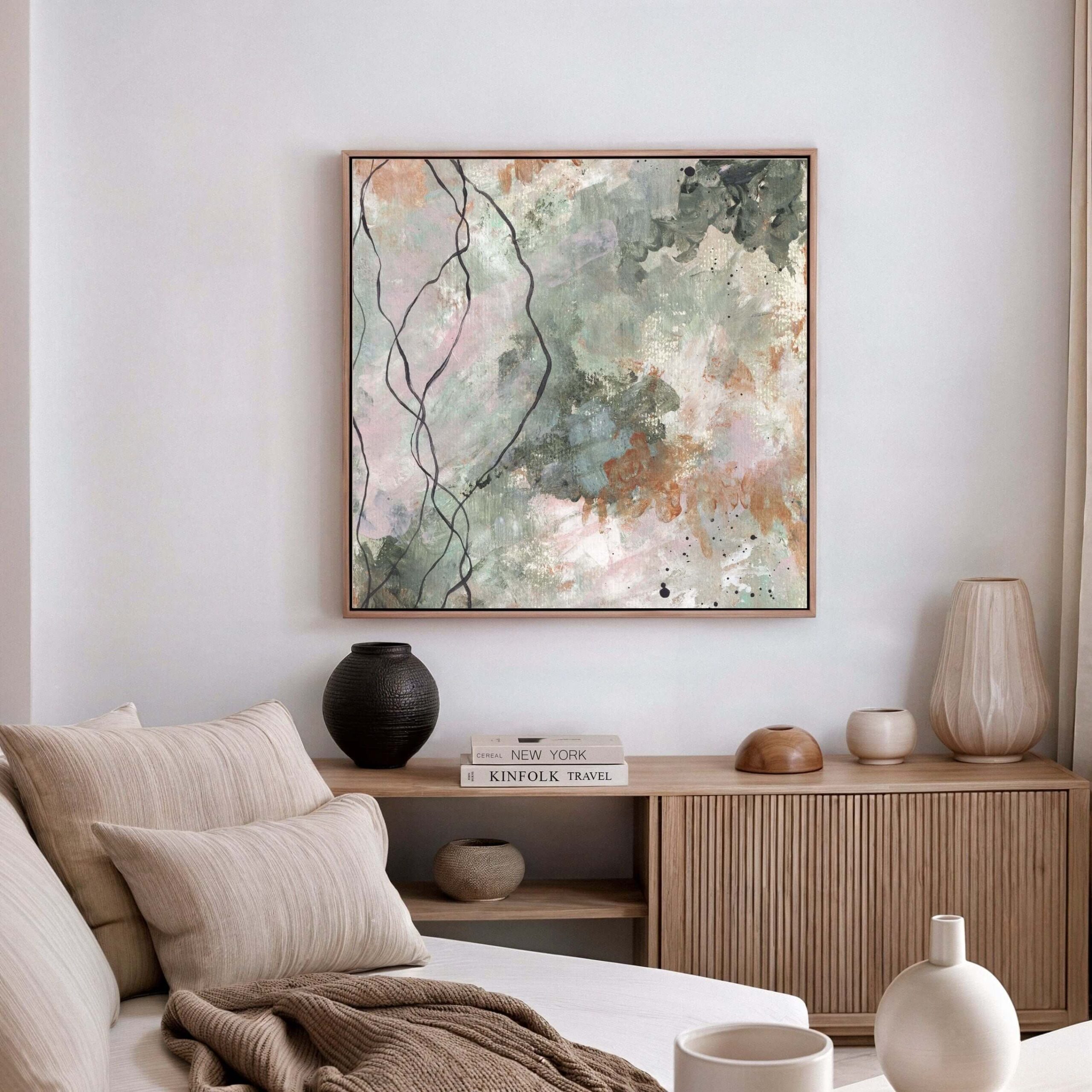
A deep blue artwork can feel calm. A dark green canvas can feel grounding. A warm earthy abstract can feel restful. A charcoal piece can feel still and protective. A layered neutral work can feel quiet because of its depth, not because it is pale.
Calm comes from a relationship.
It comes from how the colours sit together. How much contrast there is. How the surface moves. Whether the composition feels balanced or agitated. Whether the tones are soft, harsh, muddy, luminous, warm, cool, flat, layered or alive.
A pale artwork with too much visual noise may feel less calming than a darker piece with a strong, steady presence.
This matters for homes because many people want calm, but they do not necessarily want bland.
A calm room should still feel alive. It should not feel like the emotional equivalent of oat milk in a waiting room.
Abstract art can bring calm without draining the room of personality. It can soften the space, slow the eye and create breathing room, while still holding enough depth to matter.
That is the difference between calm and empty.
Warm colours can make a room feel held
Warm colours bring the room closer.
Ochre, terracotta, rust, soft orange, warm pink, clay, brown, muted red and golden tones can make a space feel more intimate, human and grounded. They can be especially powerful in rooms that feel too cool, too grey, too minimal or too architecturally sharp.
Warm abstract art can make a modern interior feel less sterile.
It can bring the sense that someone actually lives there, rather than just occasionally enters to admire the joinery.
But warm colour needs care.
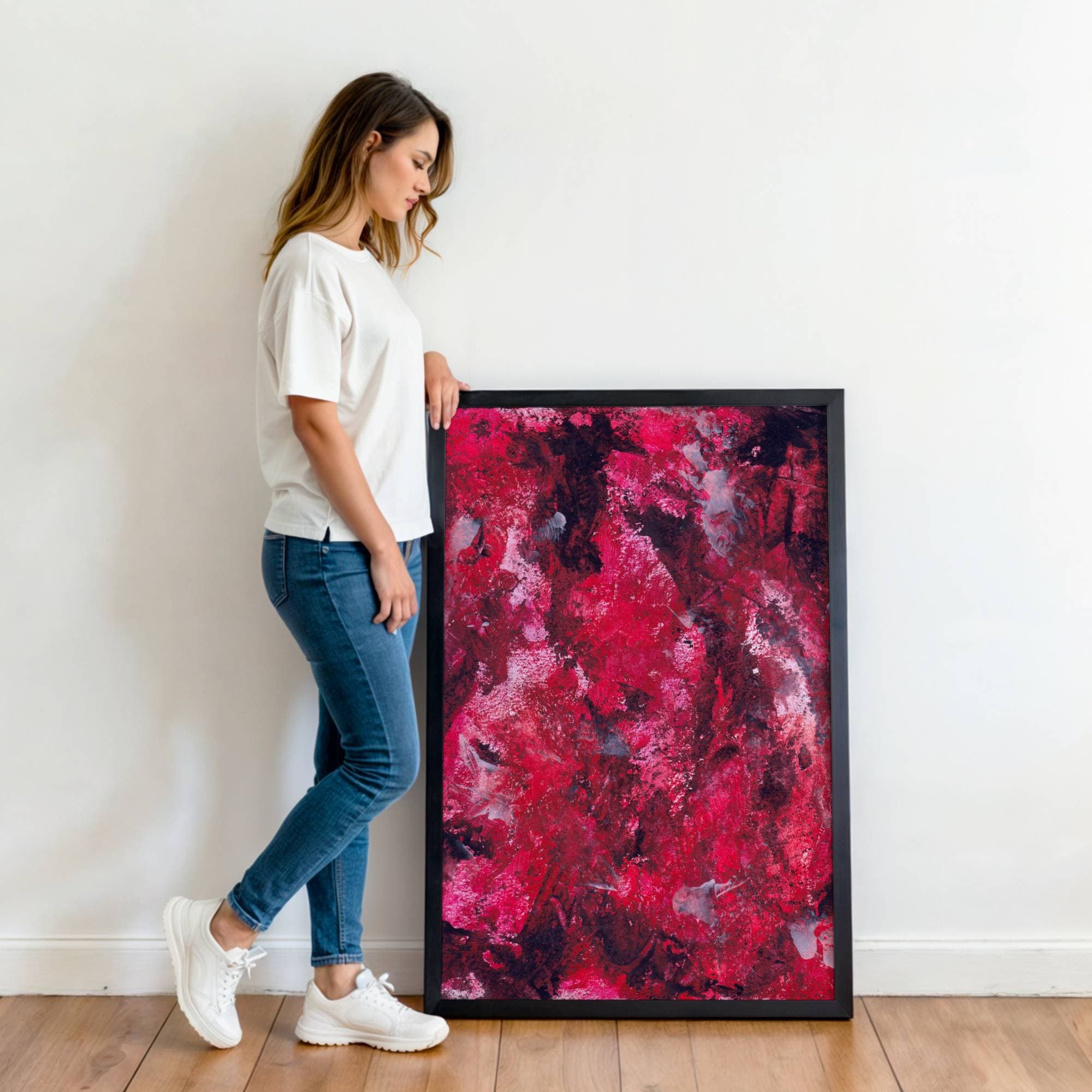
Too much saturation can overwhelm. Too much orange can feel restless. Too much red can dominate. Too much brown without light or contrast can feel heavy. Warm colour works best when it has balance, depth and enough space to breathe.
A warm abstract canvas can be beautiful in a living room, dining room, hallway or bedroom, but the emotional tone matters. Is the warmth soft and grounding? Rich and dramatic? Joyful and energising? Earthy and quiet? Intense and physical?
Those are different experiences.
A rust and ochre piece may make a room feel rooted and mature. A bright orange and pink piece may make it feel playful and energised. A deep red work may feel intimate, powerful or slightly too much if the room is small and already full of visual weight.
Warmth is not one thing. It can comfort or overstimulate.
The room will tell you which one is happening, if you actually pay attention instead of trying to force a Pinterest board into reality.
Cool colours can create space, quiet and distance
Cool colours often create a sense of space. Blue, green, grey, soft violet, mineral tones and cooler whites can make a room feel quieter, more open or more reflective. They can be especially effective in bedrooms, reading spaces, offices, treatment rooms, calm living rooms and interiors where the aim is restoration rather than stimulation.
But cool colour is not automatically peaceful.
A sharp blue can feel cold. A grey abstract can feel elegant or miserable depending on the tone, texture and surrounding light. A green can feel natural and restorative, or strangely flat if it has no depth. A cool white can feel spacious or clinical.
Again, context is everything.
Cool abstract art often works well when the room already has warmth elsewhere. Natural wood, textured fabrics, warm lighting, soft rugs, books, ceramics and human mess all help cool colour feel restful rather than sterile.
This is particularly important in modern interiors, where there can already be a lot of hard surfaces, pale walls, clean lines and controlled palettes. A cool abstract artwork can be beautiful there, but it needs enough emotional warmth in the work itself, or enough warmth in the room, to avoid creating a space that feels like nobody is allowed to exhale.
Cool colour can give a room breath. Just make sure it does not remove the blood.
Dark colour brings depth and intimacy
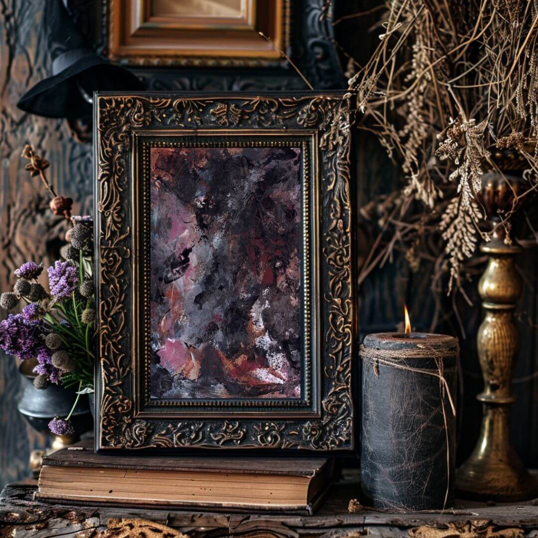
Dark abstract art can be incredibly powerful in a room. Deep blue, black, charcoal, forest green, burgundy, plum, umber and dark layered tones can bring intimacy, weight and emotional seriousness. They can make a room feel grounded. They can create a focal point. They can give a pale interior more depth. They can stop a large wall from feeling empty and unresolved. Dark art can also make a room feel more luxurious, but only when the work has depth.
A flat dark print can look heavy and lifeless. A layered dark abstract can feel rich, atmospheric and quietly magnetic.
The difference is surface, tone, variation and presence.
Dark colour needs light around it. It needs enough space to breathe. It needs placement that allows the work to hold the room rather than sink into it. In a small, poorly lit space, a very dark artwork may feel too heavy unless that intimacy is intentional.
But in the right setting, dark abstract art can be extraordinary.
It can make a room feel collected rather than decorated. It can bring emotional gravity. It can make pale furniture, warm lighting and natural materials feel more sophisticated. It can create the kind of quiet drama that does not need to announce itself every five seconds.
Not all calm rooms need pale art. Sometimes the calmest thing in the room is the deepest colour.
Bright colour needs confidence and restraint
Bright colour can change a room instantly.
A vivid abstract painting can lift the energy of a space, create a focal point, bring joy, add confidence and stop a room from feeling too safe. Bright colour can be especially useful in neutral interiors that need life, children’s spaces that still want sophistication, creative studios, social rooms, entrance areas or anywhere the room needs more pulse.
But bright colour has to be handled well. Otherwise, it can feel cheap, chaotic or exhausting.
This is where abstract art quality matters. Bright colour needs composition. It needs balance. It needs enough depth to avoid looking like a decorative splash. It needs contrast, rhythm and control. The difference between joyful and visually aggressive is not always a large one.
A bright abstract artwork should not just shout. It should sing, hold, pulse, lift, or energise. If it only shouts, you will get tired of it.
Bright colour also changes depending on scale. A small bright piece can feel like an accent. A large bright canvas can become the dominant emotional force in the room. That can be brilliant if the room needs energy, but overwhelming if the rest of the space is already visually busy.
This is why bright abstract art works best when chosen with honesty.
Do you want the room to feel more alive? Or are you trying to prove you are not boring? Those are different purchases. The second one usually ends badly and involves regret near a sideboard.
Neutral colour is not automatically sophisticated
Neutral abstract art can be beautiful.
Layered whites, taupes, creams, greys, soft browns, black, ivory, stone and mineral tones can create calm, elegance and quiet depth. Neutral art can work beautifully in luxury interiors, minimal spaces, bedrooms, offices and rooms where the aim is subtle presence rather than obvious colour. But neutral does not automatically mean sophisticated. Sometimes neutral art is just beige doing very little.
A strong neutral abstract needs texture, depth, tone, movement, proportion and authorship. Without those, it becomes filler. It may match the room, but it will not change the room.
This is one of the biggest traps in interiors.
People choose neutral art because they want calm, but end up with blandness. They choose something safe, but the room still feels unfinished. They avoid colour because they do not want to make a mistake, but the bigger mistake is choosing work with no presence.
Neutral abstract art should still have a pulse. It can be quiet, but it should not be dead.
The best neutral work often reveals itself slowly. It changes with light. It has subtle tonal shifts. It brings softness, depth or structure. It creates atmosphere without demanding attention.
That is very different from a mass-produced beige print whose main contribution is “not offending the curtains.”
If you want to understand this distinction more clearly, the article on collector-grade canvas art versus decorative wall art should link naturally here once published.
Colour behaves differently at large scale
A colour that feels gentle in a small piece can become powerful at large scale. A colour that feels exciting in a thumbnail can become exhausting across a large wall. This is why scale matters so much when choosing abstract canvas art.
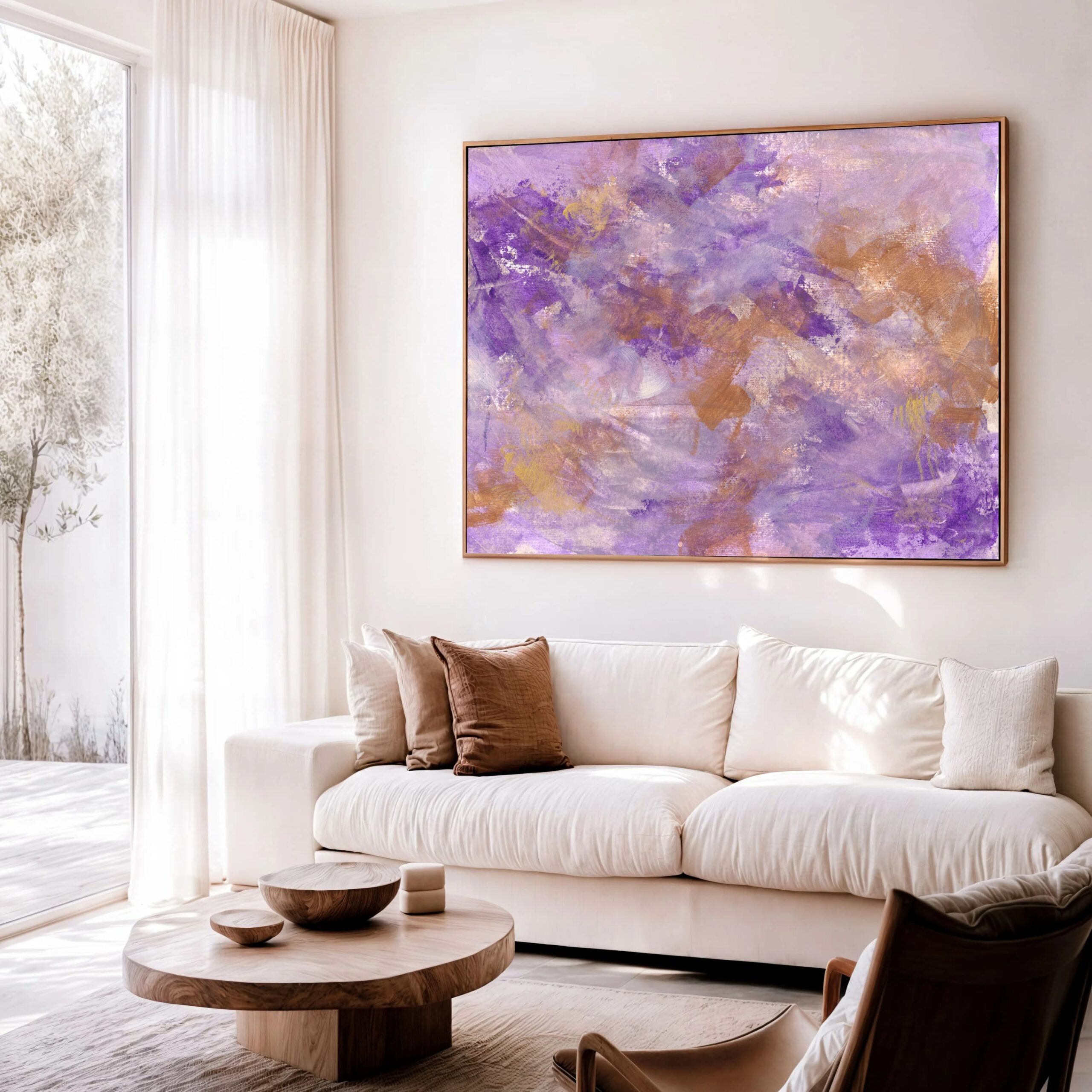
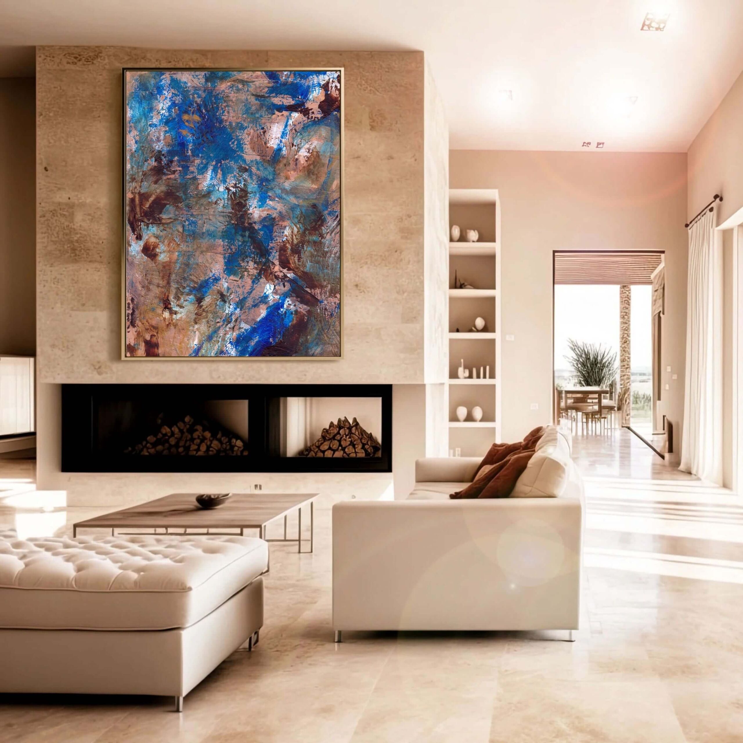
Large canvas prints have a physical presence. They do not just add colour. They change the balance of the room. A large blue work can cool and open a space. A large dark piece can anchor it. A large warm abstract can make the room feel more intimate. A large bright piece can dominate everything around it. That is not bad. It just needs intention.
When choosing large abstract art, ask what the colour will do when it becomes part of your daily visual environment. Will it support the room or overwhelm it? Will it still feel good in different light? Will it work in morning, evening, winter, summer, natural light and artificial light? Will it still feel right when you are tired?
That last question is underrated.
Some colours are exciting in the moment but tiring to live with. Others feel quiet at first but become deeply satisfying over time. Large art asks for a longer view.
If you are considering scale, this article should internally link to your piece on large canvas prints once it is live: Why Large Canvas Prints Work So Well in Modern Interiors.
Light changes everything
Colour does not exist in isolation. It changes with light. Natural light, artificial light, warm bulbs, cool bulbs, north-facing rooms, south-facing rooms, shadows, reflections, time of day and season all affect how colour in abstract art feels.
A painting that looks soft and luminous in daylight may feel darker and more dramatic at night. A warm artwork may glow under warm lighting, or become too heavy if the room is already dim. A cool piece may feel beautifully spacious in a bright room, but cold in a room with poor natural light.
This is why online images only tell part of the story.
They can show the artwork, but they cannot fully show how it will live in your room.
When choosing abstract art, think about where it will hang and when you will see it most. Is it a morning room? An evening room? A room used for rest? Work? Hosting? Reading? Recovery? Is the light bright and direct, soft and indirect, or mostly artificial?
Colour is not fixed.
It performs differently depending on where it is placed.
This is also why collector-grade canvas art benefits from slower looking. A quick purchase based only on a screen image can work, but a more considered process gives you a better chance of choosing colour that will actually feel right in the space.
You can explore available works and request private catalogue access here: Request the Private Catalogue.
Colour can make a room feel bigger or smaller
Colour affects perceived space.
Lighter, cooler colours often make a room feel more open. Darker, warmer colours can make it feel more intimate. High contrast can make a wall feel more active. Low contrast can make the room feel softer and quieter.
But this is not a simple rulebook.
A large pale artwork with no depth can make a room feel blank rather than spacious. A dark artwork in the right place can make a room feel grounded rather than small. A warm piece can make a large room feel welcoming. A cool piece can give a small room more breath.
The emotional effect matters more than the theory.
If a room feels too empty, a deeper or warmer artwork may help. If a room feels too cramped, a lighter or more spacious composition may help. If a room feels too cold, colour can bring warmth. If a room feels too busy, a calmer palette can give the eye somewhere to rest.
This is where abstract art becomes more than decoration. It becomes a spatial tool.
Not in a sterile interior-design way, but in a very real, lived way. The artwork changes how the room feels to enter, sit in, move through and return to.
That is why colour choice deserves more than “this one matches the rug.” The rug will cope.
Colour can create a focal point without shouting
A focal point does not have to be loud. Sometimes the strongest focal point in a room is not the brightest object. It is the piece with the most presence.
Colour helps create that presence, but it does not have to dominate. A deep, quiet artwork can hold a room more powerfully than a bright one. A soft but layered canvas can draw the eye because it has depth. A restrained palette can feel magnetic if the composition is strong.
This matters because many people think art has to “pop.”
Pop is fine for balloons, cereal packaging and the occasional shoe. Art does not always need to pop. Sometimes it needs to settle. Anchor. Hold. Interrupt. Warm. Deepen. Balance.
The question is not whether the art stands out. The question is whether the room feels better because it is there.
A focal point should give the room coherence. It should help the eye land. It should create a sense of arrival. It should make the space feel more resolved.
If the artwork is only shouting for attention, it may become tiring. If it has presence, it can hold attention without demanding it.
That is the difference.
Colour and emotion are personal
Colour psychology can be useful, but it is not absolute.
Blue may feel calming to one person and cold to another. Red may feel energising to one person and aggressive to another. Yellow may feel joyful to one person and visually irritating to someone who has simply had enough. Green may feel restorative, or it may remind someone of a school corridor from 1997. The body remembers weird things.
This is why personal response matters.
You can read all the colour theory you like, but if a piece makes you feel tense, it is not the right calming artwork for you. If a dark painting makes you feel held rather than heavy, that matters. If a bright work makes you feel alive rather than overstimulated, that matters too.
The emotional impact of art is not only theoretical. It is relational. It depends on the person, the room, the light, the scale, the memories, the mood, and the life being lived around it.
This is especially true with abstract art because the viewer brings more of themselves to the work. Without obvious subject matter, colour and form can open space for personal interpretation. That is part of its power.
The right abstract artwork does not tell you exactly what to feel. It gives you somewhere to feel from.
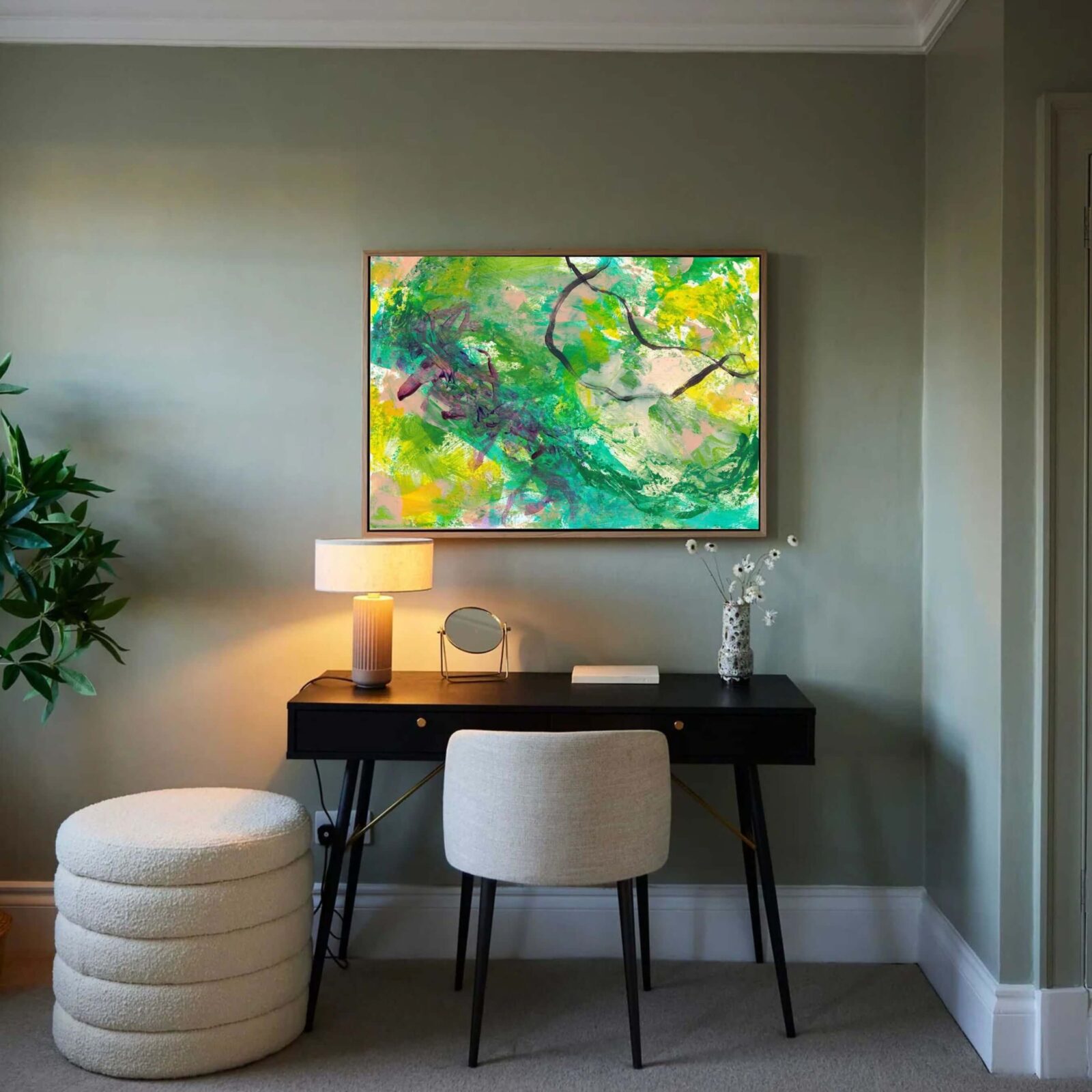
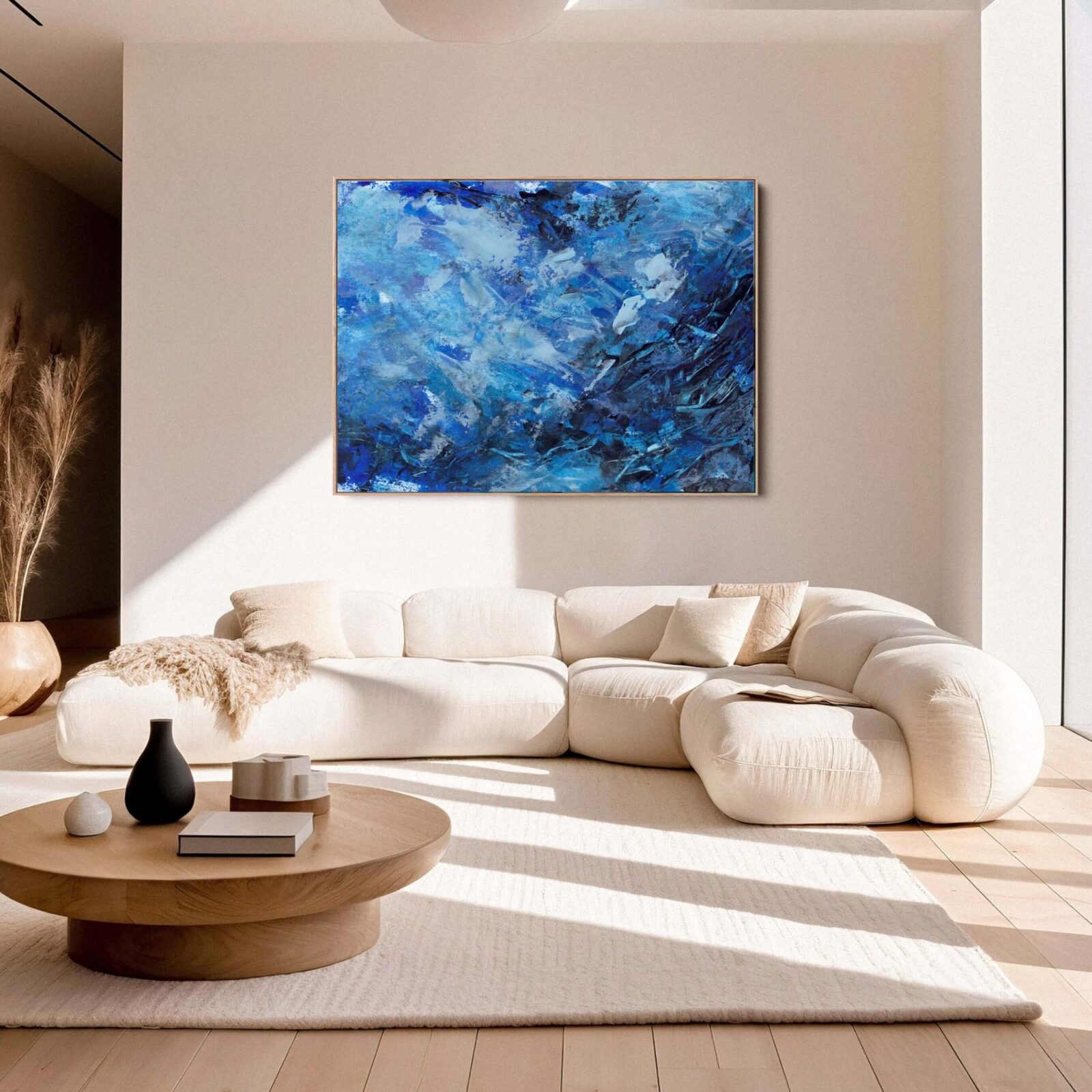
How to choose colour in abstract art for your home
Start with the room, but do not end there.
Look at the space honestly. What does it already feel like? Calm? Cold? Busy? Flat? Heavy? Empty? Polished but slightly soulless? Warm but cluttered? Beautiful but missing something?
Then ask what the artwork needs to bring. Not just what colour it should be.
What feeling.
Does the room need warmth? Depth? Calm? Energy? Softness? Contrast? Grounding? A focal point? A sense of intimacy? A little more life?
Once you know that, colour becomes easier to judge.
You are not just choosing blue because blue is nice. You are choosing a layered blue because the room needs space and quiet. You are not choosing rust because it matches a cushion. You are choosing warmth because the room feels too cool. You are not choosing a dark piece because it looks dramatic online. You are choosing depth because the room needs anchoring.
That is a much better way to buy art. It respects both the room and the work.
For a practical buying framework, use How to Buy Canvas Art.
Comparison table: how colour changes a room
| Colour family | Possible room effect | Best used when… | Be careful if… |
|---|---|---|---|
|
Soft blue |
To fill, finish, or decorate a space |
Calm, spacious, reflective |
The room already feels cold |
|
Deep blue |
Intimate, grounded, contemplative |
The room needs depth |
The room has poor light |
|
Green |
Restorative, natural, balanced |
The room needs softness and connection |
The tone feels flat or dull |
|
Ochre |
Warm, earthy, mature |
The room needs warmth without shouting |
The room already has lots of warm tones |
|
Terracotta |
Grounded, human, welcoming |
The room feels too cool or polished |
The space is small and dark |
|
Red |
Intense, energising, dramatic |
The room needs confidence and heat |
You want a restful atmosphere |
|
Yellow |
Bright, optimistic, lively |
The room needs lift |
The colour is too sharp or dominant |
|
Pink |
Soft, warm, expressive |
The room needs warmth and emotional softness |
It becomes too sweet or decorative |
|
Black |
Strong, elegant, anchoring |
The room needs structure and depth |
The piece lacks tonal variation |
|
Neutral |
Calm, refined, quiet |
The room needs subtle presence |
The work has no depth or authorship |
Practical checklist before choosing colour in abstract art
| Question | Why it matters |
|---|---|
|
What does the room already feel like? |
You need to know what the artwork is changing |
|
Do you want calm, warmth, depth, energy or intimacy? |
Colour should serve the emotional purpose |
|
Does the artwork match too neatly? |
Over-matching can make art feel decorative and flat |
|
Does the colour still work at large scale? |
Scale intensifies colour |
|
How does the room’s light affect the palette? |
Colour changes across the day |
|
Does the piece feel alive up close? |
Strong abstract art needs depth, not just colour |
|
Would you still want this colour in five years? |
Art should outlast a temporary interiors mood |
|
Does the work hold the room? |
Presence matters more than matching |
|
Does it feel personal to you? |
Colour response is emotional and individual |
|
Is it connected to a serious body of work? |
Context gives the piece more long-term value |
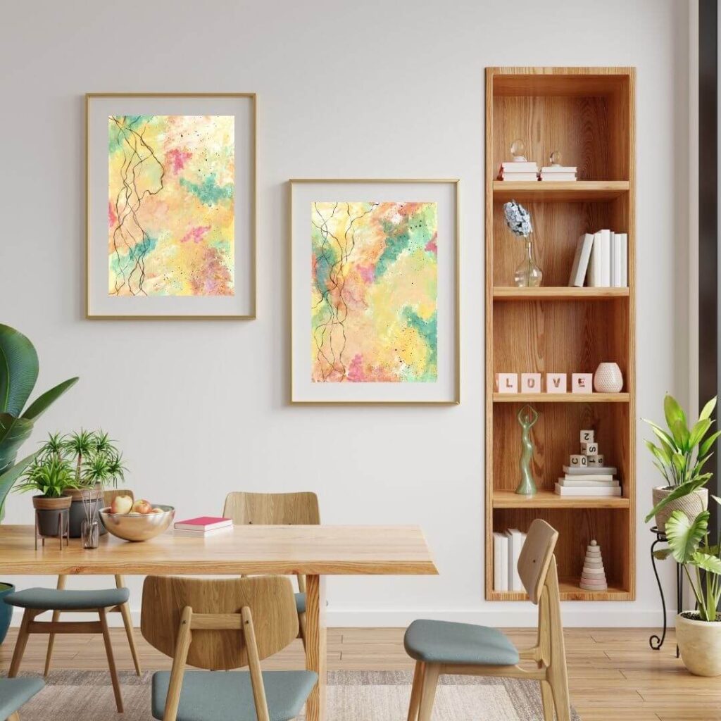
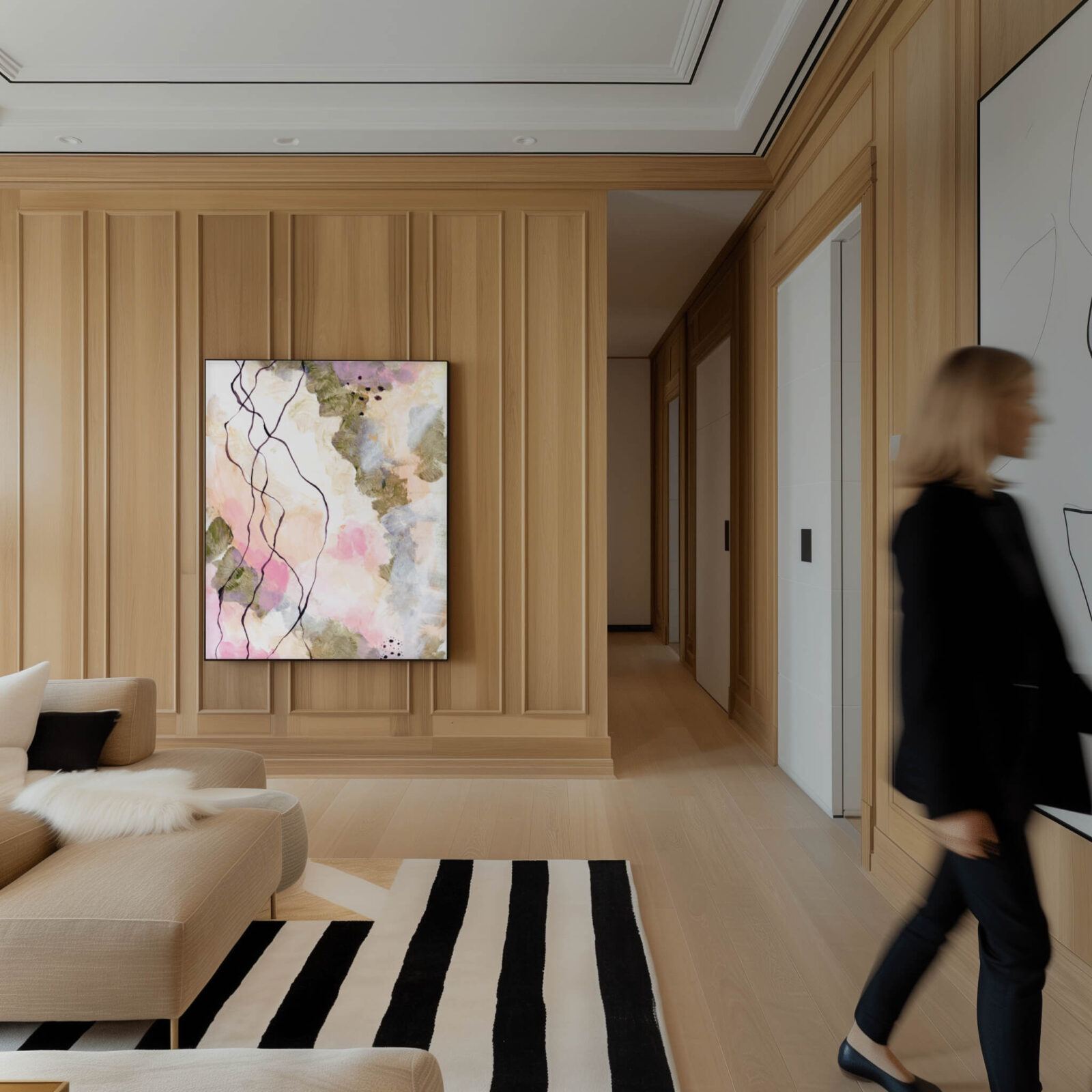
Where to place colourful abstract art
Placement changes the effect of colour.
A large colourful canvas above a sofa becomes part of the main emotional identity of the living room. A deep piece in a hallway can create a strong sense of arrival. A calm artwork in a bedroom can support rest. A bright piece in a dining room can add energy and conversation. A grounded piece in a home office can support focus without making the room feel sterile.
Think about how the room is used.
A bedroom usually needs colour that supports rest, intimacy or softness. That does not mean it must be pale, but it should not feel visually aggressive unless you enjoy trying to sleep under emotional fireworks.
-
- A living room can usually hold more range. It may need warmth, depth, energy or calm depending on the existing furniture and light.
- A hallway can take stronger colour because people move through it. It can create impact without requiring you to sit with it for hours.
- A home office may benefit from colour that supports focus and energy without becoming distracting.
- A dining room can often handle richer, warmer or more expressive colour because it is a social space.
The artwork should support the way the room is lived in. Not just how it photographs. That distinction saves a lot of bad decisions
Colour should support the artwork, not replace it
Colour is powerful, but it is not everything.
A weak artwork in a fashionable colour is still weak. A strong artwork in a quiet palette can be extraordinary. Colour can attract attention, but it cannot compensate for lack of composition, depth, surface, authorship or emotional presence.
This is why choosing abstract art purely by colour can lead to disappointment.
You may find something that technically matches the room, but after a few weeks, it starts to disappear. It does not hold attention. It does not change the space. It does not give anything back. It becomes visual furniture.
Collector-grade abstract art should offer more than palette.
It should have a sense of origin. It should feel like it came from a real practice. It should hold up at different distances. It should reward repeated looking. It should carry emotional depth as well as colour.
Colour opens the door. The work still has to be worth entering.
If you want to explore canvas art with that level of intention, start with Selected Works or request access to the Private Catalogue.
Final thoughts: colour is not decoration, it is atmosphere
Colour in abstract art changes the feeling of a room because it changes atmosphere.
It can calm, warm, ground, lift, deepen, soften or energise a space. It can make a room feel more intimate, more expansive, more human or more alive. It can create a focal point without shouting. It can bring emotional depth into a neutral interior. It can stop a modern room from feeling too polished, too cold or too thin.
But colour should not reduce art to matching. The strongest abstract art does not simply coordinate with a room. It changes the way the room feels. That is the real point.
Choose colour for what it does, not just what it matches. Notice how it behaves in light. Think about scale. Pay attention to your own emotional response. Let the artwork relate to the room without becoming obedient to it.
A good abstract artwork does not just add colour to a wall. It gives the room a different presence. And once you understand that, choosing art becomes far more interesting than trying to find something that goes with the cushions. The cushions will survive.
If you are choosing abstract canvas art for a calm, considered or emotionally resonant home, start with the wider guide to collector-grade canvas art, then explore available works in context.
Start here: Collector-Grade Canvas Art Guide
Explore available work: Selected Works
Request private catalogue access: Request the Private Catalogue
Key Takeaway
Colour in abstract art does not just decorate a room. It changes the emotional temperature of the space. The right artwork can make a room feel calmer, warmer, deeper, more intimate, more expansive or more alive. The best choice is not always the colour that matches your sofa. It is the work whose colour, scale and emotional presence change the room in the way you actually want to live with.
Frequently Asked Questions
Colour in abstract art affects the atmosphere of a room. It can make a space feel calmer, warmer, deeper, brighter, more intimate or more energised. Because abstract art does not rely on obvious subject matter, colour often carries much of the emotional impact.
Soft blues, muted greens, warm neutrals, pale greys and gentle earth tones can all support a calm room. Darker colours can also feel calm if they are layered and balanced. Calm does not always mean pale. It means the colour relationship feels steady, spacious and settled.
Abstract art should relate to the room, but it does not need to match perfectly. Matching too closely can make the artwork feel decorative and flat. Strong abstract art often works because it brings resonance, contrast or emotional depth, not because it repeats the sofa colour.
Ochre, terracotta, rust, warm pink, soft orange, brown, muted red and golden tones can make a room feel warmer. These colours are especially useful in cool, grey, minimal or modern interiors that need more humanity and emotional warmth.
Light, cool colours such as pale blue, soft grey, off-white and gentle mineral tones can help a room feel more spacious. However, scale, composition and light matter too. A pale artwork with no depth may feel blank rather than spacious.
Yes, dark abstract art can work beautifully in interiors when it has depth and enough space around it. Deep blue, charcoal, black, forest green and burgundy can bring intimacy, grounding and quiet drama. Dark art works best when the room has enough light or contrast to support it.
Not necessarily. Colourful abstract art can bring life, energy and personality to a living room, especially if the rest of the space is neutral. The key is choosing work with balance, depth and strong composition, rather than colour that simply shouts for attention.
Bedroom art usually works best when the colour supports rest, softness or intimacy. Soft blues, greens, warm neutrals, deep calming tones and gentle earthy colours can work well. Very bright or high-contrast pieces may be too stimulating unless the room is designed around that energy.
Start by asking what the room already feels like and what you want it to feel like. Then choose colour that supports that emotional shift. Think about light, scale, existing materials, furniture and your own response to the work. Do not choose colour only because it matches.
Colour psychology can be useful, but it is not absolute. Personal response matters more. A colour that feels calming to one person may feel cold to another. The best artwork is one whose colour feels right in your room and right to you over time.
Yes, neutral abstract art can have strong impact if it has depth, texture, tonal variation and presence. Neutral does not automatically mean bland. The best neutral abstract work feels quiet but alive, not empty or generic.
You can start with the Collector-Grade Canvas Art Guide, explore Selected Works, or request private catalogue access here: Request the Private Catalogue.