How to Choose Abstract Art for a Calm, Considered Home
Definition: What does it mean to choose abstract art for a calm home?
To choose abstract art for a calm home means selecting artwork that supports the emotional tone, visual rhythm, and atmosphere of a space. Rather than choosing art only by colour, trend, or size, you consider how the piece affects the room’s sense of stillness, depth, balance, and presence. Calm abstract art can be subtle or expressive, but it should feel considered rather than chaotic.
Why abstract art matters in a calm, considered home
A calm home is not just a tidy home. That would be lovely, obviously, but most of us live with laundry, chargers, mugs, receipts, mysterious drawer chaos, and at least one object we keep moving from surface to surface because we have not emotionally committed to dealing with it.
A calm home is a space that gives something back to you.
It does not constantly demand attention. It does not feel visually aggressive. It does not make your nervous system feel as though it has walked into a badly lit airport lounge at 5.40 in the morning. It gives you room to arrive, soften, breathe, think, and remember that you are a person, not a task management system with legs.
Abstract art can play a powerful role in that.
Unlike representational art, abstract art does not tell the viewer exactly what to see. It does not insist on a single story. It creates space for interpretation, emotion, memory, and atmosphere. That is why abstract art can be so effective in a calm, considered home. It can hold depth without cluttering the room with literal imagery. It can bring colour without becoming decorative noise. It can create movement without making the space feel restless.
But choosing abstract art well matters.
The wrong piece can make a room feel unsettled, forced, cold, or visually confused. The right piece can make the whole space feel more intelligent, more grounded, and more alive.
And no, that does not mean everything has to be cream, stone, oatmeal, mushroom, putty, greige, or whatever new expensive word we are currently using for beige with a better publicist.
Calm does not mean bland.
A considered home can include colour. It can include contrast. It can include emotional intensity. It can include artwork that has weight, movement, and presence. The difference is whether the piece belongs to the atmosphere of the room, or whether it looks like it has wandered in from another life and is now trying to make friends with the sofa.
TL;DR
Choosing abstract art for a calm, considered home is not about matching colours perfectly or filling an empty wall because it looks a bit sad and abandoned. It is about choosing work that supports the emotional atmosphere of the room.
Start with how you want the space to feel. Then consider scale, colour, movement, texture, placement, and the relationship between the artwork and the room around it. Calm abstract art does not have to be pale, beige, or barely there. It can be bold, layered, expressive, and still feel grounded if the composition, palette, and emotional tone are right.
The best abstract art for a calm home gives the room presence without making it feel busy. It should hold attention without shouting across the room like someone who has discovered LinkedIn thought leadership and refuses to recover.
Start with the feeling, not the wall
Most people begin the wrong way round. They look at a blank wall and think, “I need something there.”
That is understandable. A blank wall can feel unfinished, especially in a living room, hallway, bedroom, or dining space. But if you start with the gap, you usually end up choosing something to solve the gap. That is how homes end up with artwork that technically fits, matches the cushions, and still somehow feels emotionally dead.
The better question is not, “What should I put on this wall?”
The better question is, “What do I want this room to help me feel?”
That question changes everything.
A calm, considered home is not created by filling every space. It is created by making deliberate choices. Abstract art should not just occupy a wall. It should contribute to the emotional architecture of the room.
For example, you might want a living room to feel grounded, warm, and quietly expressive. You might want a bedroom to feel restful, intimate, and soft without becoming visually limp. You might want a hallway to feel welcoming and composed. You might want a home office to feel focused but not sterile. You might want a reading corner to feel reflective, private, and slightly removed from the world’s nonsense.
Each of those spaces asks something different from the art.
A piece that feels perfect in a hallway may feel too transitional in a bedroom. A work that brings depth to a living room may feel too intense above a bed. A piece that gives a dining room energy may feel distracting in a workspace.
So before choosing abstract art, name the emotional function of the room.
Not in a precious way. You do not need to sit cross-legged with a candle and ask the wall what it wants from you, unless that is your thing, in which case crack on. But you do need to be honest.
Ask:
-
- Do I want this room to feel softer?
- Do I want it to feel more grounded?
- Do I want it to feel warmer?
- Do I want it to feel more spacious?
- Do I want it to feel more personal?
- Do I want it to feel less staged?
- Do I want it to feel calmer, but not boring?
- Do I want the art to soothe the space or give it a focal point?
Once you know the feeling, you can choose art with more clarity.
This is especially important with abstract art because the subject is not literal. You are not choosing “a landscape” or “a portrait” or “a still life.” You are choosing colour, rhythm, gesture, density, space, texture, composition, and emotional charge. That is where the real work is.
Decision box: what kind of abstract art should you choose?
| If you want the room to feel… | Choose abstract art with… | Avoid… |
|---|---|---|
|
Calm and grounded |
Balanced composition, soft contrast, earthy or deep tones |
Overly fragmented work with too many competing focal points |
|
Light and spacious |
Open areas, gentle movement, pale or breathable colour palettes |
Dense, heavy pieces that visually shrink the room |
|
Warm and intimate |
Layered texture, muted warmth, organic marks |
Cold palettes that make the room feel clinical |
|
Focused and clear |
Strong structure, limited palette, clean visual rhythm |
Chaotic compositions with restless movement |
|
Personal and soulful |
Emotional depth, visible gesture, imperfect human texture |
Generic prints that look mass-produced and emotionally flat |
|
Elegant but not stiff |
Refined colour, confident scale, quiet complexity |
Art chosen only to match furniture |
|
Restful but alive |
Subtle movement, tonal variation, gentle contrast |
Art so neutral it disappears completely |
Colour matters, but not in the way people think
Colour is usually the first thing people think about when choosing abstract art for a home.
That makes sense. Colour is immediate. You notice it before scale, texture, or composition. It can pull a room together, disrupt it, soften it, warm it, cool it, or make it feel as though someone has made a brave decision at 11.47 pm after too much Pinterest.
But colour matching is not the same as choosing well.
A common mistake is trying to match artwork exactly to the room’s existing palette. The sofa is blue, so the art must include blue. The cushions are terracotta, so the painting must have terracotta. The rug has green in it, so now the artwork is apparently legally required to contain green.
This can work, but it can also make a room feel overly coordinated. When everything matches too neatly, the space can lose depth. It starts to feel decorated rather than lived in. There is a difference between harmony and obedience.
Abstract art for a calm home should relate to the room, but it does not need to copy it.
A better approach is to think in terms of colour temperature, emotional tone, and visual balance.
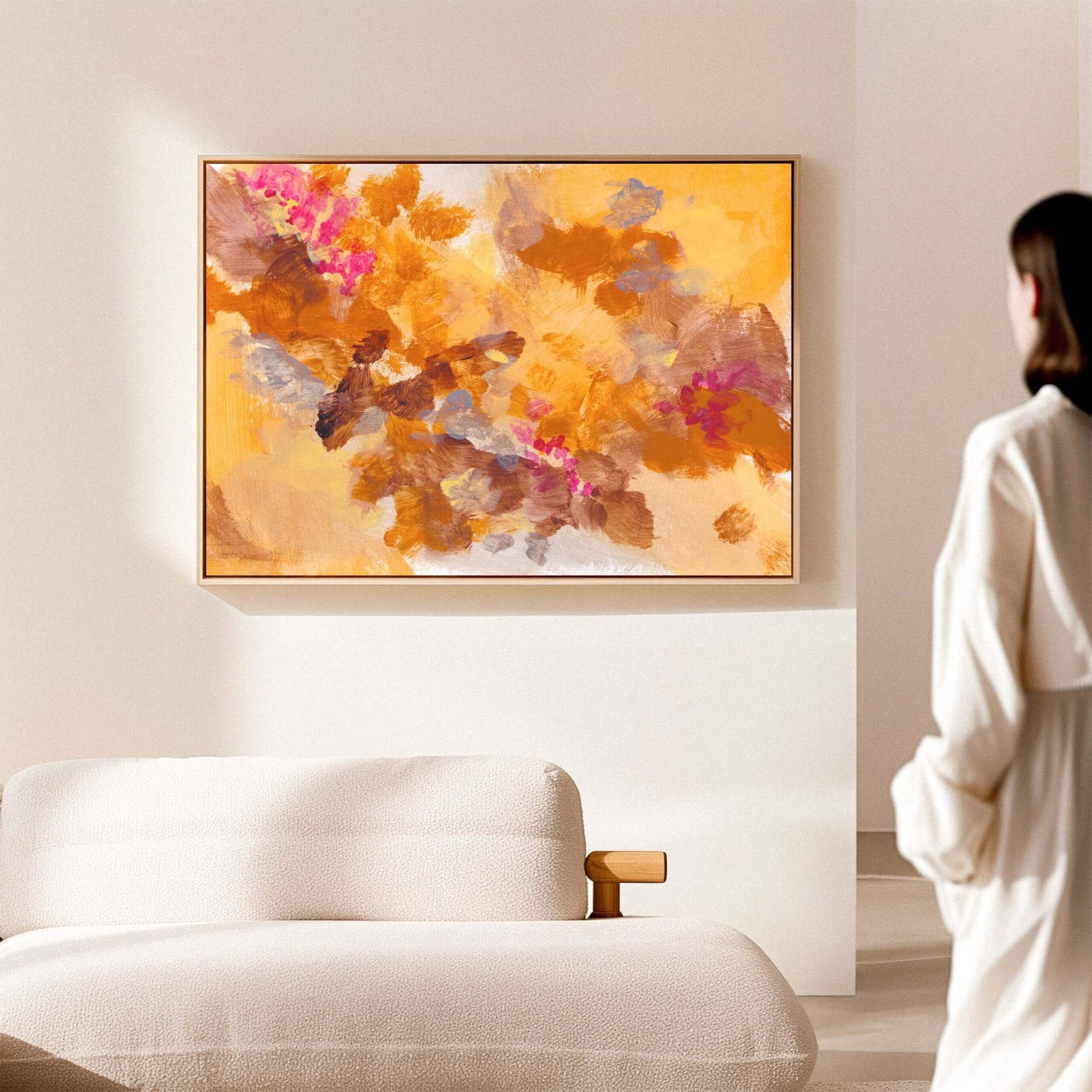
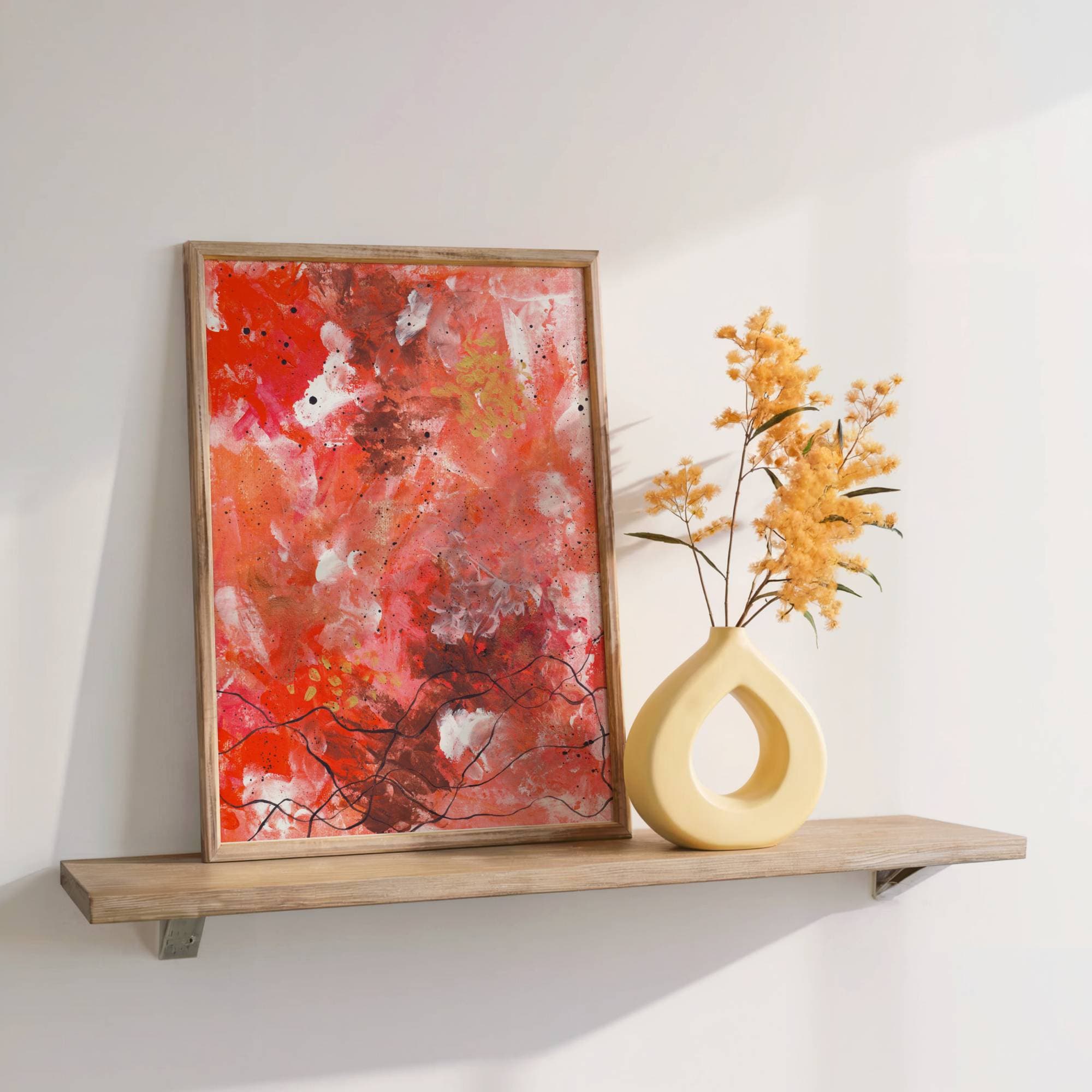
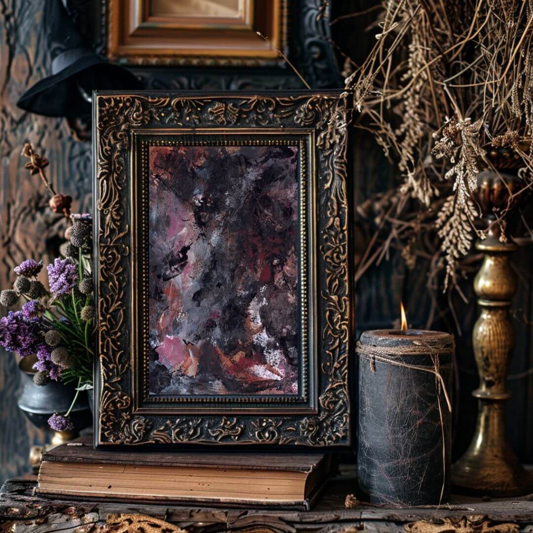
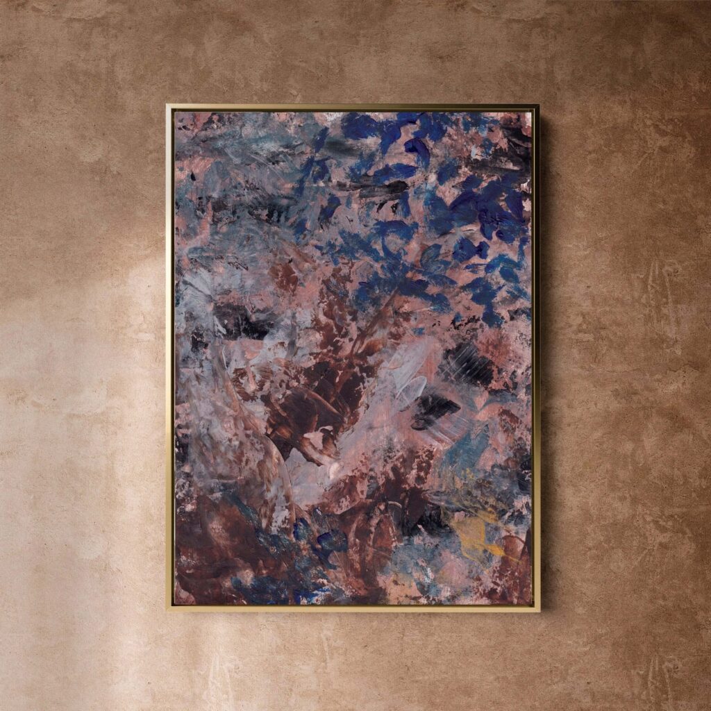
Warm colours such as ochre, rust, clay, rose, soft coral, amber, and muted gold can make a room feel more intimate and human. Cooler colours such as blue, grey, green, violet, and soft white can create a sense of spaciousness, reflection, or quiet. Deep colours such as charcoal, indigo, forest green, burgundy, and umber can bring grounding and weight. Pale tones can create openness, but only if the composition still has enough presence to hold the wall.
The question is not, “Does this artwork match my room?”
The question is, “Does this artwork support the emotional temperature of the room?”
A calm room can include contrast. In fact, it often needs it. Without contrast, a room can become flat. If everything is pale, soft, and neutral, the space may feel restful at first, but it can also become visually anaemic. Like a hotel room that has been designed to offend absolutely no one and therefore says absolutely nothing.
A darker abstract piece in a pale room can create depth. A warm piece in a cool room can add humanity. A softly expressive piece in a minimal room can stop the space from feeling sterile. A restrained piece in a richly layered room can give the eye somewhere to rest.
Colour should not dominate the decision, but it should be understood.
You are not just choosing a palette. You are choosing the emotional weather of the room.
Calm abstract art does not have to be neutral
There is a strange assumption that calm art must be pale, quiet, minimal, and barely visible. It can be. But it does not have to be.
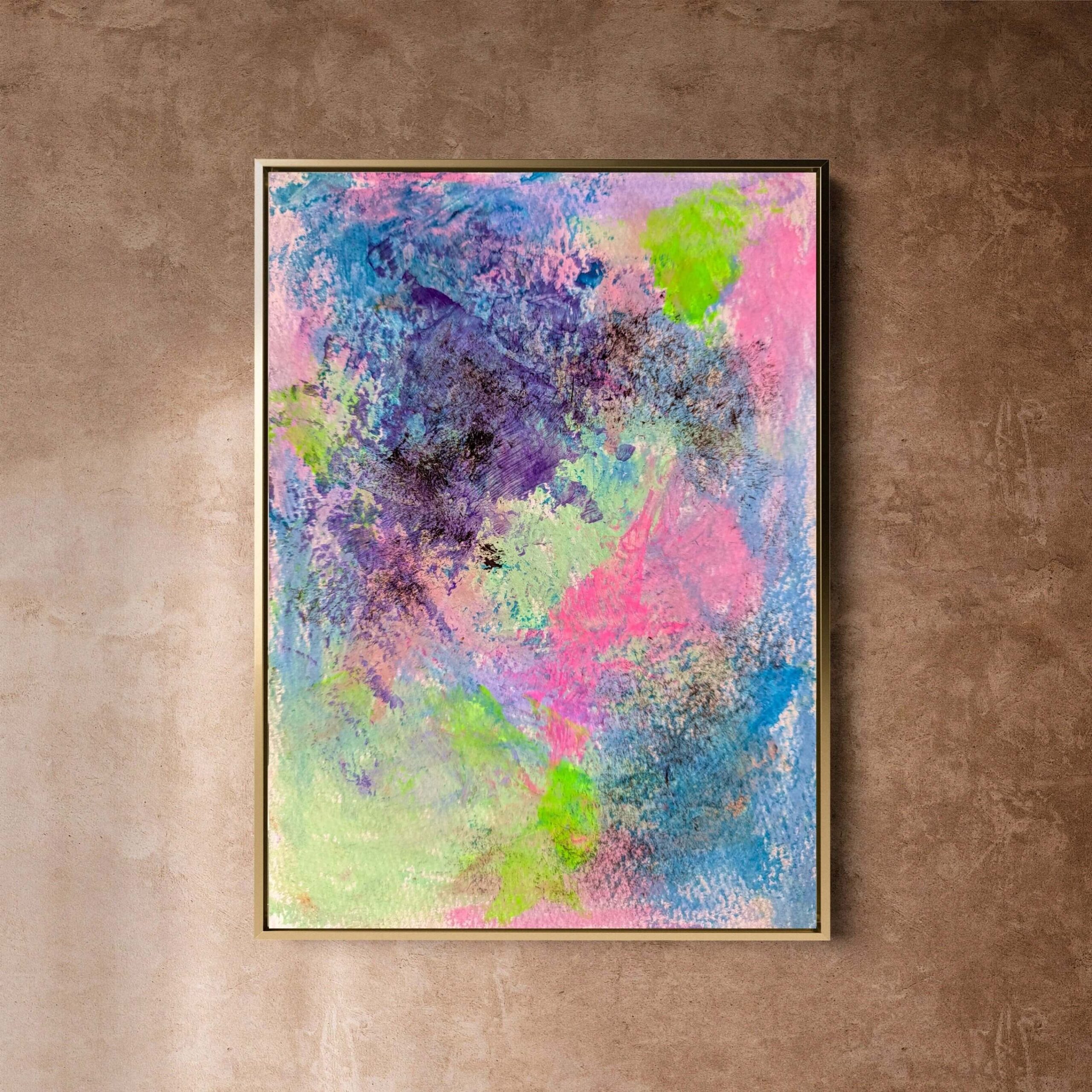
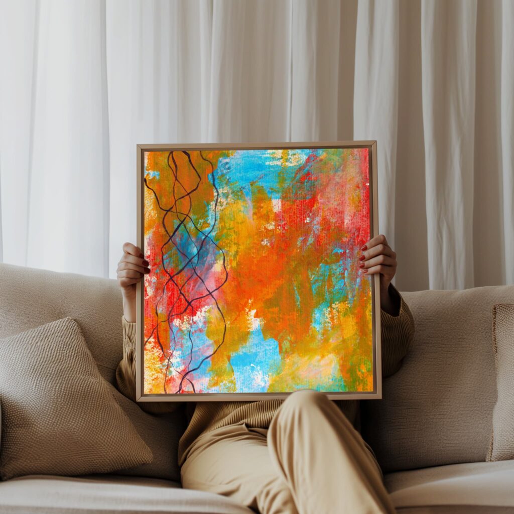
Some of the calmest spaces are not neutral because they lack colour. They are calm because every element has been chosen with care. A room can include deep blue, burnt orange, black, moss green, violet, crimson, or gold and still feel deeply composed. Calm comes from relationship, not from removing everything interesting.
A piece of abstract art can be expressive and still calming if the movement feels resolved. It can be colourful and still considered if the palette is balanced. It can be layered and still restful if the composition has enough space and rhythm. It can carry emotional intensity without making the room feel chaotic.
This matters because many people mistake quietness for quality.
They choose the safest possible artwork because they do not want to disturb the room. But art should disturb the room a little. Not in a violent way. Not in a “why is there a neon pink square above the fireplace and why do I feel personally attacked?” way. But art should shift the energy. It should bring something alive into the space.
A calm home does not need dead walls.
It needs work that has presence without noise.
Neutral abstract art can be beautiful when it has depth, texture, restraint, and subtle variation. But neutral art chosen only because it is safe can feel empty. The problem is not neutrality itself. The problem is emotional absence.
When choosing abstract art for a calm, considered home, look beyond whether the colours are soft. Ask whether the piece has life in it.
Does it invite you to look again?
Does it hold quiet complexity?
Does it feel made, not manufactured?
Does it bring the room into focus?
Does it have a rhythm your body can settle with?
That is the difference.
Scale is where many rooms go wrong
Scale is one of the most important parts of choosing abstract art, and it is also one of the easiest to underestimate.
A piece can be beautiful, emotionally resonant, and completely wrong for the wall if the scale is off.
Too small, and it looks apologetic. It floats awkwardly in the middle of the wall like it has been sent there without instructions. Too large, and it can overwhelm the room, especially if the composition is dense or high contrast. The right scale gives the artwork authority and gives the room balance.
In a calm, considered home, scale should feel intentional.
That does not mean every piece has to be enormous. Smaller works can be powerful, especially in intimate spaces, narrow walls, reading corners, bedrooms, and transitional areas. But small work needs breathing room, thoughtful placement, or grouping. It should not look like an afterthought.
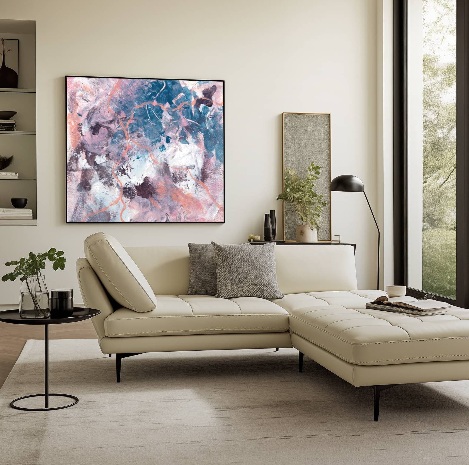
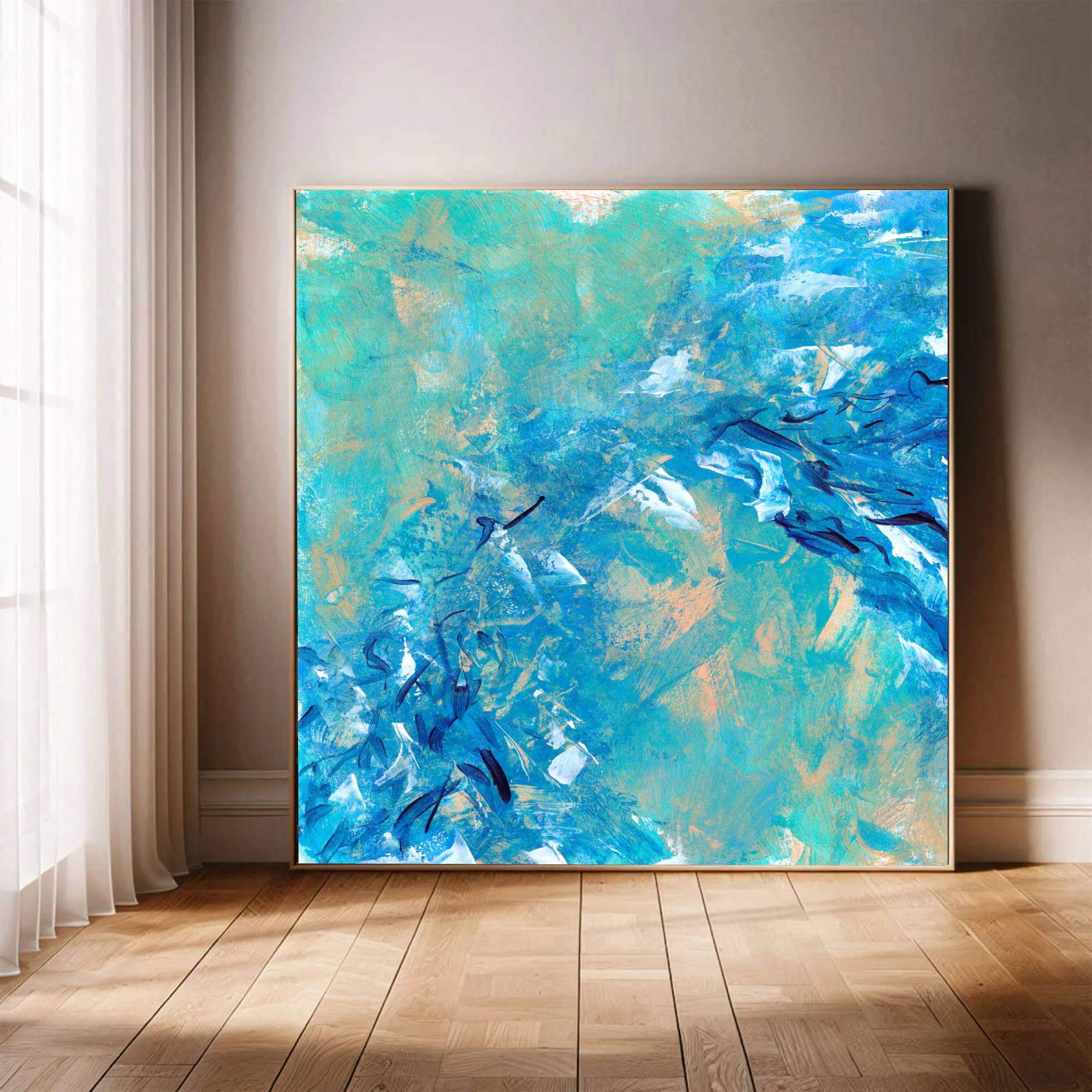
For larger walls, especially above sofas, beds, consoles, fireplaces, or dining tables, one substantial piece often works better than several smaller pieces. Large abstract art can create a strong focal point without adding visual clutter. This is one reason collector-grade canvas prints can work beautifully in calm interiors. They bring presence, texture, and scale without the visual busyness of a gallery wall.
As a rough guide, artwork above furniture often looks best when it is around two-thirds to three-quarters of the width of the furniture below it. This is not a law. Nobody is going to burst through the door with a tape measure and arrest you for aesthetic misconduct. But it is a useful starting point.
For example:
- Above a three-seater sofa, choose a large horizontal piece or a substantial square or vertical work with enough visual weight.
- Above a bed, choose something that feels restful and proportionate, not so small that it disappears or so intense that it keeps the room mentally switched on.
- In a hallway, consider vertical work or a series of pieces that guide movement without overcrowding.
- In a dining room, choose art with enough presence to hold conversation but not so much agitation that the room feels restless.
- In a home office, choose work that supports focus, clarity, and steadiness rather than visual overstimulation.
Scale is not just about measurements. It is about confidence.
A calm home often benefits from fewer, stronger choices rather than many small decorative ones. Too many small pieces can make a space feel fragmented. One well-chosen abstract work can make the room feel calmer because it gives the eye somewhere to land.
That is the quiet power of scale.
Composition affects how your body reads the room
Abstract art is not just colour and size. Composition matters deeply.
Composition is the structure of the artwork. It is how the marks, shapes, colours, lines, spaces, and tensions relate to each other. Even if you cannot explain why, your body responds to composition. You feel whether a piece is balanced, restless, open, compressed, heavy, floating, chaotic, grounded, or unresolved.
This is especially important when choosing abstract art for a calm home.
A composition with too many competing focal points can make a room feel busy. Sharp diagonals, high contrast, crowded marks, and restless movement can bring energy, but they may not suit a bedroom or quiet living space. A composition with too little structure can feel weak or decorative. A piece with no tension at all may look pleasant but fail to hold attention.
The strongest calm abstract art often contains both movement and resolution.
It has enough activity to feel alive, but enough structure to feel held.
Look for:
- Areas of visual rest
- A clear sense of balance
- Movement that leads the eye rather than scatters it
- Layers that feel intentional rather than cluttered
- Contrast that creates depth without aggression
- Negative space that gives the work room to breathe
- Marks that feel human rather than mechanically decorative
Negative space is particularly important. In art, negative space is the area around and between the main elements. In interiors, it works almost like silence in music. Without it, everything becomes noise.
A calm home needs visual pauses.
If the artwork is dense, the surrounding room may need to be simpler. If the room already has strong pattern, texture, books, objects, plants, textiles, and architectural detail, the artwork may need more spaciousness. If the room is minimal, the artwork can carry more movement and complexity.
Again, this is about relationship.
The artwork and the room should not compete for dominance. They should speak to each other. Ideally without either of them becoming the sort of person who says “I’m just playing devil’s advocate” at dinner.
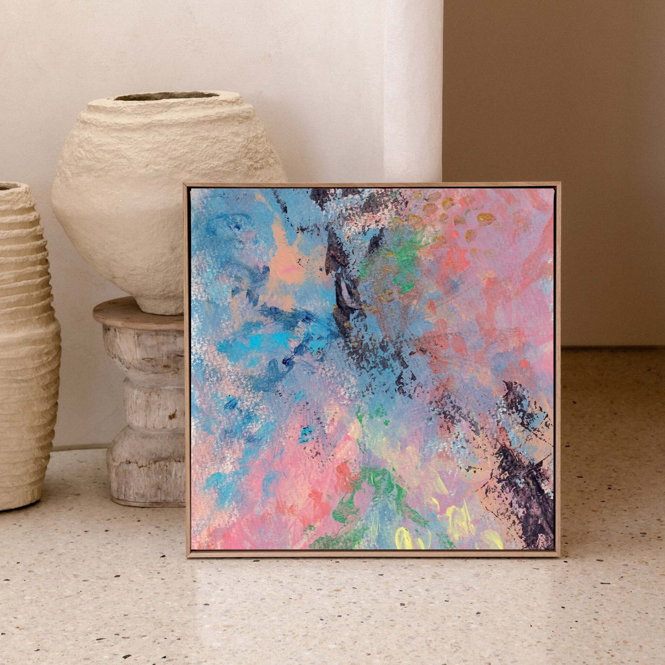
Texture gives abstract art emotional depth
Texture is often what separates emotionally resonant abstract art from flat decoration.
Even in canvas prints, texture matters. The original work may contain layered paint, visible brushwork, movement, marks, softness, drag, density, or atmospheric shifts. A high-quality canvas print can retain much of that visual depth, especially when produced with care, strong source imagery, and appropriate materials.
Texture gives the eye something to stay with.
In a calm home, this matters because texture creates depth without necessarily adding visual clutter. A textured abstract piece can make a room feel warmer, more human, and more grounded. It can soften modern interiors, add soul to minimal spaces, and bring emotional weight to rooms that might otherwise feel too polished.
This is why flat, generic prints often fail in considered homes.
They may look acceptable from a distance, but they do not reward attention. They do not hold the wall. They do not shift as the light changes. They do not carry the trace of making. They are image without presence.
Collector-grade canvas art, when done properly, can offer a different experience. It has physicality. It sits in the room as an object, not just an image. The canvas surface, scale, depth, and finish all contribute to the atmosphere.
For calm interiors, texture can be especially powerful when paired with restraint. A piece does not need to be visually loud if the surface has depth. It can be quiet and still hold enormous presence.
Look for work that feels layered rather than flat.
Not necessarily busy. Layered.
There is a difference.
Busy art throws everything at you. Layered art lets you discover it slowly.
That slow discovery is exactly what makes abstract art so valuable in a calm, considered home. It gives the room a sense of unfolding. You do not consume it all at once. You live with it. It changes depending on light, mood, season, distance, and attention.
That is what good art does.
Match the artwork to the room’s purpose
Every room has a different emotional job.
A bedroom is not a hallway. A hallway is not a dining room. A dining room is not a home office. A home office is not a place where your nervous system should feel like it has been plugged into twelve browser tabs and a passive-aggressive email.
The artwork should support the purpose of the room.
This does not mean being obvious. You do not need “relaxing art” in a bedroom in the same way you do not need a giant word print saying “EAT” in a kitchen. We know. That is why the forks are there.
But you do need to consider how the artwork affects the experience of the space.
Choosing abstract art for a living room
The living room is often the emotional centre of the home. It is where you rest, talk, read, watch things, recover, host, collapse, and occasionally pretend you are going to fold the laundry while absolutely not folding the laundry.
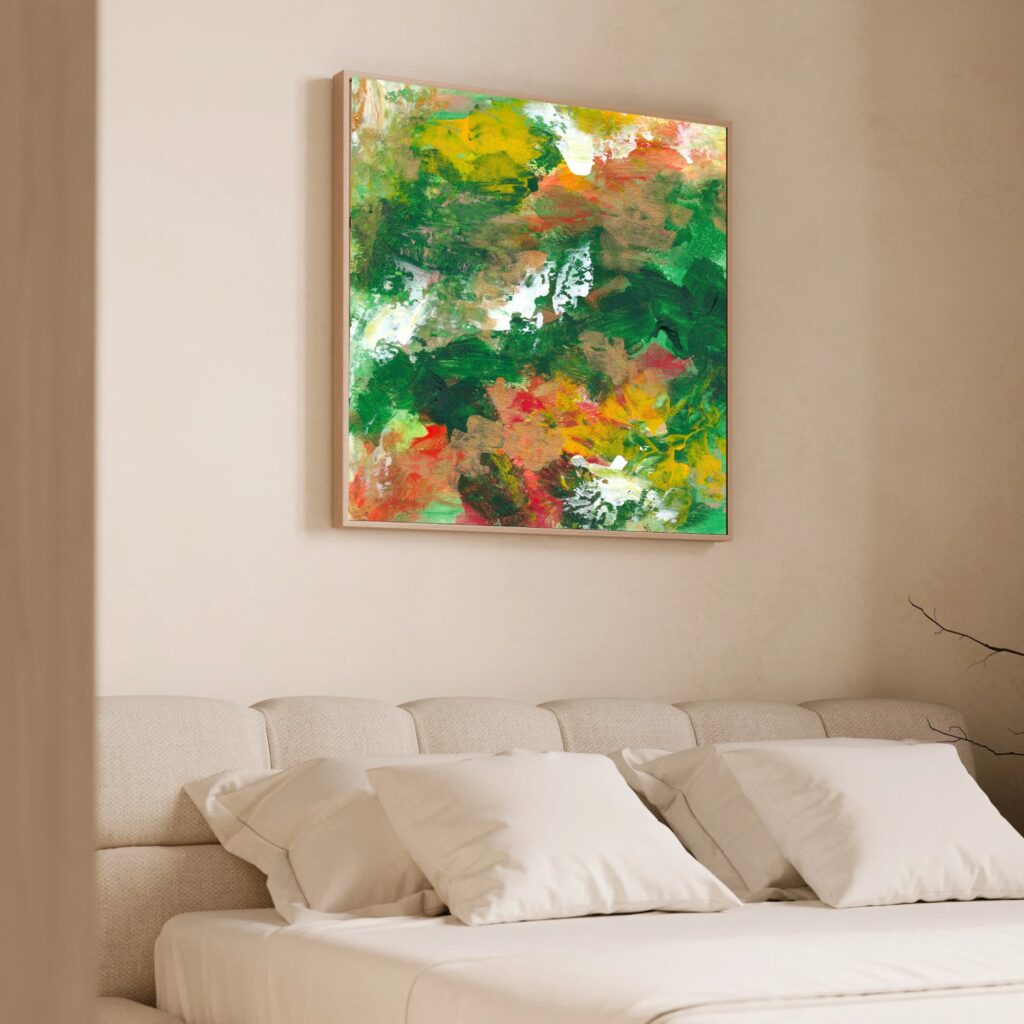
Abstract art in a living room can afford to have presence. It can be larger, deeper, and more expressive than art in a bedroom. The living room usually benefits from a strong focal point, especially if the furniture arrangement is simple.
For a calm living room, look for abstract art that creates warmth, depth, and visual grounding. A piece with layered colour, organic movement, and balanced composition can make the room feel more complete without making it feel crowded.
If the room is neutral, art can bring emotional life. If the room already has colour, choose a piece that either deepens the palette or introduces contrast in a controlled way.
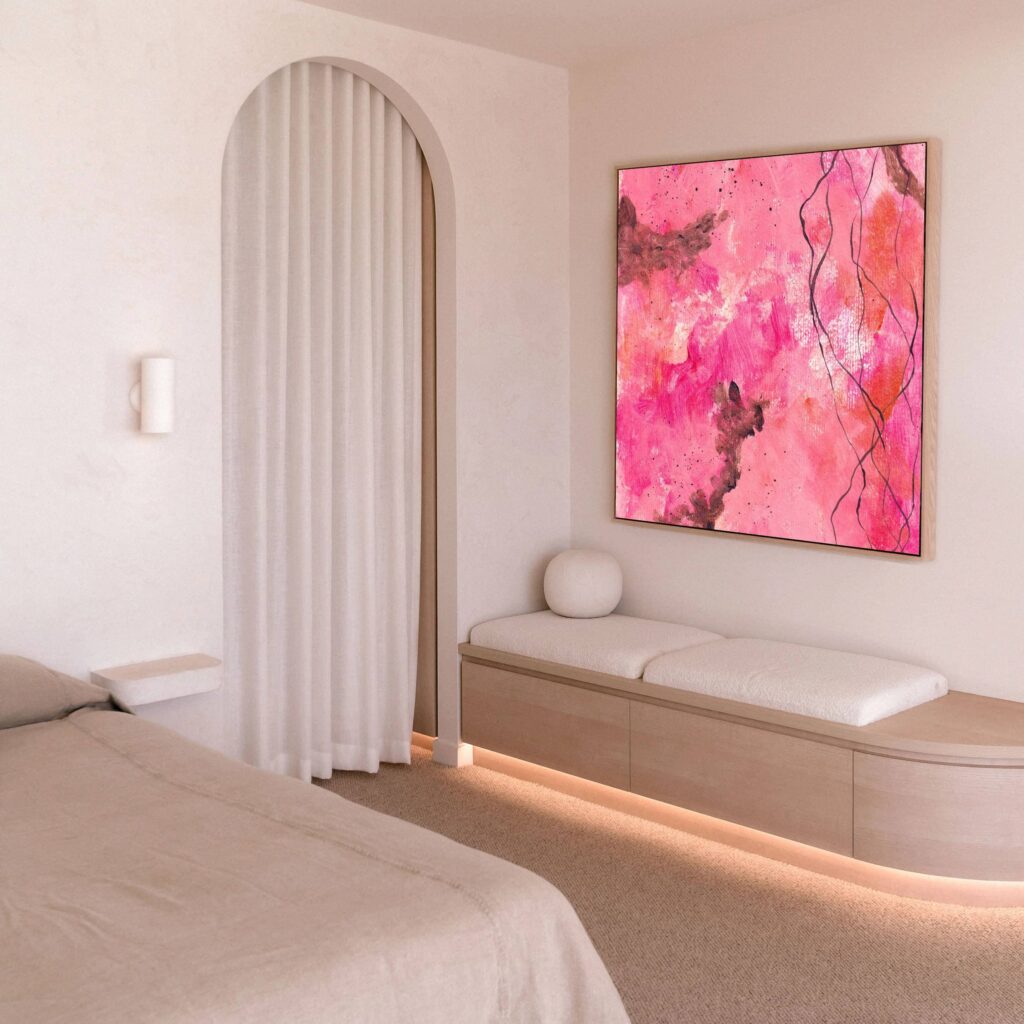
Choosing abstract art for a bedroom
A bedroom asks for a different kind of attention.
This is not the place for artwork that feels too sharp, frantic, confrontational, or visually demanding. That does not mean the art has to be pale or sleepy, but it should support rest.
For a bedroom, choose abstract art with softer transitions, grounded tones, gentle movement, or a sense of spaciousness. If you choose darker work, make sure it feels enveloping rather than heavy. If you choose colourful work, make sure the composition feels resolved.
Above the bed, scale matters. A tiny piece can feel awkward. A huge intense piece can feel like it is supervising your sleep, which is frankly unnecessary. Choose something that feels proportionate, calm, and quietly present.
Choosing abstract art for a hallway
Hallways are often overlooked, but they shape the first emotional impression of a home.
A hallway does not usually need the deepest or most complex work, but it does benefit from art that creates rhythm and welcome. Abstract art can help a hallway feel intentional rather than purely functional.
Vertical pieces work well in narrow spaces. A sequence of smaller works can create movement, but avoid overcrowding. The aim is to guide the eye, not turn the hallway into a visual obstacle course.
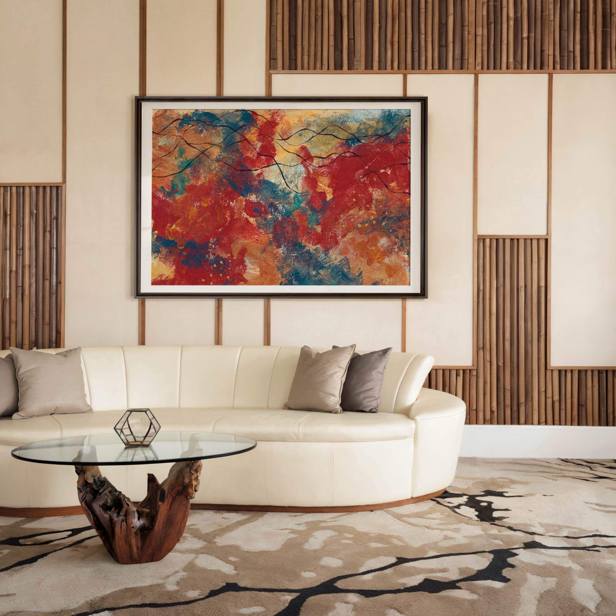
Choosing abstract art for a dining room
Dining rooms can hold more drama.
This is a space where people gather, talk, eat, and spend time facing each other. Art here can have richness and depth. It can become part of the atmosphere of conversation.
For a calm but considered dining space, choose abstract art with warmth, sophistication, and enough visual interest to hold attention without dominating the room. Deeper tones, layered compositions, and confident scale can work beautifully here.
Choosing abstract art for a home office
A home office needs clarity.
The wrong art can be distracting. The right art can support focus, steadiness, and creative thought. Abstract art is particularly useful here because it can create atmosphere without becoming too literal.
Choose work with structure, balance, and a palette that helps you feel alert but not overstimulated. Avoid pieces that feel visually chaotic if you already spend your day managing information, screens, decisions, and the low-grade existential theatre of email.
A good piece of abstract art in a workspace should help you return to yourself, not make your brain feel like a drawer full of cables.
Consider the relationship between art and furniture
Art does not exist in isolation once it enters a home. It relates to furniture, lighting, architecture, textiles, objects, books, plants, flooring, and negative space. A piece that looks powerful on a white website background may behave differently above a velvet sofa, beside a dark bookcase, or opposite a window.
When choosing abstract art, think about the whole visual field.
If the furniture is heavy, the art may need lightness, movement, or spaciousness. If the furniture is minimal, the art may need warmth and texture. If the room has lots of pattern, the art may need simplicity. If the room feels too plain, the art may need depth and emotional charge.
The artwork should either complement or counterbalance the room.
Complementing means it supports what is already there. For example, a soft, earthy abstract piece in a room with natural wood, linen, stone, and warm neutrals.
Counterbalancing means it brings what the room lacks. For example, a bold, layered canvas in a minimal white room, or a quiet tonal piece in a richly decorated space.
Both can work.
The mistake is choosing art that neither complements nor counterbalances. That is when a piece feels random. It may be beautiful on its own, but it does not belong in the room.
Also consider height.
Art is often hung too high. This creates a strange floating effect where the artwork appears to be trying to escape. As a general guide, the centre of the artwork should sit around eye level, though this changes depending on furniture and ceiling height. Above furniture, leave enough space for the piece to breathe, but not so much that it disconnects from what sits below it.
A calm, considered home depends on these relationships.
Not because everything must be perfect. Perfection is exhausting and usually quite boring. But because the eye can feel when things are unresolved. Good placement makes art feel settled.
Lighting changes everything
Lighting can make or ruin abstract art.
A piece with depth, texture, and subtle tonal shifts needs good light. Not necessarily dramatic gallery lighting, though that can be beautiful, but enough thoughtful illumination for the work to be seen properly.
Natural light changes throughout the day. A piece may feel soft in morning light, richer in the afternoon, and more intimate in the evening. This is one of the pleasures of living with art. It is not static. It changes with the room.
But be careful with direct sunlight, especially with valuable or collector-grade work. Strong direct sun can cause fading or damage over time, depending on materials and production quality. If a wall receives harsh sunlight for long periods, consider UV-protective glazing for framed works, careful placement, or choosing a canvas print produced with archival-quality materials and proper care guidance.
Artificial lighting also matters.
A poorly lit piece can look dull, flat, or oddly coloured. Warm bulbs can enhance earthy tones but may distort cooler palettes. Cool bulbs can make some work feel crisp, but they can also make a room feel clinical. Picture lights, wall washers, lamps, and directional lighting can all help bring art into the room more intentionally.
For calm homes, avoid lighting that feels too harsh or theatrical unless the room can hold it. The goal is not to make your living room feel like a private viewing room where everyone is afraid to sit down. The goal is to let the art breathe.
Soft, layered lighting usually works best. Think lamps, wall lights, indirect light, and carefully placed illumination. The artwork should be visible, but the room should still feel livable.
Choose art that has emotional resonance, not just visual appeal
This is where choosing abstract art becomes more personal. A piece can be beautiful and still not be right for you. t can match the room, fit the wall, suit the palette, and still leave you cold. That matters, especially in a home.
Art in a home is not just for guests. It is not there to prove taste. It is not there to perform sophistication. It is there because you live with it. You see it in ordinary moments. When you walk in tired. When you drink coffee. When you cannot sleep. When you are trying to think. When you are having people over. When you are alone. When the house is quiet. When life is not.
So the work needs to mean something, even if you cannot explain exactly what.
Abstract art often speaks through recognition rather than narrative. You may not know why a piece moves you. You may simply feel that it does. Something in the colour, movement, tension, softness, density, or space meets something in you.
That is not vague. That is perception.
A calm, considered home should not feel like a showroom. It should feel inhabited by a person with a nervous system, a history, a sense of humour, and hopefully at least one decent mug. Art helps create that sense of inner life.
When choosing abstract art, ask:
Do I keep wanting to look at this?
Does it make the room feel more like mine?
Does it hold something I recognise emotionally?
Does it feel alive?
Would I still want this if nobody else saw it?
Does it calm me, steady me, open me, or sharpen my attention in a good way?
Does it feel like decoration, or does it feel like presence?
The last question is the important one. Decoration fills space. Presence changes it.
Avoid choosing abstract art only because it matches the sofa
This deserves its own section because it is such a common trap.
Matching the sofa is not a crime. Sometimes the sofa has excellent taste. But if the main reason you choose a piece of art is because it repeats the cushion colour, the artwork becomes subordinate to the décor. It stops being art and becomes an accessory.
That may be fine for some spaces. Not every wall needs a profound emotional encounter. Sometimes you just need the downstairs loo to stop looking like a rental holding pen.
But in a calm, considered home, especially if you are investing in collector-grade canvas art, the work should have more authority than that.
Art can relate to the sofa without obeying it.
Instead of exact matching, look for:
- Shared undertones
- Complementary warmth or coolness
- Repeated but not identical colour notes
- Contrast that feels intentional
- A similar emotional mood
- A balance between soft and strong elements
- A relationship with the room’s materials, not just its colours
For example, a room with a pale linen sofa and oak flooring might work beautifully with abstract art that includes warm whites, ochre, soft charcoal, and muted rose. It does not need to contain the exact beige of the sofa. In fact, please do not make beige work that hard. It has suffered enough.
A dark green velvet sofa might work with art that includes deep blue, earthy pink, smoky grey, or warm metallic tones. A charcoal sofa might need art with warmth, light, or texture to prevent the room from feeling too heavy.
The goal is not coordination. The goal is conversation. The artwork should converse with the room, not take orders from it.
Think about visual rhythm across the whole home
A calm, considered home is not created room by room in isolation. There should be some sense of rhythm across the whole space. Not sameness. Not a matching set of prints in every room like a hotel corridor that has given up. But rhythm.
This means the artworks throughout the home should feel as though they belong to the same emotional world, even if they vary in colour, scale, and intensity.
You might have one large expressive canvas in the living room, a quieter tonal piece in the bedroom, a small vertical work in the hallway, and a deeper, more atmospheric piece in the dining room. They do not need to match, but they should not feel like four completely different people arguing over the aux cable.
A considered collection has coherence.
That coherence might come from:
- A shared colour sensibility
- Similar materials
- A consistent level of quality
- A preference for organic forms
- A relationship to stillness or movement
- A certain emotional depth
- A balance between restraint and expression
- The collector’s own taste becomes clearer over time
This is where collecting becomes more interesting than decorating.
Decorating often asks, “What goes here?”
Collecting asks, “What am I building a relationship with?”
Even if you are only buying one piece, that distinction matters. A home with art chosen slowly and personally feels different from a home filled quickly to complete a look.
A calm home benefits from patience.
You do not need to solve every wall at once. In fact, please do not. That way lies panic buying, regret, and a suspicious number of prints called “Abstract Neutral Form No. 7.”
Choose fewer pieces. Choose better pieces. Let the home evolve.
Comparison table: decorative abstract art vs collector-grade abstract art
| Feature | Decorative abstract art | Collector-grade abstract art |
|---|---|---|
|
Main purpose |
To fill space or match décor |
To bring presence, depth, and lasting value |
|
Emotional impact |
Often surface-level |
More resonant, layered, and personal |
|
Materials |
Often mass-produced on basic paper or canvas |
Produced with higher-quality materials and attention to finish |
|
Scale |
Often chosen by convenience |
Chosen intentionally for the room and the work |
|
Relationship to home |
Accessory to the interior |
Active part of the atmosphere |
|
Longevity |
May be replaced when trends change |
Intended to be lived with over time |
|
Visual depth |
Can feel flat or generic |
Holds attention through texture, tone, and composition |
|
Best for |
Temporary styling, low-investment spaces |
Considered homes, collectors, meaningful interiors |
|
Risk |
Looks coordinated but forgettable |
Requires more thought, but gives more back |
How to know when a piece is right
There is no perfect formula for choosing abstract art.
There are principles, yes. Scale, colour, composition, placement, lighting, quality, emotional tone. These all matter. But at some point, you also have to pay attention to the quieter response.
The right piece often creates a sense of recognition.
Not necessarily instant drama. Sometimes it is quieter than that. You return to it. You think about it after you close the tab. You imagine it in the room and the room feels more complete. You notice that it does not just look good. It changes the feeling of the space.
That is usually a good sign. The wrong piece often needs too much justification.
If you keep saying, “Well, it matches the rug,” or “It is the right size,” or “It is very on trend,” or “Everyone seems to like this style,” but you feel nothing, that is information. Useful information. Annoying, perhaps, but useful.
The right artwork does not always make logical sense immediately. But it should feel emotionally coherent.
You should be able to imagine living with it, not just installing it.
This is especially true with abstract art because the relationship deepens over time. A good piece does not reveal everything at once. It continues to offer something. It changes in different lights. It meets you differently depending on your mood. It becomes part of the room’s memory.
That is what you are choosing. Not just an image. A long-term presence.
Common mistakes when choosing abstract art for a calm home
Choosing abstract art can feel intimidating because there is no obvious subject to judge. With a landscape, you can say, “I like that mountain.” With a portrait, you can say, “That face has something.” With abstract art, you are dealing with feeling, rhythm, space, and atmosphere.
That can make people second-guess themselves.
Here are the most common mistakes.
Mistake 1: Choosing art that is too small
This is probably the most common issue. People underestimate scale because they are afraid of overwhelming the room. But a small piece on a large wall often creates more visual discomfort than a larger piece would. It makes the room feel unresolved.
If in doubt, mock up the size with paper or tape before buying. It is not glamorous, but neither is spending good money on a piece that looks like a postage stamp having an identity crisis.
Mistake 2: Choosing art only by colour
Colour matters, but it is not enough. A piece can match the room perfectly and still feel dead. Look at composition, texture, movement, emotional tone, and quality.
Mistake 3: Choosing art that is too generic
Generic abstract art can make a room look finished but not felt. If the work looks like it could be in any hotel, office, rental apartment, or catalogue, ask whether it really belongs in your home.
Mistake 4: Ignoring the room’s purpose
A dramatic, high-energy piece might be wonderful, but not above your bed if you are trying to sleep. A soft tonal piece might be beautiful, but too quiet for a large living room that needs a focal point.
Mistake 5: Hanging art too high
Art should relate to the human body, not hover near the ceiling like it is avoiding intimacy. Hang it where the eye naturally meets it, and consider the furniture below.
Mistake 6: Buying too quickly
A calm home does not need rushed decisions. Sit with the piece. Look at it more than once. Imagine it in different moods and seasons. If it still holds you, that matters.
Mistake 7: Thinking calm means boring
Calm art can be expressive, colourful, textured, and emotionally powerful. Calm is not the absence of interest. It is the presence of balance.
A practical checklist before buying abstract art
Before choosing a piece, ask yourself these questions.
Emotional fit
- What do I want this room to feel like?
- Does this artwork support that feeling?
- Does it calm, ground, open, warm, or deepen the space?
- Do I feel something when I look at it?
Visual fit
- Is the scale right for the wall?
- Does the composition feel balanced in the room?
- Does the colour palette relate to the space without becoming too matchy?
- Does the piece have enough presence?
Practical fit
- Will the artwork be exposed to direct sunlight?
- Does the room have suitable lighting?
- Is the wall large enough for the piece to breathe?
- Is the material appropriate for the space?
Long-term fit
- Would I still want this in five years?
- Does it feel personal rather than trend-led?
- Does it have depth beyond first impression?
- Am I buying it because I love it, or because I want the room finished?
That last one is rude but necessary.
A lot of poor art decisions happen because people want closure. They want the room done. They want the wall handled. They want the space to stop asking questions.
But good art is not just a solution. It is a relationship.
Choose accordingly.
Where collector-grade canvas art fits in a calm home
Collector-grade canvas art can be especially effective in calm, considered interiors because it occupies a middle ground between emotional presence and physical warmth.
Unlike framed paper prints, canvas has objecthood. It sits forward from the wall. It has texture, depth, and a softer relationship with light. It can feel substantial without needing heavy framing. In larger sizes, it can create a strong focal point while still feeling integrated into the room.
For abstract work, canvas is particularly powerful because it supports the language of gesture, surface, and movement. Even when the piece is a print rather than an original painting, the quality of the reproduction, the canvas, the finish, and the scale all affect how the work lives in the space.
This is important for collectors who want presence but not visual clutter.
A large collector-grade canvas can do more for a calm room than several smaller decorative prints. It gives the eye one strong place to rest. It creates atmosphere. It holds the wall. It reduces the need for excess styling.
In a considered home, this matters. The best interiors do not feel full of things. They feel full of intention. A strong abstract canvas can carry that intention beautifully.
How to choose abstract art if you are nervous about getting it wrong
If you are new to buying abstract art, it is normal to feel uncertain.
Abstract art can feel less straightforward than other forms because it does not explain itself. That is also why it can be so powerful. But if you are worried about choosing badly, start with a simple framework.
First, choose the room. Do not browse endlessly with no context. That way lies confusion and seventeen open tabs. Decide where the artwork might live.
Second, define the feeling. Calm, warm, grounded, spacious, intimate, focused, elegant, reflective, quietly expressive. Pick two or three words.
Third, identify the scale. Measure the wall. Measure the furniture below it. Use tape if needed. This removes a lot of uncertainty.
Fourth, narrow the palette. Not exact colours. Just emotional temperature. Warm, cool, earthy, deep, pale, tonal, high contrast, muted, layered.
Fifth, look for resonance. This is the part you cannot outsource entirely. You can get guidance, but you have to notice what holds your attention.
If a piece keeps pulling you back, pay attention. If you are trying to convince yourself, also pay attention.
Your body usually knows before your spreadsheet does, which is inconvenient but often accurate.
Why calm homes need art with presence
A calm home is not created by removing personality.
That is the great misunderstanding of minimal and considered interiors. People strip rooms back, soften the palette, reduce the objects, hide the clutter, and then wonder why the space feels empty rather than peaceful.
Peace is not emptiness. Stillness is not absence.
A calm home still needs soul. It needs signs of life. It needs texture, memory, warmth, and emotional intelligence. Abstract art can provide that without making the room feel visually overloaded. The right artwork gives a room a centre.
It can make a simple space feel rich. It can make a polished space feel human. It can make a quiet space feel alive. It can make a beautiful space feel personal rather than staged.
That is why choosing abstract art matters. Not because the wall needs something. Because the room needs presence.
Final thoughts: choose the piece that changes the room’s emotional weight
Choosing abstract art for a calm, considered home is not about following a formula.
It is about paying attention.
To the room. To the light. To the scale. To the colours. To the furniture. To the way your body responds. To the difference between something that merely looks good and something that actually belongs.
The best abstract art does not just complete a room. It deepens it.
It gives the space emotional weight without making it heavy. It creates stillness without making the room bland. It brings beauty without turning the home into a showroom. It lets the room breathe, but it also gives it something to say.
A calm home should not feel empty. It should feel held. And the right abstract art can do exactly that.
If you are choosing abstract art for a calm, considered home and want work with emotional depth, presence, and collector-grade quality, explore the private catalogue of canvas works available through the Collector’s Vault.
These pieces are created for homes, interiors, and collectors who want more than decoration. They are for spaces that need stillness, depth, and a little bit of truth on the wall.
Explore the Collector’s Vault: https://vikithorbjorn.art/collectors-vault/
Request the private catalogue: https://vikithorbjorn.art/request-private-catalogue/
Read the Collector-Grade Canvas Art Guide: https://vikithorbjorn.art/collector-grade-canvas-art-guide/
Key Takeaway
If you want to choose abstract art for a calm, considered home, do not begin with the wall. Begin with the feeling. The right piece will not simply decorate the room. It will change how the room holds you.
Frequently Asked Questions
To choose abstract art for your home, start with the feeling you want the room to hold. Then consider scale, colour, composition, texture, placement, and lighting. The artwork should support the emotional atmosphere of the space rather than simply match the furniture.
The best abstract art for a calm home usually has balanced composition, thoughtful colour, visual breathing room, and emotional depth. It does not have to be neutral or minimal, but it should feel resolved rather than chaotic.
Abstract art does not need to match your sofa exactly. It should relate to the room through tone, warmth, contrast, scale, or emotional mood. Exact matching can make a room feel overly coordinated and less personal.
Calming colours often include soft neutrals, warm earth tones, muted blues, greens, greys, ochres, blush tones, and deep grounding shades. However, calm depends more on the whole composition than on colour alone. Even bold colours can feel calm when used with balance and restraint.
The right size depends on the wall, furniture, and room. Above a sofa, bed, or console, artwork often works well when it is around two-thirds to three-quarters of the furniture width. Larger walls usually need larger artwork or a carefully arranged group of pieces.
Yes, large abstract art can be excellent for a calm interior because it creates one strong focal point rather than adding lots of smaller visual distractions. A large, well-balanced piece can make a room feel more grounded and considered.
Yes. Colourful abstract art can feel calm if the palette, movement, and composition are balanced. Calm does not mean colourless. It means the artwork feels emotionally and visually resolved.
Avoid choosing art only because it matches the décor, buying pieces that are too small, selecting generic prints with no emotional depth, hanging artwork too high, or rushing the decision just to fill a blank wall.