
How to Choose Abstract Art for a Hallway, Landing or Transitional Space
TL;DR
Choosing abstract art for a hallway, landing or transitional space is not about filling an awkward blank wall because it looks a bit sad and unfinished. It is about using art to shape the emotional rhythm of the home.
Hallways, landings and transitional spaces are the areas people move through rather than settle in, which means the artwork has to work differently from art in a living room, bedroom or dining space. It needs presence without clutter, depth without visual noise, and enough emotional pull to make the space feel intentional rather than abandoned.
The best abstract art for a hallway usually has clear composition, considered colour, strong atmosphere and enough breathing room around it. In narrow spaces, one confident piece often works better than several smaller pieces fighting for attention like badly behaved thumbnails.
For collector-grade canvas prints, private catalogue works and emotionally intelligent abstract art, you can explore Selected Works or request access to the Collector’s Vault.
Definition: what is a transitional space in interior design?
A transitional space is an area people pass through rather than stay in for long periods, such as a hallway, landing, stairwell, corridor, entrance area or space between rooms. These areas connect the main rooms of a home and often shape the first emotional impression of the interior. Art in transitional spaces should create atmosphere, rhythm and visual interest without making the area feel crowded or overworked.
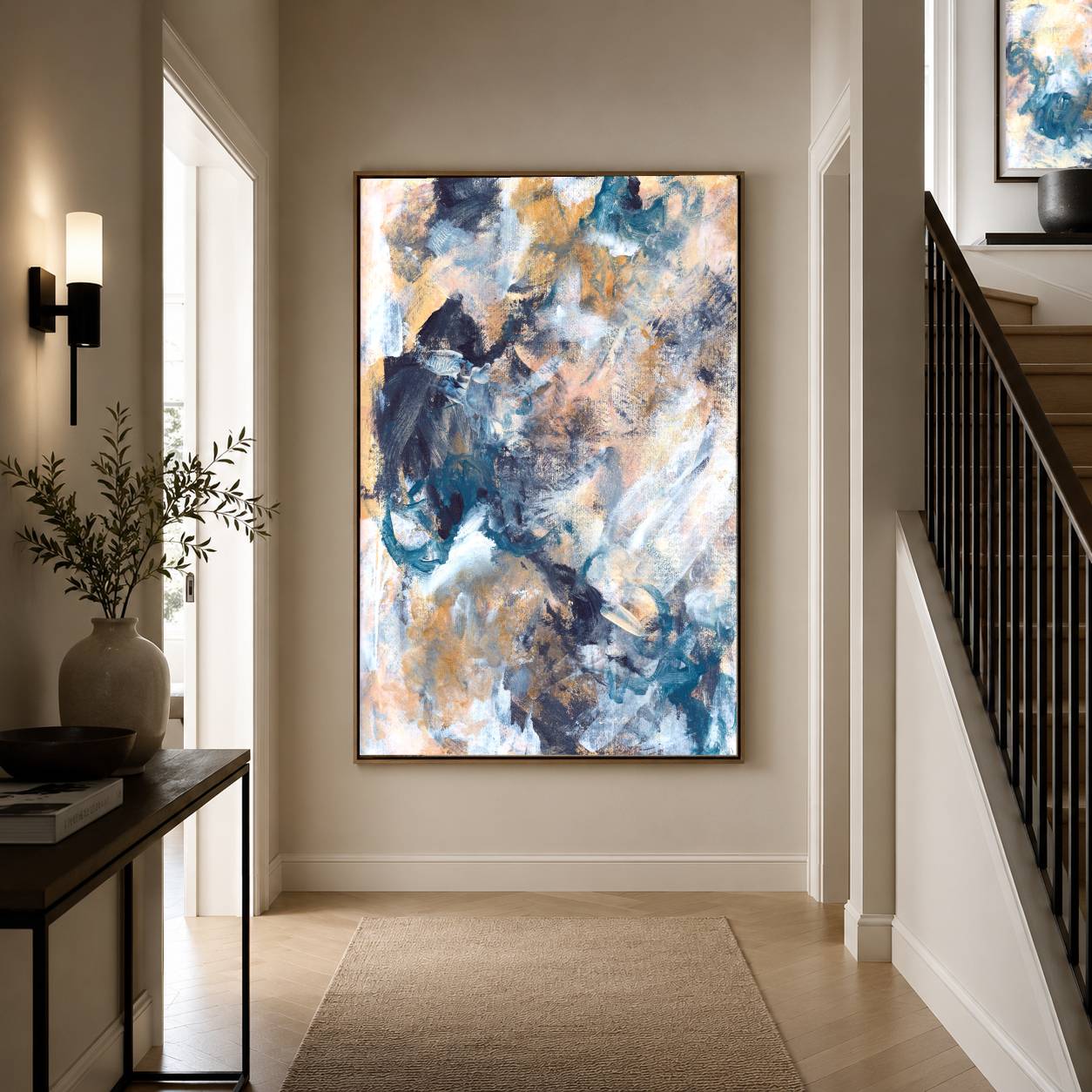
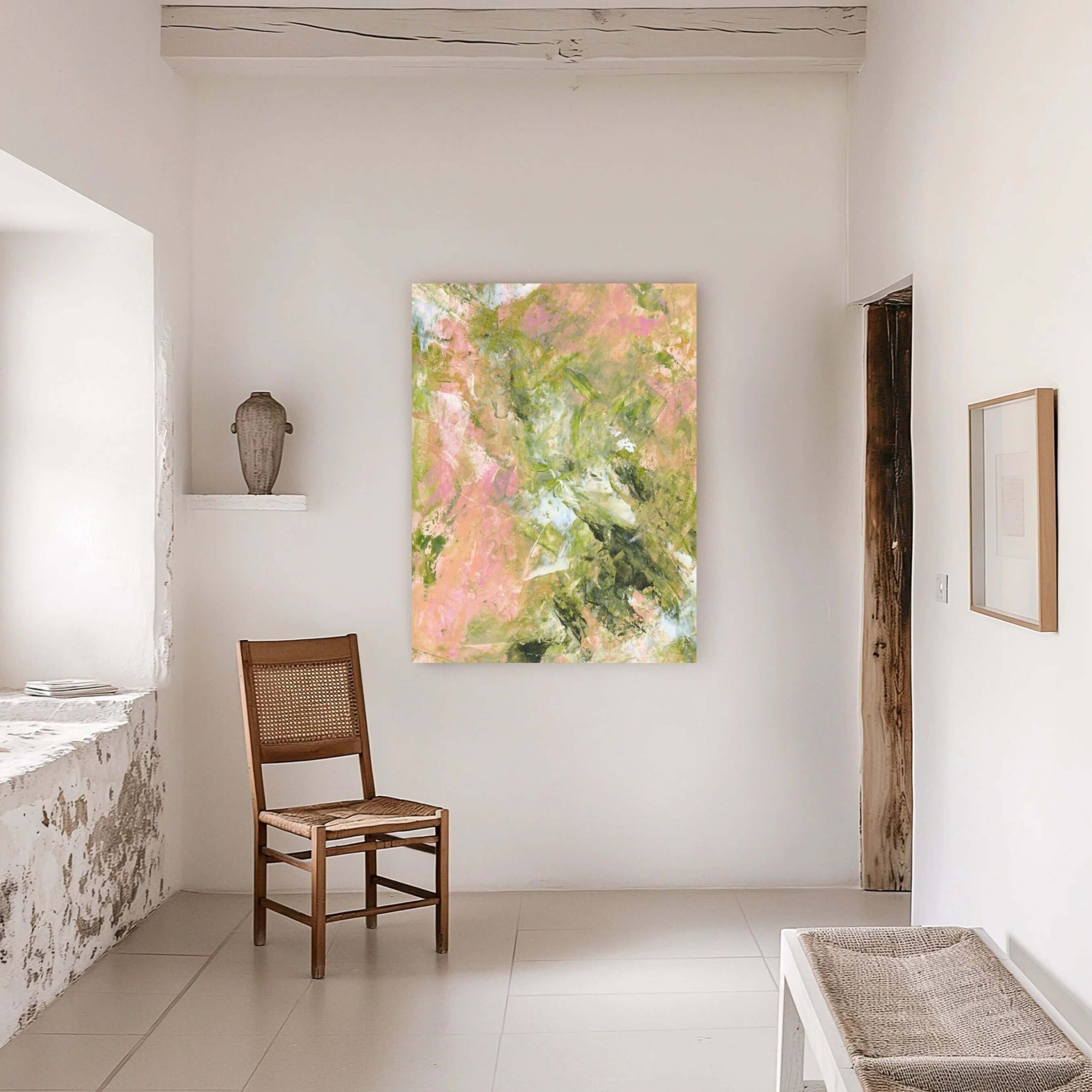
Why hallways and landings deserve better art decisions
Hallways are often treated like leftover space.
The living room gets the big artwork. The bedroom gets something calm. The dining room gets something elegant. The hallway gets a mirror, a console table, three coats, a rogue shoe, and possibly a print bought in a panic because the wall looked empty and everyone was coming round for dinner.
But hallways matter.
A hallway is usually the first part of the home someone experiences. It sets the emotional tone before anyone reaches the rooms you have spent actual time thinking about. It is the place where people arrive, remove shoes, pause, move through, glance up, turn a corner, and begin to understand the atmosphere of the home.
A landing matters too. It is not just the bit at the top of the stairs where laundry gathers in small accusatory piles. It is a pause point. It is a visual breath between levels. It is often seen from below, from above, from bedrooms, from the stairs, and from several angles at once.
Transitional spaces are subtle but powerful because they shape movement. They decide whether the home feels connected or disjointed, considered or accidental, calm or visually chaotic.
This is why abstract art can work so well in these areas.
Abstract art does not need to tell a literal story. It does not demand that someone stop and decode a scene. It can create feeling quickly through colour, form, texture, rhythm and scale. In a hallway or landing, where people are usually moving, that matters. The artwork has to register emotionally without needing a long explanation.
The right piece can make a narrow hallway feel calmer, a landing feel more grounded, a stairwell feel more elegant, or an entrance feel quietly memorable.
The wrong piece can make the whole space feel like someone lost a fight with a homeware aisle. And nobody needs that.
Why abstract art works especially well in transitional spaces
Abstract art is particularly suited to hallways, landings and transitional spaces because it can hold attention without becoming too literal.
In a room where people sit for long periods, a figurative or narrative piece can invite slow looking. In a hallway, the viewing experience is different. People see the artwork while entering, leaving, passing, turning, climbing stairs or glancing from another room. The artwork has to make sense in fragments.
Abstract art can do that beautifully.
A strong abstract piece can be read from a distance as colour, shape and energy. As someone moves closer, it can reveal texture, layering, brushwork, contrast and quieter details. It does not need one perfect viewing position. It can shift depending on angle, light and movement.
That makes it ideal for transitional spaces because these areas are rarely experienced from one fixed seat.
A hallway artwork may be seen straight on from the front door, side-on while walking past, reflected in a mirror, partly visible from the living room, or glimpsed while coming downstairs half-awake and questioning every life choice. A landing piece may be seen from below, from the stairs, from the upper hallway, or from bedroom doorways.
Abstract art can hold all of that.
It can create atmosphere without needing symmetry. It can bring warmth into a pale corridor, depth into a white stairwell, softness into a sharp architectural space, or energy into a quiet entrance.
It also allows the homeowner to choose emotional resonance rather than obvious subject matter. Instead of asking, “Should I put a landscape here?” the better question becomes, “What should this space feel like as people move through it?”
That is where abstract art becomes useful. Not decorative filler. Emotional architecture.
Decision box: what kind of abstract art should you choose?
| If your hallway, landing or transitional space feels… | Choose abstract art that… | Avoid artwork that… |
|---|---|---|
|
Narrow and dark |
Brings light, softness or depth without heavy visual clutter |
Feels dense, muddy or visually cramped |
|
Long and plain |
Creates rhythm, movement or a strong focal point |
Is too small or scattered to hold the wall |
|
Cold or clinical |
Adds warmth, texture and emotional softness |
Repeats the same hard, flat feeling |
|
Busy or cluttered |
Has calm composition and breathing room |
Adds more noise, detail or competing colours |
|
Architecturally strong |
Holds its own with scale and confidence |
Looks timid or decorative |
|
Small but visible |
Feels intentional and well-proportioned |
Looks like an afterthought |
|
Open to other rooms |
Connects colour or mood across the home |
Fights with nearby rooms |
|
Too neutral |
Adds depth, contrast or quiet colour |
Disappears completely into the wall |
|
Too intense |
Creates calm, balance and visual pause |
Adds more drama than the space can hold |
|
Emotionally flat |
Brings presence, atmosphere and curiosity |
Feels generic or purely decorative |
Start with the feeling, not the wall
Most people choose hallway art by looking at the empty wall and thinking, “What size thing fits here?”
That is not wrong, but it is not the best starting point. The better question is: what do you want the space to feel like?
A hallway can feel calm, warm, elegant, dramatic, grounded, intimate, spacious, curious, bright, moody, quiet or alive. A landing can feel like a pause, a transition, a visual anchor, or a private moment between rooms. A stairwell can feel sculptural, cinematic, serene or full of movement.
The art should support that feeling.
If your home already has a calm, minimal interior, you may want abstract art that adds quiet depth rather than loud contrast. If the hallway feels too plain, you may want a piece with more energy, colour or movement. If the entrance feels cold, you may want warmer tones, softer texture or a composition that brings emotional warmth into the space. If the home already has a lot going on, you may need artwork that calms the eye rather than joins the shouting.
This is especially important with abstract art because the subject is not literal.
You are not choosing a picture of a place, object or person. You are choosing an atmosphere. You are choosing the emotional temperature of the wall.
That sounds dramatic, but it is true.
A large blue and white abstract piece can make a hallway feel spacious and calm. A deep red, ochre or charcoal piece can make the same space feel grounded and intense. A soft layered neutral work can create quiet sophistication. A bold, high-contrast piece can create energy and drama. A piece with flowing forms can make a transitional space feel more fluid, while a more structured composition can make it feel anchored.
Before you think about size, ask what the space is currently missing.
Then choose art that brings that quality in.
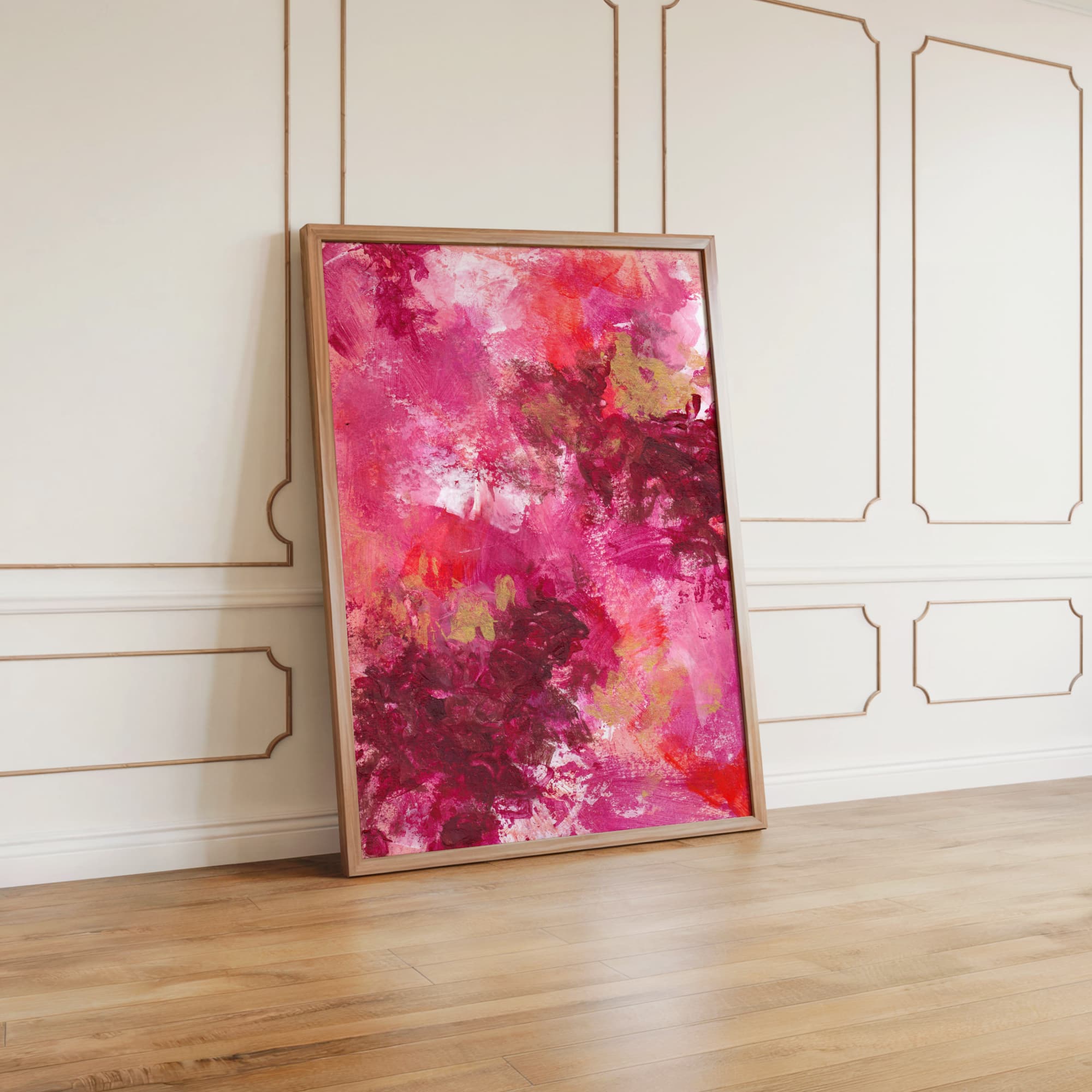
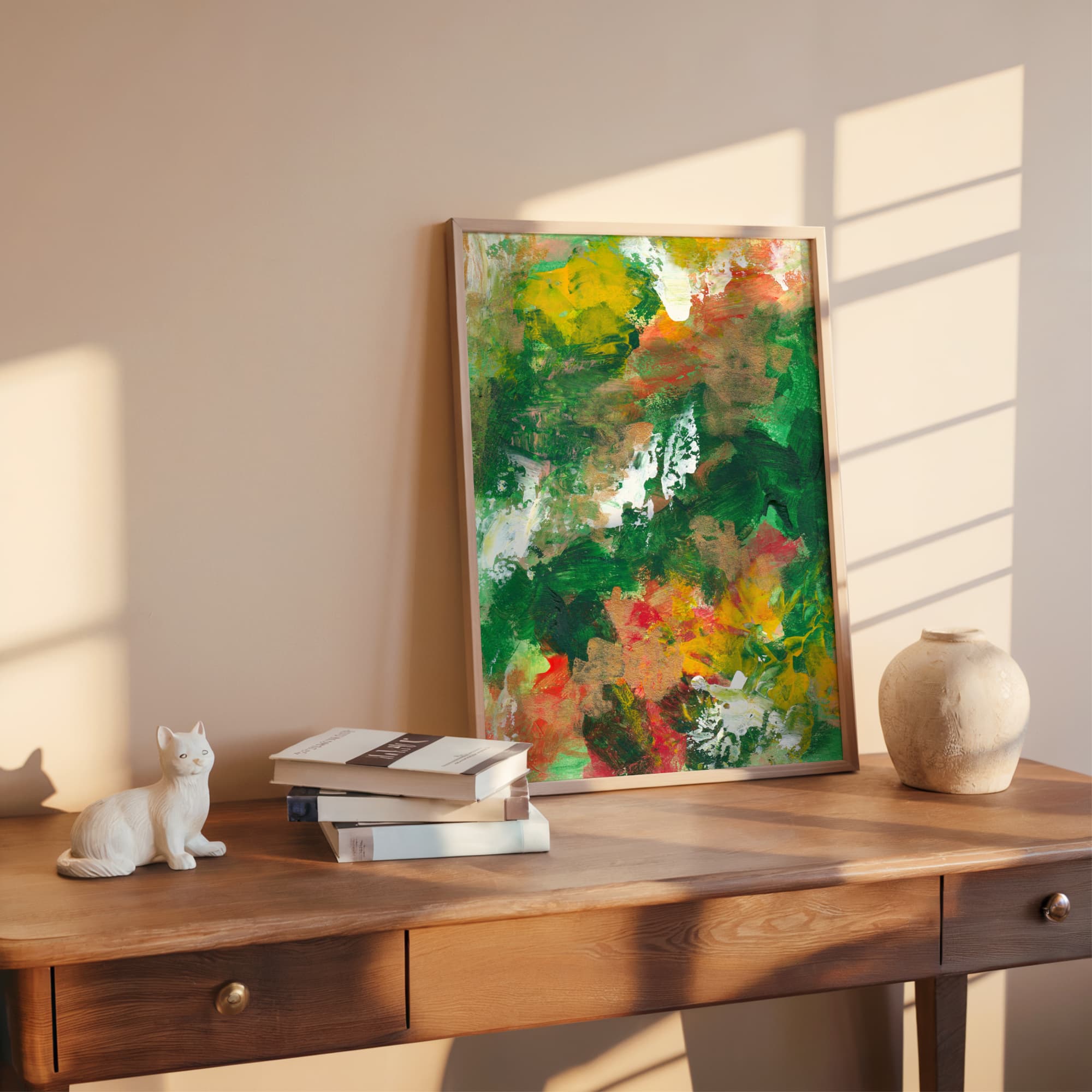
Scale matters more than people think
Scale is one of the biggest reasons hallway art either works beautifully or looks slightly apologetic.
A piece that is too small can make a wall feel larger, emptier and more awkward. It can look like someone hung a polite little rectangle and hoped the wall would stop complaining. In a transitional space, where people often view art from a distance or while moving, small artwork can disappear unless it is intentionally grouped or placed in a very specific way.
A larger piece often works better because it gives the space a clear visual anchor.
This does not mean every hallway needs a massive canvas. It means the artwork should have enough presence for the wall, the sightline and the architecture around it.
In a narrow hallway, one strong vertical or medium-large piece can feel more considered than a row of small prints. In a long corridor, a larger horizontal work may help carry the eye through the space. On a landing, one substantial artwork can create a pause point and make the area feel like part of the home rather than a forgotten bit of circulation space.
Scale should be judged by the wall and the viewing distance.
If someone sees the artwork from the end of the hallway, it needs enough impact to register from that distance. If the piece is only seen close-up while passing, it can be quieter and more textural. If the artwork sits above a console table, bench or radiator cover, it should relate to the furniture below it rather than floating too high or looking disconnected.
A good rule is that hallway art should feel deliberate.
Not squeezed in. Not timid. Not shouting for attention either, unless the space can genuinely hold that level of drama.
The best scale feels inevitable, as if the wall had been waiting for that piece rather than tolerating it.
Why one strong piece often beats several small ones
Gallery walls can work in hallways, but they are often overused.
A hallway gallery wall can look personal, layered and full of character when it is curated properly. It can also look like a wall had a nervous breakdown and nobody intervened. The difference is usually spacing, scale, frame consistency, colour rhythm and whether the collection has any visual logic beyond “we had these.”
For abstract art, one strong piece often works better in a hallway or landing because it gives the eye somewhere to rest.
Transitional spaces already involve movement. People are walking, turning, entering, leaving, climbing, passing bags, carrying laundry, avoiding pets, trying not to trip over shoes, and generally existing in motion. If the wall is filled with lots of small competing pieces, the space can feel busier than it needs to.
One confident abstract artwork can create calm and presence.
It can make the hallway feel more grown-up, more considered and more architecturally resolved. It can also make a smaller space feel less cluttered because the eye reads one clear gesture rather than several competing ones.
This is especially true if the hallway is narrow. A narrow space does not always need more detail. It often needs clarity.
A single collector-grade canvas print can bring depth, colour and texture without adding physical bulk. Because canvas does not require glass, it can also avoid reflections in narrow spaces where framed prints may catch glare from windows, ceiling lights or wall sconces.
That does not mean small works are wrong. They can be beautiful in the right place. A small abstract piece can work well at the end of a short hallway, above a narrow console, beside a doorway, or as part of a carefully edited pair. But if the wall is large, visible and central to the home’s flow, do not be afraid of choosing something with more presence.
Hallways are not second-class walls. They can take real art.
Consider the sightline before choosing the artwork
A sightline is what you see from a particular viewpoint, and in hallways, landings and transitional spaces, sightlines matter enormously.
You may see a hallway artwork from the front door. You may see it from the kitchen. You may see it while sitting in the living room. You may see it through an open doorway. You may see it from the bottom of the stairs, the top of the stairs, or while walking from one room to another.
This means the artwork is not only decorating one wall. It is participating in the wider visual rhythm of the home.
Before choosing abstract art for a hallway or landing, stand in the places where the artwork will actually be seen. Look from the entrance. Look from the adjacent rooms. Look from the stairs. Look from the point where someone turns a corner. Notice whether the wall is a focal point, a side wall, a background surface or a visual stop.
A visual stop is especially powerful. This is the wall you see at the end of a hallway, the landing wall at the top of the stairs, or the area directly visible when entering the home. These walls can hold stronger artwork because they naturally draw the eye.
Side walls often need a different approach. If people pass close to the artwork, the piece should not feel too visually aggressive or physically vulnerable. Texture, subtle colour, layered composition and quieter detail can work beautifully here because the viewer experiences the piece up close.
A landing wall may need to work from multiple angles, which means composition becomes important. Abstract art with movement, depth or layered forms can hold interest from different viewpoints, while overly symmetrical or highly directional pieces may feel awkward if they are only strong from one angle.
Choosing art without considering sightlines is how people end up with a piece that technically fits the wall but feels wrong in the home. The wall is not the whole story. The movement through the space is the story.
Hallway art does not need to match the interior. In fact, matching too closely can make the artwork disappear.
The better goal is connection.
Colour can connect to the home through warmth, contrast, undertone, mood or repetition. A piece does not need to contain the exact same beige as the runner, the same green as the plant pot, or the same grey as the paint. That level of matching can become painfully literal, and frankly, interiors deserve better than colour-by-numbers obedience.
Instead, look at the emotional temperature of the space.
Is the hallway warm or cool? Light or dark? Soft or sharp? Minimal or layered? Does it need contrast? Does it need calm? Does it need a colour that lifts the space or one that grounds it?
If the hallway is painted in warm neutrals, abstract art with ochre, rust, cream, soft pink, muted gold, brown, charcoal or deep red may create a rich, grounded feeling. If the space is cooler, with whites, greys, blues or stone tones, artwork with soft blue, slate, black, white, silver, green or muted violet may feel more connected. If the home is very neutral, one piece with stronger colour can bring life without requiring the whole interior to become loud.
Colour can also guide people through the home.
If a colour appears in the hallway artwork and then reappears quietly in the living room, bedroom or stair runner, the home begins to feel more coherent. Not matched. Coherent. There is a difference.
Matching says, “I bought everything from the same mood board and now we all have to live with it.”
Coherence says, “There is a rhythm here.”
Abstract art is excellent for this because it can carry several tones at once. It can echo the home without becoming decorative wallpaper. It can introduce colour in a way that feels emotional rather than obvious.
Choose mood carefully in narrow or enclosed spaces
Hallways and landings often have less natural light than main rooms, which means mood matters.
A dark, intense artwork can look stunning in a hallway if the space has enough light, width and architectural strength to hold it. It can create drama, intimacy and depth. But in a very narrow or dim hallway, a heavy piece may make the space feel smaller or more compressed unless that is the intended effect.
Equally, very pale artwork can bring lightness and calm, but if the piece has too little contrast, it may disappear into the wall and feel weak.
The balance depends on the space.
A narrow hallway often benefits from artwork with depth but not excessive visual weight. Soft contrast, layered texture, flowing composition and a restrained palette can work beautifully. A landing can often take slightly more drama because it acts as a pause point rather than a tight passage. A stairwell may benefit from movement, vertical energy or a composition that echoes the upward and downward flow of the stairs.
Think about whether the artwork should expand the space, ground it, soften it or energise it.
If the hallway feels cramped, choose art that gives the eye somewhere to travel. This might mean lighter areas, open composition, layered depth or colour that creates a sense of air. If the hallway feels bland, choose art with stronger contrast or a more distinctive emotional presence. If the space feels cold, choose a warmer colour or texture. If the space feels visually busy, choose something calmer and more resolved.
The goal is not to make every transitional space calm. The goal is to make it intentional.
A dramatic hallway can be wonderful. A quiet hallway can be wonderful. A warm hallway can be wonderful. A moody stairwell can be wonderful. Accidental is the problem.
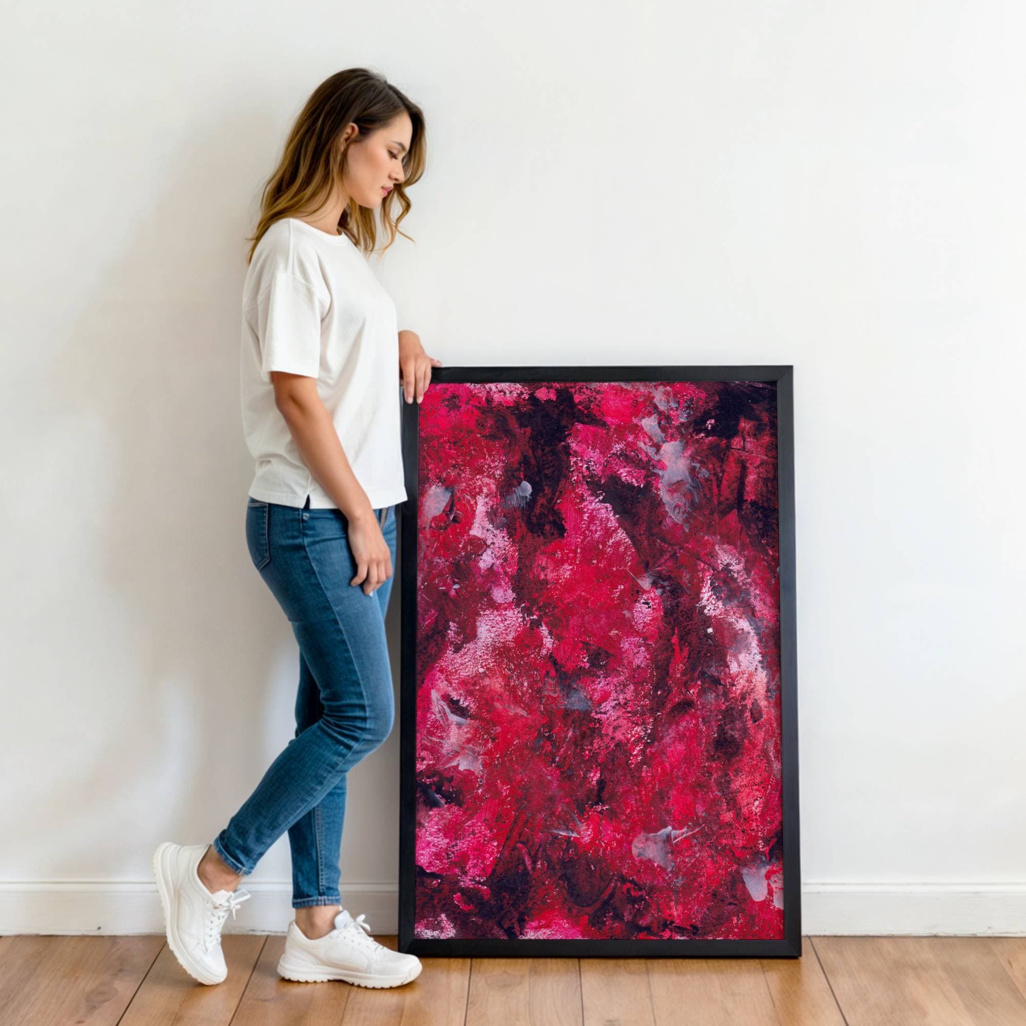

Texture can make a hallway feel more alive
Texture is one of the most underrated qualities in hallway art. Because transitional spaces are often passed through rather than occupied, people sometimes assume the artwork needs to be bold to be noticed. But texture can create a quieter kind of presence. It catches light, changes with angle, and gives the eye something to discover as the body moves.
This is one reason canvas works so well in hallways and landings.
A collector-grade canvas print can bring surface, depth and softness without the reflective glare of glass. In narrow spaces, this matters. Glass can catch overhead lights, windows, doorways and awkward reflections, which sometimes means the viewer sees themselves, the ceiling bulb or the neighbour’s car more clearly than the artwork. Not ideal, unless the emotional theme is “mild irritation in a corridor.”
Canvas has a different quality.
It absorbs light more softly. It can feel more integrated with the wall. It brings a tactile presence that suits spaces where people pass close to the artwork. It also has a more architectural feel than a flat paper print behind glass, especially when the scale is generous.
Texture does not have to mean physical thickness or heavy impasto. It can be visual texture, layered colour, painterly marks, soft transitions, movement, grain, depth or the feeling of the hand behind the work.
In a hallway, where people often see art from close range, those details matter. They make the piece feel alive rather than merely placed.
Lighting can make or ruin the artwork
Lighting is not a minor detail in transitional spaces. It can make the artwork feel rich, atmospheric and intentional, or it can make it look flat, dull, shadowed or weirdly haunted. Hallways and landings often have overhead lighting, limited natural light, wall sconces, stairwell shadows or changing light throughout the day, so the artwork needs to be chosen with that reality in mind.
Before choosing a piece, notice the light.
Is the wall naturally bright or dim? Does it receive direct sunlight? Is there a ceiling light above it? Is the light warm or cool? Does the stairwell cast shadows? Will the artwork be visible in the evening? Does the hallway rely on artificial lighting most of the time?
A piece with subtle tones may look beautiful in daylight but disappear in a dim corridor. A dark artwork may become too heavy without proper lighting. A glossy framed piece may reflect every bulb in the house. A canvas piece may work better because it reduces glare and keeps the focus on colour and surface.
If the artwork is important, light it properly.
A picture light, directional spotlight or well-placed wall light can transform a hallway artwork from “nice thing on wall” to “this space has been considered.” The lighting does not need to be theatrical. It just needs to let the work be seen.
In a landing or stairwell, lighting can also create atmosphere. A softly lit abstract piece at the top of the stairs can feel like a quiet arrival point. A stronger piece near an entrance can create a sense of welcome and identity. A textured canvas in warm light can soften a hard architectural space.
Art and lighting are not separate decisions.
They are in conversation. Sometimes a piece does not fail because the art is wrong. It fails because the lighting is doing it dirty.
Placement height matters, especially in hallways
People often hang art too high.
This is especially common in hallways because the wall is empty, the ceiling may be tall, and everyone suddenly develops the instinct to float artwork somewhere near the clouds.
Most art should be hung so the centre of the piece sits around eye level, but hallways and landings require a little more judgement because people view the work while moving. If the piece is at the end of a hallway, centre height matters. If it is above a console table, the relationship to the furniture matters. If it is on a stair wall, the angle of the stairs changes the viewing experience.
For a hallway, the artwork should feel connected to the human body moving through the space.
Not too low, where it feels vulnerable or awkward.
Not too high, where it feels disconnected.
If the piece is large, it can sit slightly lower than people expect because large artwork has its own presence. If it is above furniture, leave enough space between the furniture and the artwork for breathing room, but not so much that they look like strangers forced into the same room at a bad networking event.
On a landing, the artwork should usually anchor the wall where people naturally pause or turn. If it is visible from the stairs, check how it looks from below and above. A piece that looks perfect straight on may feel oddly placed when seen from the main approach.
Placement is not just a measurement. It is a relationship. The art needs to relate to the wall, the body, the architecture and the movement through the home.
Abstract art for entrance hallways
The entrance hallway carries a particular responsibility because it creates the first impression of the home. This does not mean it needs to be dramatic. It means it needs to be truthful.
The entrance should introduce the emotional tone of the home. If the home is calm, the art should support that calm. If the home is bold and expressive, the art can announce that energy. If the home is elegant and minimal, the art can bring quiet depth. If the home is warm and layered, the art can add richness and intimacy.
Abstract art is useful here because it can create identity without becoming too literal.
A landscape might say something specific. A portrait might create a particular kind of presence. A typographic print might announce a message, often one everyone has seen before and nobody needed again. Abstract art can do something subtler. It can set a tone through colour, movement and feeling.
For entrance hallways, choose a piece that can be understood quickly but still rewards closer looking.
This is where strong composition matters. The artwork should have enough clarity to register as people enter, but enough depth to avoid feeling like decorative filler. If the hallway is narrow, avoid pieces that feel too visually crowded. If the entrance is spacious, consider a larger canvas that creates immediate presence.
The entrance is also a good place for art that feels personal.
Not necessarily autobiographical. Not necessarily sentimental. But chosen. Felt. Connected to the atmosphere you want people to experience when they step into the home.
A hallway should not feel like the waiting room before the real interior begins. It should feel like the first sentence.
Abstract art for long corridors
Long corridors can be tricky because they often feel like tunnels. If the walls are plain and the lighting is flat, the space can feel functional rather than considered. Art can help by creating rhythm, interruption and movement.
There are two main approaches.
The first is to place one strong artwork at the end of the corridor. This creates a destination for the eye and gives the space a clear focal point. It can make the corridor feel more intentional and less like a passage to somewhere better.
The second is to use a carefully spaced series of artworks along the corridor. This can work beautifully if the pieces have a clear relationship to each other through scale, palette, mood or framing. But it needs discipline. Too many small, unrelated pieces can make a corridor feel cluttered and restless.
For abstract art, a long corridor can handle pieces with movement.
Flowing forms, layered marks, directional energy or repeated colour can echo the act of walking through the space. A horizontal piece can lengthen the wall, while a vertical piece can interrupt the corridor and create a pause.
Colour also matters. If the corridor is dark, use art that brings lift or depth. If it is very bright and plain, a stronger piece can prevent the space from feeling sterile. If the corridor connects several rooms, choose artwork that harmonises with the wider palette of the home without becoming bland.
A long corridor does not need to be ignored. It can become one of the most elegant parts of the home when the art is chosen properly.
Abstract art for stair landings
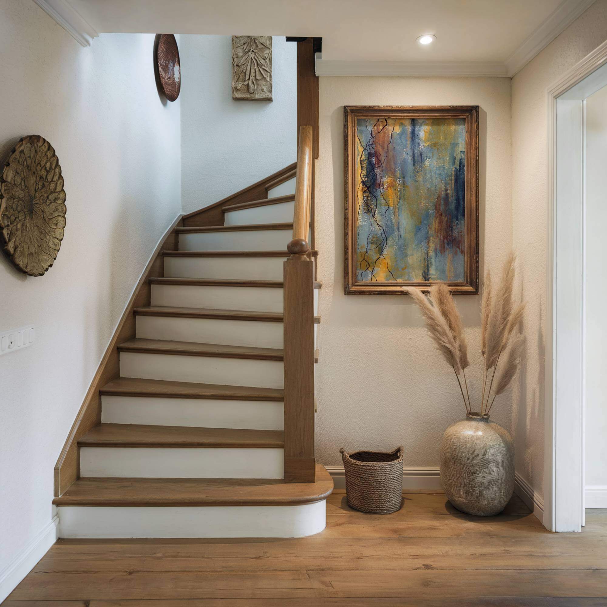
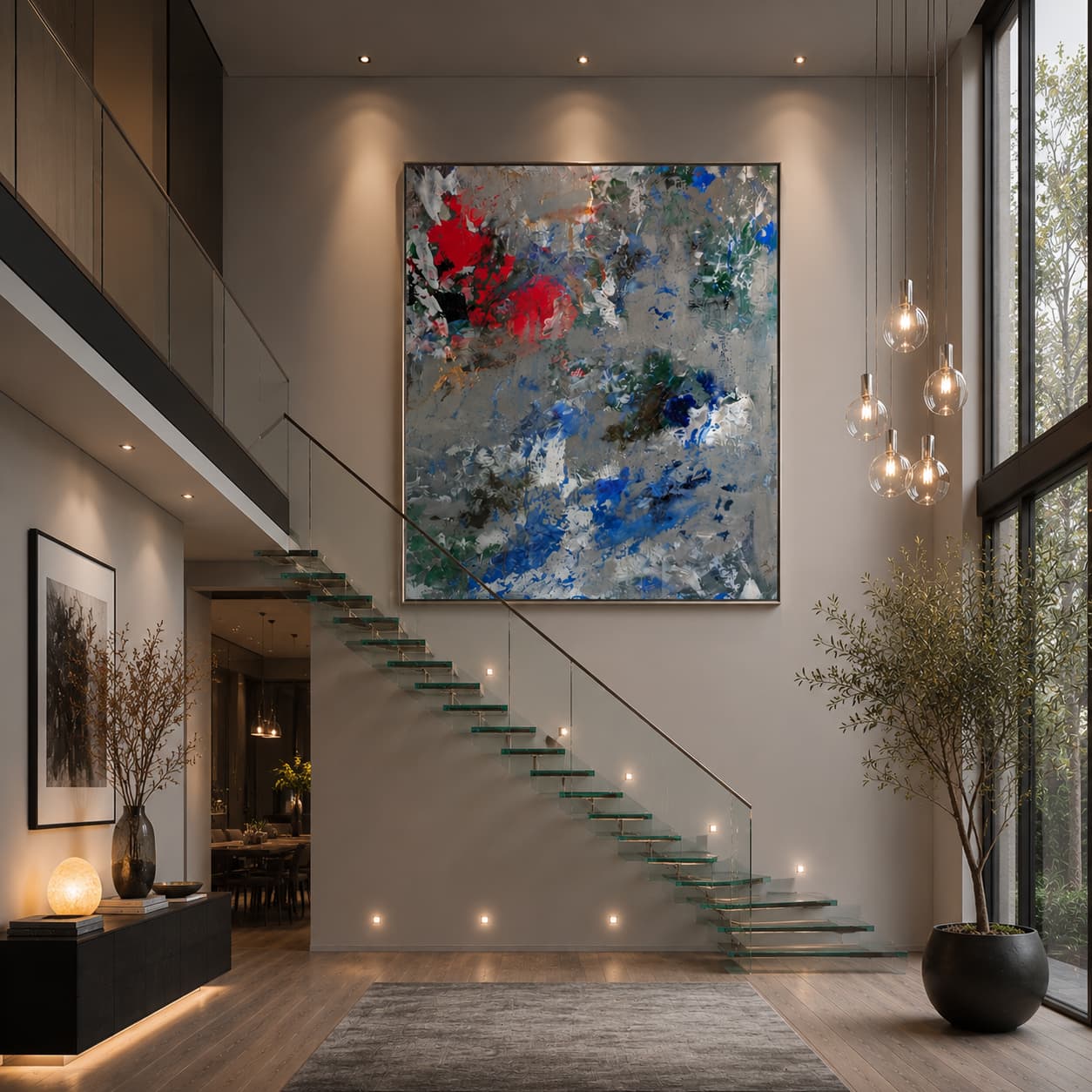
A stair landing is a natural place for abstract art because it is both a pause and a transition. People arrive there. They turn. They look up. They look down. They move between private and shared spaces. A landing often connects bedrooms, bathrooms, stairwells and hallways, which means it can quietly shape how the upper part of the home feels.
The artwork on a landing should feel anchored.
It needs enough presence to hold the space, especially if the wall is visible from below. A small piece can work if the landing is intimate, but if the wall is large or seen from the stairs, a more substantial artwork usually feels better.
Abstract art with depth, softness or movement can work especially well here because landings often have unusual light and angles. A piece with layered colour can shift throughout the day. A piece with vertical energy can echo the movement of the stairs. A calm, spacious composition can create a sense of breath between levels.
A landing is also a good place for art that feels slightly more private.
Entrance art often speaks to visitors. Living room art speaks to shared life. Bedroom art speaks to rest. Landing art sits somewhere in between. It can be more intimate, more reflective, more atmospheric.
It does not need to explain itself. It just needs to make the transition feel considered.
Abstract art for narrow hallways
Narrow hallways need restraint. That does not mean boring art. It means the artwork should not make the space feel visually crowded or physically awkward.
In a narrow hallway, people pass close to the wall, so the art is experienced at a short range. This makes texture, surface and detail more important. It also means very busy compositions can feel overwhelming if they are too large, too dark or too visually dense.
A narrow hallway often works well with one of three approaches.
The first is a calm, medium-scale abstract piece with enough depth to create interest but enough breathing room to avoid visual pressure. The second is a vertical piece that draws the eye upward and helps the space feel taller. The third is a single larger canvas on a clear wall, creating confidence and simplicity rather than clutter.
Avoid overcrowding the wall.
A narrow hallway does not need ten little frames unless they are curated with real care. It often needs one strong decision.
Canvas can work particularly well because it avoids glass reflections and feels softer in tight spaces. If the hallway is very narrow, consider the depth of the canvas too. A slim profile may be more practical, while still giving the surface quality of canvas.
Colour should also be chosen carefully. Dark art can work in a narrow hallway if the lighting is good and the mood is intentional, but if the space already feels tight, a piece with lighter passages, movement, or contrast may help it breathe.
The aim is not to make the hallway disappear. The aim is to make it feel held.
Abstract art for small transitional spaces
Small transitional spaces can still hold meaningful art.
A small landing, short corridor, entrance nook or wall between doorways may not have the scale for a large statement piece, but it can still carry atmosphere. In fact, small spaces often benefit from art because they are easy to overlook.
The key is proportion.
A small artwork can feel beautiful if it is placed intentionally, given enough breathing room, and chosen for emotional presence rather than just size. A medium piece can also work if the wall can hold it and the surrounding space is not too cluttered.
In small transitional spaces, avoid choosing art that feels too visually busy. Because the viewer is close, the piece does not need to shout. It can be quieter, more textural, more intimate. This is where subtle abstract work can be especially effective.
A small landing can become a pause. A wall between rooms can become a moment. A corner can become more than dead space. This is the difference between decorating and considering. Decorating fills. Considering listens. Yes, that sounds a bit poetic, but annoyingly, it is accurate.
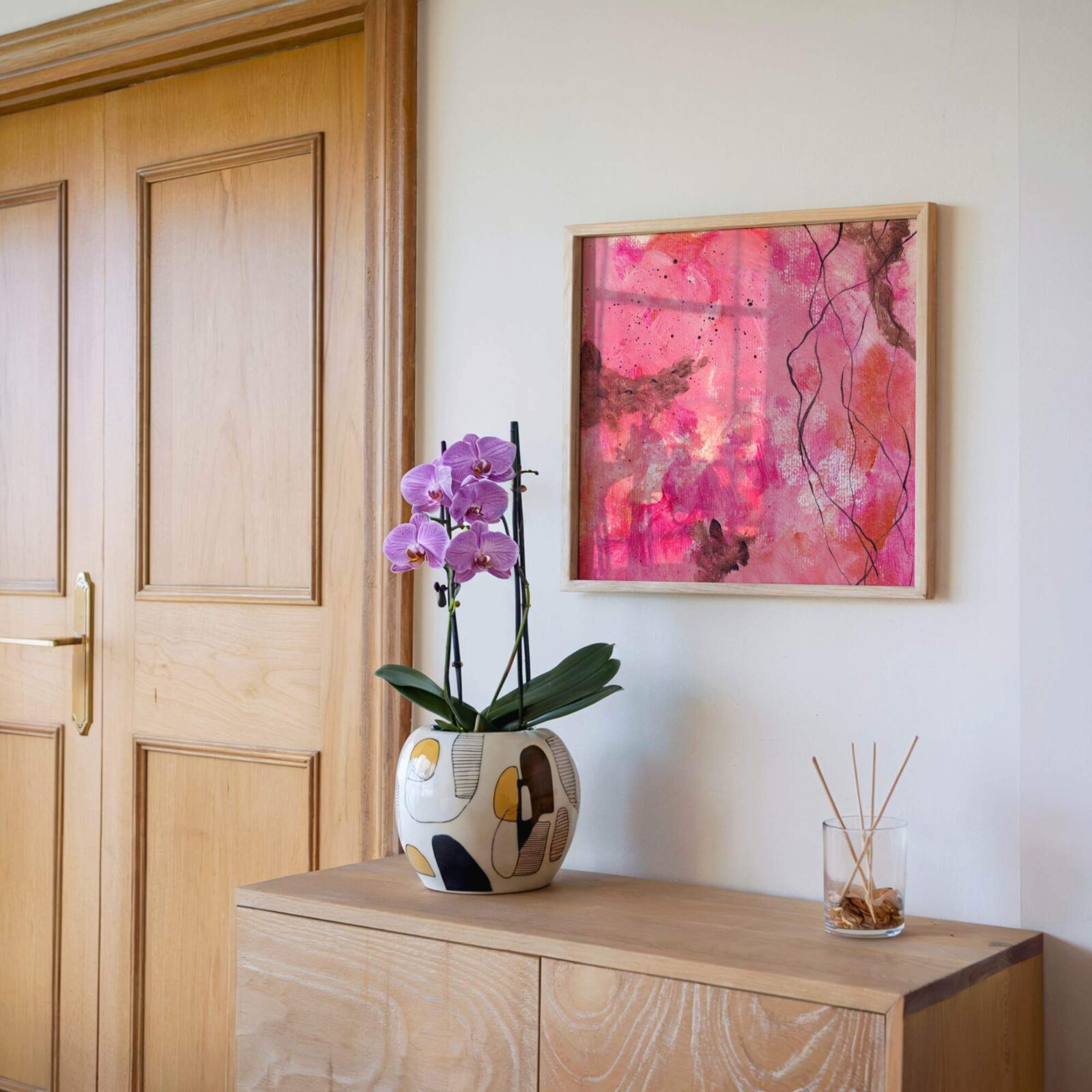
How to choose art for a hallway with a console table
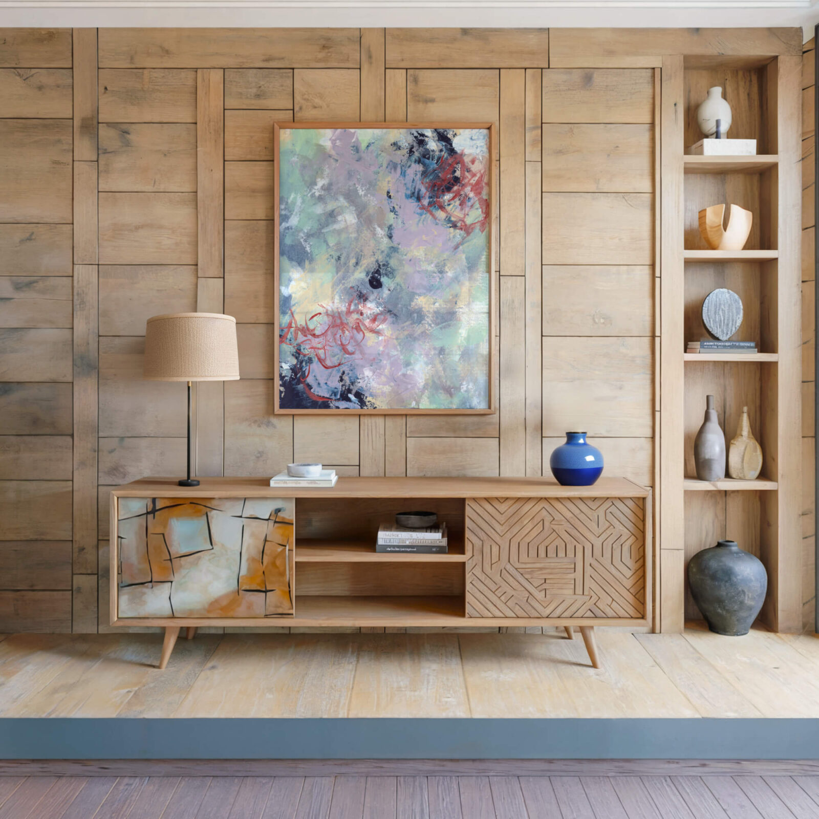
A hallway console table creates a natural place for art, but the relationship between the artwork and the furniture matters.
The artwork should not float too high above the table. It should feel visually connected to it. At the same time, it should not sit so low that the arrangement feels cramped or vulnerable to keys, bags, elbows, flowers, candles, and whatever else ends up living on the console because apparently surfaces attract objects like emotional magnets.
The width of the artwork should usually relate to the width of the console.
It does not need to match exactly, but it should feel proportionate. A tiny artwork above a wide console can look lost. A very wide piece above a narrow table can feel top-heavy unless the composition and wall can support it.
Abstract art above a console can create a strong entrance moment.
If the table holds objects, keep the artwork calmer or make sure the objects are restrained. If the artwork is bold, do not clutter the console underneath it. Let the piece breathe. If the artwork is quiet, the table styling can add texture through ceramics, books, branches, a lamp or a sculptural object.
The art and furniture should work together. Not compete like two people trying to tell different stories at the same dinner party.
How to choose art for a stairwell wall
Stairwell walls are awkward, but they can be beautiful. The challenge is that the wall is viewed at an angle and often across changing heights. This makes placement more complex than a standard hallway wall. The artwork has to relate to the movement of the stairs, the height of the wall, and the points where people naturally look while climbing or descending.
A single large abstract piece can work well on a stairwell wall if there is a strong landing or visual pause point. It creates a clear anchor and avoids the chaos that can happen when multiple pieces climb the stairs without enough spacing or logic.
A series of artworks can also work, but it needs careful planning. The pieces should follow the line of the stairs in a way that feels intentional, not like they are slowly escaping up the wall. Consistency in scale, framing or palette helps.
For abstract art, stairwells can handle movement beautifully.
A piece with vertical flow, layered marks or a sense of upward energy can echo the architecture. A calmer piece can create contrast with the movement of the stairs. A darker, more dramatic piece can make a stairwell feel intimate and cinematic if the lighting supports it.
Lighting is especially important here because stairwells often have shadows. If the art is placed where it cannot be properly seen, it will never fully work.
Stairwell art should feel integrated with the architecture. Not stuck on afterwards because the wall looked lonely.
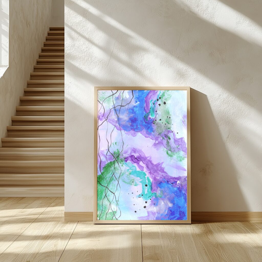
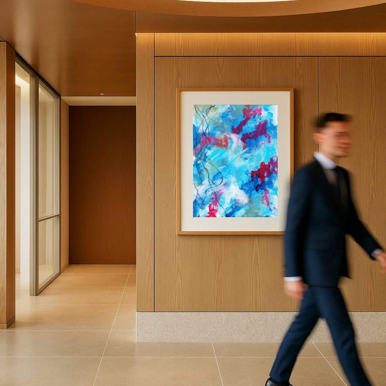
Why collector-grade canvas prints suit transitional spaces
Collector-grade canvas prints can work extremely well in hallways, landings and transitional spaces because they combine presence, texture and practicality.
A high-quality canvas print has a different feeling from a standard decorative print. It can carry the depth, colour and surface quality of the original artwork in a way that feels substantial and integrated with the interior. It does not sit behind reflective glass. It does not feel flimsy. It has object presence.
That matters in transitional spaces because the artwork is often seen from different angles and distances.
A canvas can hold the wall without needing heavy framing. It can soften architectural lines. It can bring warmth and depth into narrow or hard-surfaced spaces. It can feel more like part of the home rather than something temporarily attached to it.
For a deeper explanation of this distinction, read What Makes Collector-Grade Canvas Art Different from Decorative Wall Art.
Collector-grade art also changes the way a hallway feels.
Instead of treating the space as a place for leftover prints, it gives the hallway the same level of care as the main rooms. That does not mean the piece has to be loud or expensive for the sake of it. It means the artwork has been chosen for presence, quality, emotional resonance and long-term value rather than quick decoration.
Hallways are often where people reveal how much they actually care about the whole home.
A considered piece says the home has been thought through. Even the passing spaces. Especially the passing spaces. How to avoid making hallway art look generic. Generic hallway art usually happens when the piece has been chosen to match the décor rather than shape the space.
It may be pleasant. It may be inoffensive. It may have the correct colours. It may even be technically “nice.” But it does not do anything. It does not hold the wall. It does not create atmosphere. It does not say anything about the home or the person living there.
It just exists. Politely. And sometimes politeness is the problem.
To avoid generic hallway art, choose work with emotional presence. Look for composition, depth, colour, texture, movement or atmosphere that makes you feel something. The piece does not need to be dramatic, but it should have a reason to be there.
-
- Avoid buying art only because it fills the space.
- Avoid choosing something because it matches the runner.
- Avoid defaulting to safe prints that look like they were designed to offend absolutely nobody.
A hallway is a brilliant place to show confidence because it does not require the same functional considerations as a room. You are not designing around a television, bed, dining table or sofa. You are shaping an experience of arrival and movement. That gives you freedom. Use it.
Common mistakes when choosing abstract art for hallways and landings
One common mistake is choosing artwork that is too small. This makes the wall feel unfinished and the art feel apologetic. If the space has a strong sightline, the artwork needs enough scale to hold it.
Another mistake is hanging the piece too high. Hallway art should still relate to the human body moving through the space. If it floats awkwardly above eye level, it can feel disconnected.
A third mistake is choosing art that is too busy for a narrow space. Hallways often need clarity, not more visual noise. A piece can be rich and layered without being chaotic.
Another mistake is ignoring lighting. Art in a dim hallway needs enough contrast, depth or proper illumination to be seen. Otherwise even a beautiful piece can look flat.
People also often match too literally. They choose artwork because it contains the exact colour of the wall, rug or cushions, then wonder why the space feels lifeless. Connection is better than matching.
The final mistake is treating transitional spaces as less important.
They are not. They are the connective tissue of the home. If they feel neglected, the whole interior can feel less resolved.
Comparison table: choosing art by space type
| Space | Best art approach | What to avoid |
|---|---|---|
|
Entrance hallway |
A confident piece that sets the tone of the home |
Generic prints chosen only to fill space |
|
Narrow hallway |
Calm composition, texture and clear scale |
Too many small competing pieces |
|
Long corridor |
Strong focal point or carefully spaced rhythm |
Random gallery walls with no visual logic |
|
Stair landing |
Anchoring artwork with depth or atmosphere |
Pieces too small for the sightline |
|
Stairwell wall |
Art that works with vertical movement and angles |
Poorly spaced frames climbing awkwardly |
|
Small transition wall |
Intimate, textural or quietly powerful work |
Overcrowding the wall |
|
Hallway console area |
Art proportionate to the furniture below |
Hanging too high or styling too much underneath |
|
Dark hallway |
Artwork with light, contrast or good lighting |
Dense work with no illumination |
|
Neutral hallway |
Art with depth, warmth or quiet contrast |
Pieces that disappear into the wall |
|
Busy hallway |
One clear, considered artwork |
Adding more visual clutter |
Practical checklist before choosing hallway art
| Question | Why it matters |
|---|---|
|
What does the room already feel like? |
Sightlines affect scale, composition and placement |
|
Is the space narrow, wide, dark or open? |
The architecture changes what kind of art will work |
|
Does the wall need a focal point or quiet depth? |
Not every hallway needs drama |
|
Is the artwork large enough for the wall? |
Small pieces often look accidental in transitional spaces |
|
Does the colour connect to the home? |
Connection is better than literal matching |
|
Does the piece work in the available light? |
Hallway lighting can flatten or transform art |
|
Will people view it close-up or from a distance? |
Texture and detail matter more at close range |
|
Does the art create the right emotional tone? |
Transitional spaces shape how the home feels |
|
Is there enough breathing room around it? |
Crowding weakens the artwork |
|
Does the piece feel chosen rather than convenient? |
Intentionality is what makes the space feel considered |
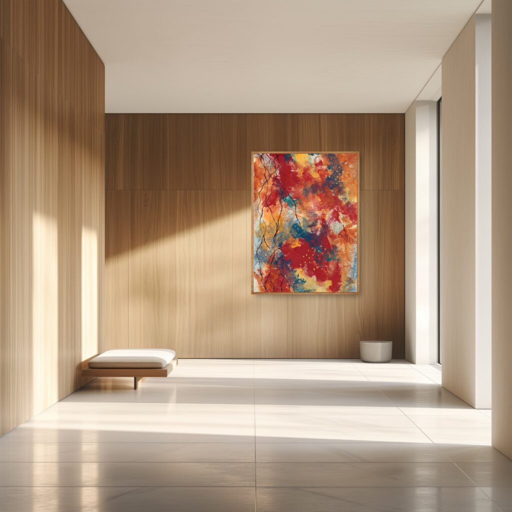
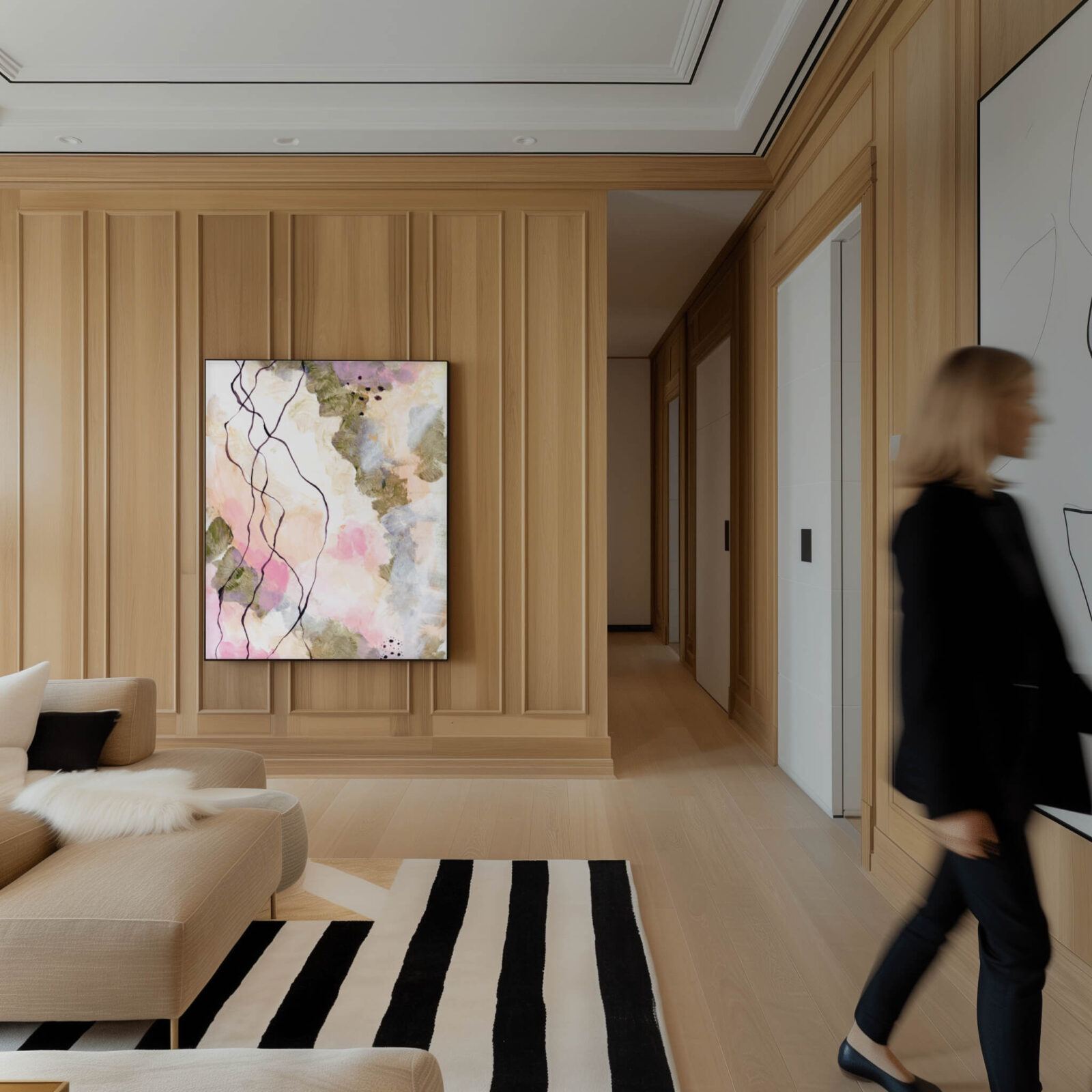
How abstract art can guide the emotional rhythm of the home
A home is not experienced all at once. It unfolds.
You enter. You move through. You turn. You pause. You pass from public spaces to private ones. You go upstairs. You come downstairs. You glimpse rooms from other rooms. You experience colour, light, texture and atmosphere in sequence.
Transitional spaces guide that sequence.
This is why abstract art in a hallway or landing can have more impact than people expect. It becomes part of the rhythm of the home. It can slow the pace, create curiosity, soften the architecture, introduce warmth, or create a sense of arrival.
A calm abstract piece near the entrance can make the home feel grounded from the first moment. A bold piece at the end of a corridor can create energy and direction. A quiet canvas on a landing can create a moment of pause before entering more private rooms. A textured work in a narrow hallway can make the space feel intimate rather than cramped.
Art changes how movement feels.
That is the point of using it in transitional spaces. You are not just decorating a wall. You are shaping the passage between rooms.
When to choose calm abstract art
Calm abstract art works well in hallways and landings when the space already has enough architectural interest, pattern, furniture or visual activity.
A calm piece does not mean boring. It may have subtle layering, soft colour, gentle movement, spacious composition or quiet texture. It can bring sophistication without shouting.
Choose calm abstract art if the hallway feels busy, narrow, overstimulating, dark, cluttered or already visually complex. Calm artwork can help the space breathe. It can create a pause between rooms. It can make the home feel more settled.
Calm art also works well in homes where the hallway connects to restful spaces such as bedrooms, reading areas or quiet living rooms. It helps the transition feel natural.
The danger is choosing something so calm that it disappears.
A calm artwork still needs presence. It needs depth, texture, proportion or tonal contrast. Otherwise, it becomes beige obedience, and nobody needs to pay good money for beige obedience.
The best calm abstract art has quiet authority. It does not shout. It does not vanish either.
When to choose bold abstract art
Bold abstract art works well when the hallway or landing needs identity, contrast or a stronger focal point.
This is especially true in entrance halls, long corridors, stair landings and large transitional spaces where the architecture can hold more visual presence. A bold artwork can create energy, confidence and memorability. It can stop the space from feeling bland or purely functional.
Choose bold art if the hallway is plain, neutral, spacious, well-lit or architecturally strong. A large canvas with rich colour, contrast or movement can transform the space.
But bold does not mean chaotic.
A bold piece still needs composition. It needs balance. It needs to feel intentional rather than aggressive. In a transitional space, where people are moving, too much visual noise can become tiring. The best bold abstract art has power and clarity.
It gives the eye something to land on. Not something to survive.
How to connect hallway art with the rest of the home
Hallway art should feel connected to the rest of the home, but it does not need to match every room.
Connection can happen through colour, mood, material, scale or emotional tone. If the living room has warm neutrals and deep earthy tones, the hallway artwork might echo that warmth in a more abstract way. If the bedroom palette is soft and cool, the landing artwork might carry a similar quietness. If the home has strong architectural lines, the artwork might either complement that structure or soften it.
The hallway can also act as a bridge between different rooms.
If one room is calm and another is more expressive, the hallway art can sit between those moods. It can carry a little of both. This is where abstract art is particularly useful because it can hold multiple colours and feelings without becoming literal.
Think of the hallway as a thread. It does not need to repeat the same idea everywhere. It needs to help the home feel like one connected experience.
Why emotional resonance matters more than trend
Trends are dangerous in transitional spaces because hallways and landings are already easy to neglect.
If you choose art because it is currently popular, it may look fine for a while, but it may not hold emotional value. And because transitional spaces are passed through every day, weak choices become very visible over time. You may not stare at the artwork for hours, but you will see it constantly.
That daily contact matters. Choose art that gives you something.
A feeling. A pause. A lift. A sense of recognition. A little internal yes. Something that makes the space feel more like yours.
Abstract art does not need to be understood in a literal way. You do not need to explain exactly what it means. You only need to feel that it belongs in the emotional life of the home.
This is where collector-grade work differs from decorative art.
Decorative art often solves a surface problem. The wall is empty, so something goes there. Collector-grade art asks a deeper question. What kind of presence do you want to live with?
That question matters in hallways too.
Maybe especially there, because transitional spaces are where the home quietly repeats itself to you every day.
Final thoughts: transitional spaces are not afterthoughts
Hallways, landings and transitional spaces deserve more care than they usually receive.
They are not just the bits between the important rooms. They are where the home begins, shifts, pauses and connects. They shape first impressions. They carry movement. They influence how the rest of the interior feels.
Abstract art works beautifully in these spaces because it can create atmosphere without demanding a literal story. It can bring calm, warmth, depth, movement, texture, colour or quiet drama into areas that are often overlooked.
The key is to choose with intention.
Think about sightlines. Think about scale. Think about colour. Think about lighting. Think about the emotional tone of the home. Think about whether the artwork gives the space presence or simply fills a gap.
A hallway does not need leftover art. A landing does not need something small and safe because nobody knew what else to do with the wall.
A transitional space can hold real work. It can carry a feeling. It can make the home feel more complete.
And when the right abstract artwork is placed in the right passing space, it does something quietly powerful. It changes the way the home moves.
If you are choosing abstract art for a hallway, landing or transitional space and want work with presence, depth and emotional resonance, explore Selected Works or request private access to the Collector’s Vault.
The Collector’s Vault includes collector-grade canvas prints drawn from the archive, created for interiors that need more than decorative wall filler. These works are designed to bring atmosphere, colour, stillness and emotional depth into considered spaces.
Key Takeaway
Abstract art works beautifully in hallways, landings and transitional spaces because these areas carry the movement, atmosphere and first emotional impression of a home. The right piece can create calm, depth, warmth, curiosity or quiet drama without overwhelming the space. Choose art by considering scale, sightline, colour, wall width, lighting, emotional tone and how the artwork supports the feeling you want people to carry as they move through the home.
Frequently Asked Questions
The best abstract art for a hallway usually has clear composition, strong atmosphere and enough scale to hold the wall. In narrow hallways, one confident piece often works better than several small pieces because it creates presence without visual clutter.
Hallway art should be proportionate to the wall and sightline. If the artwork is seen from the entrance or the end of a corridor, a larger piece often works better. Smaller pieces can work in intimate spaces, above consoles or on short walls, but they need to feel intentional rather than accidental.
Yes, large canvas art can work beautifully in a narrow hallway if the composition is clear and the piece has enough breathing room. Canvas can be especially effective because it avoids glass reflections and brings texture without adding visual clutter.
The best colours depend on the mood and light of the hallway. Warm tones can make a hallway feel more welcoming, while cooler tones can create calm and spaciousness. Stronger colour can lift a neutral hallway, while softer palettes can calm a busy or narrow space.
Hallway art should connect with the rest of the home, but it does not need to match exactly. Connection can come through mood, undertone, colour rhythm, texture or emotional tone. A piece that feels related but not overly matched usually looks more sophisticated.
Yes, abstract art works very well on stair landings because it can create a visual pause between levels. A landing often benefits from artwork with enough presence to be seen from different angles, especially if the wall is visible from the stairs.
Most hallway art should be hung around eye level, with the centre of the artwork sitting roughly where the eye naturally lands. If the piece is above a console table or on a stair wall, adjust the height so it feels connected to the furniture, architecture and movement through the space.
One large artwork often creates a calmer, more considered effect, especially in narrow or modern hallways. A gallery wall can work if it is carefully curated, but too many small pieces can make a transitional space feel cluttered.
Canvas can be a strong choice for hallways because it avoids glare, brings texture and feels integrated with the wall. Framed glass can work too, but in narrow spaces it may reflect lights, windows or movement, which can distract from the artwork.
For a dark hallway, choose abstract art with enough contrast, lightness or depth to remain visible. Good lighting is also important. A picture light, wall light or directional spotlight can make the artwork feel intentional rather than lost in shadow.
Art above a hallway console should relate to the width and height of the table. A medium or large abstract piece often works well, especially if the console styling is kept simple enough to let the artwork breathe.
Yes, abstract art can make a hallway feel calmer when the composition, colour and scale are chosen carefully. Soft contrast, spacious composition, layered texture and a restrained palette can help a transitional space feel more settled and considered.